Tuesday, April 30, 2013

Sneak peek of the cutest girl's room in town


It is possible that I love this room a little too much.  We are waiting on a few little odds and ends, and then I'll show you the whole shebang!

These were the original boards.  We mostly went for number 2, but with some tweaks.

I will say, this is one happy nine year old.

Monday, April 29, 2013

A colorful Art Wall

There is an episode of Design Star that I often think of in my work.

After a big reveal, the homeowner says something like "I love it!  It's just what I imagined!"  The homeowner appears thrilled and the designer is thrilled, but judge Genevieve Gorder gives her a withering look and corrects her. "A designer's job is not to give a client just what they imagined.  It is to give them something they never COULD have imagined."

I hung an art wall on Friday, and I was very pleased when my client said just that: that they loved the results and could never have imagined it themselves.


I first met with this client last fall, and it was fun to come back and see all my suggested changes implemented, from paint to floor plan.  They have collected some wonderful treasures over years of travel, including the Mexican rug and chair that are now in the living room.  (I wish I had a proper before shot!)


In my mind, this art wall is a great example of "buy what you love and it will work together."  They have been drawn to a particular style and consistent color palette, and but the pieces were spread through the house a bit willy nilly.  When I laid out all the pieces together, they made a much stronger impact than each piece on its own.  Even the frames were the right mix for a collected vibe--mostly black or raw wood.  (The temple photo in the silver frame will get a black frame to better blend in.)


The big painting on the right was a wedding present more than 40 years ago, and has been used in many ways, including as a coffee table!

This was such a lovely way to end the week.

Happy Monday, folks.


Friday, April 26, 2013

Is it a sign?

Do you do this thing, where you don't buy something and then you think about it all the time, and when you go back to get it but it's gone you tell yourself it wasn't meant to be?

There are so many variations on this theme.

I was at Pottery Barn the other day picking something up for a client, when I noticed they had the Hotel bedding in blue majorly on sale.  With the addition of my trade discount, I was looking at half off.

We could actually use new bedding for the guest room, but I walked away thinking it was final sale, and unsure whether the blue would be the right blue.

But the more I thought about it, the more I knew it was perfect.  I love hotel bedding, and in this case I love the idea of something a little proper to temper the new bohemian print on the headboard.  And suddenly I had a vision: I would love it with these red-printed sheets underneath and my favorite leopard pillow.  And then I started seeing little inspirations everywhere, like Jenny's blue hotel bedding, the red bed at the newly revamped Biscuit, and the ribbon-trim shams on the pattern-heavy bed at Furbish.

But, considering the final sale thing, I wanted to be sure.  So I went to Target to find out how little I could spend on a full/queen duvet.  And they were completely sold out!  At TWO Targets!  And guess what else? The first Target didn't have those red sheets at all.  At the second one they were rain checked.  An entire aisle of sheets all lined up in rows, and ONLY this pattern in the size I needed was out of stock.

But all's well that ends well.


I went to Pottery Barn, they still had the duvet cover and shams, which had been further marked down.  I had a random gift card and merch credit in my wallet which had a combined $117 on them.  ("FREE MONEY!"  Do you do that one, too?)  And the bedding was not final sale after all.  I ordered a duvet on line from overstock with a major coupon.  And I realized the red sheets were unnecessary.

So, wham.  The bedding in situ.  (I guess I should get out the iron).  Waiting on the duvet, but at the end of the day I spent not a lot on the duvet and still have $27 to spend at Pottery Barn.


I guess it was just meant to be.

Until I change my mind.  I have 30 days to return!


Thursday, April 25, 2013

Nate Berkus for Calico Corners

It's no secret that I love Nate Berkus.

In fact, I love him so much it makes me question my notion that I prefer feminine spaces.  I love his brand of eclectic, traveled, masculine interiors, and of course the way he makes it seem so chic and effortless.  Oh, this old thing?

(Except of course he would never say that, because he is unabashedly enthusiastic about design, which is so much better than nonchalance, faux or real, don't you think?)

I say this as if we know each other. As if we were friends, or something.  The internet--or maybe all of modern life?--is funny that way.

Anyway.

I loved his collection for Target, and lo and behold, I wandered in to Calico Corners today to see what was new, and I'll tell you, I swooned for his collection.


I wanted it all.  And I could actually afford some of it.


Calico did a good job of showing it off, too.  Love the choice of this organic, almost-animal print cotton on a fancy chair.


Sadly, while I LOVE the color palette, it is just a little off for my current house.  (Love this ikat spot for this chair, but sadly the hue is too plummy.)


Anyone want me to come use a bunch of these textiles at your house?

Say yes.

See the entire collection here, though I will tell you, they are so much better in person.

Wednesday, April 24, 2013

I'm no artist


I probably "shouldn't" post this, but I'm gonna go ahead and do it anyway.
After sitting with a construction paper collage on canvas for a while, over spring break the girls and I just jumped in and started painting this giant canvas.

Basically, I chose a palette from the existing sample cans of latex house paint I had lying around (and believe me, there were LOTS to choose from!)  


This is all wrong: one should not paint a pre-stretched canvas using latex house paint.  I know this.  But this project is truly a matter of function, effect, and saving money, so there was no way I was going to invest in a bunch of oil paints and brushes.


I have been living with it in place for a while now to see how I feel about the colors, if it's too much of a pain to move the thing on and off the TV (it's not, though our TV has been broken for a couple of weeks, making it a wee bit moot), and whether I will ultimately feel the need to add a frame.


The gap at the sides actually doesn't bother me.  I do need to add a cross bar to the back to raise the whole thing up a couple of inches though.

Right now, the painting itself lacks depth and detail, but this is really just the base layer.  For now I am deciding how I feel about the base palette, whether to bring in black or gold or both, whether to add a more rigid geometric element and whether to do some embroidery on the canvas.  I know.

I share this today partly because blogs sometimes make it feel like a blogger has an idea and then Poof!  It's finished and perfect.  I tend to think a lot, and some decisions are very slow in coming.  I guess I want to make clear that these things can take time....and really, there's no rush.

Tuesday, April 23, 2013

Triumph!


Once daylight savings set in, and before Minnesota returned to a state of perpetual winter (a winter storm warning is in effect and another 4-6 inches of snow is predicted as I write this, on APRIL TWENTY-SECOND), there was a brief moment of evening sunshine.  This was so very lovely, with one little problem: my children would not go to sleep because their in-progress window treatments let in all that light.

And so, last weekend, I finally made a pair of light-blocking draperies.  People, let me tell you, if you have ever been knocked over in shock at the price of custom draperies, you just need to make yourself a pair to understand, and you will never complain again.  Promise.  (Well, you might complain, but you will know you are not being ripped off.)


Mine are only a single fabric width, only because I bought this fabric a dozen years ago and I didn't have any more.  I used black-out liner, and that business is HEAVY.  I used this tutorial for lining, but made my own pinch pleats instead of using pleat tape.  As it turns out, pleat tape is basically useless if you want any control over the spacing of your pleats--which you do if you want them to fit the window properly.  And if you're going to all this trouble, you definitely want them to fit your window properly.


What this means is that when the draperies are closed, they overlap about 2 inches in the middle, and the return at the outside ends is the right size to actually wrap around the side of the window and touch the wall.

I chose a butterfly pleat, which seems sweet for a girls' room, don't you think?


For the drapery rod, I used this one from Allen + Roth at Lowes, which I blogged about here.  I love the look, and it was very easy to customize the length--my husband just cut off about a foot section and drilled a new hole for the finial.  My big complaint is that the rings do not maneuver smoothly on the rod, and for curtains that get opened and closed daily, this is a problem.  That said, I got the rod, rings, brackets, and finials for $50, about 1/4 to 1/8 of the price of something similar from a higher-end custom line.  So in the future, I would consider using the slightly narrower pole with these rings.

Noe I jut need to revisit the beds.  I've been thinking about tufted headboards in white, natural, or blush pink linen.  But then today I saw these.


Love the shape.  Painted white, I think.

What say you?

Monday, April 22, 2013

Hanging an art wall long distance

I often marvel at the technology we now have available to us, and think how different my job would be without it.  I'm just old enough that I have had it both ways and can really appreciate the tools we now have at our fingerprints.

I remember location scouting for a photo shoot in 2000 for Keds, I think, driving along the Jersey Shore from beach club to beach club with a paper map and actual film in my camera.  If I needed to call ahead to make sure the manager was around, I stopped at a pay phone.  Back in the city that evening I dropped the film at an overnight photo developing place praying the pictures would come out.  When I picked them up, I literally taped the prints together to create panoramas, put them in manila folders, and had a bike messenger deliver them to the client.

So different now, no?

My parents are just back from their house in Arizona.  This trip, the house project on the agenda was a wall of photographs in the kitchen.  My aunt is a wonderfully talented photographer, and sent my mom five 16x20 prints of horses.  I've hung a lot of art for my mom, including this wall, so she used her phone to photograph the prints and sent them to me along with a picture of the kitchen.  Using olioboard, I was able to send her my recommended layouts in 5 minutes.

With three horses:


Four horses:


And all five horses:


Proof positive that an odd number usually works better in a grouping (though of course there are exceptions.)  They decided to use all five.

The next day, my parents called from Michaels and we were able to select frames long-distance.  They loved this frame:


And I agreed, but suggested mixing in another molding to keep the wall from getting too heavy and too matched.


Later in the week, when the framing was done and it came time to hang the work, they sent me this picture.


The arrangement was too high.  They adjusted so the top of the grouping was in line with the kitchen cabinets:


And got my seal of approval.

And here's the arrangement, all hung up!


Ten years ago, I probably would have had to just go to Arizona and hang this for them.  Or there would have been a flurry of faxes and photos printed and sent by mail.  Now it's truly amazing how much we can do long distance.

Saturday, April 20, 2013

Small Measures


Another excellent example of the big impact of a custom stamp.  On my list for the powder room...

Friday, April 19, 2013

En Suite Bath

I hope you're enjoying a little peak in to this process.

So, every client is different.  Usually when they get their range of looks, there is one clear favorite and one or two small changes.  (Maybe they loved a lamp from a different board, or want to swap throw pillows.)

This was a case where the client had two favorites--glam and bohemian--and when we took the best of both, it added up to something way too grown up for a 5 year old.  So additional tweaks were in order, and we landed here:


The client loved those Robert Abbey table lamps, and while they had been on my short list, they didn't make it into any of the looks.  Their shine and sharp angles combined with the X of the bench legs and the nightstand legs meant we needed something round--enter the drum shade pendant with glass orbs--and something soft--the textured bedding.  A strong solid on the lamp meant breaking up the solid on the x bench , so the geometric pattern moves there.  Then we frame it all out with pretty navy border bedding, and a tiny-scale navy animal print on a custom bulletin board (not shown.)

So fun.  The client is managing the install herself, in stages.  Hoping to have room shots one day.

Meanwhile, in the bathroom.


I put the "love" textile on the window, and can't you just die for that vintage art screenprint?  It's hard to tell, but it is navy on white, with pink sunglasses.

All in all, a room that works now but will not be outgrown, well, ever!  She'll get bored of it first.  In, like, a decade.


Thursday, April 18, 2013

How to achieve different looks with one color and fabric story

Yesterday's post was kind of a trick.  I didn't include the fabric combo that we actually went with.  I know, I'm sneaky that way.

Here's what we chose:


That white linen with the navy embroidered pattern (middle, Robert Allen) will be draperies.  The top fabric, a scrumptious watercolor lily print from Designer's Guild, will make euro shams.  The furry pink dot on the left is intended for a bedskirt (though we may go retail), and the graphic pink trellis options are, well, options.  The pink wallpaper at right is for the en suite bathroom--I'll show you that plan tomorrow.

Even with these colors and patterns set, there is still plenty of room to create different vibes.  Here's how.

Preppy Cottage

mis-matched nightstands and a shabby chic chandelier give this space a fresh take on cottage.  All the graphic punches of solids keep it from getting too sweet.

Regency Glam


The bits of bling (chandelier, nightstand hardware) add glitz, while the coordinating geometric motifs reference Hollywood Regency style.


Eclectic Bohemian


Pink leather poufs and a bead chandelier are beachy global, while the masculine bedding and mid-century inspired nightstands keep it down to earth.

Preppy


Seeded glass lamps, chunky navy nightstands, pom pom pillows, ribbon trim shades on a classic chandelier, and those french ticking stripes on the bench--very preppy "Nantucket"!  All of a sudden, this is my favorite.  How cute is the little pillow in Lulu DK's "love" embroidered print for Schumacher Child?

It's amazing how much the look can change, even with the same colors, same base elements, and even some of the same prints, don't you think?


Wednesday, April 17, 2013

Choosing a palette for a girls' room

You know that 9 year old girls are my favorite clients, right?

Well, 5-year-olds aren't so bad, either.

I recently completed a plan for a Big Girl Room in a newly renovated house.  Mom spent loads of time and energy managing a gorgeous renovation, and she just needed a little help rethinking her daughter's space.  She wanted modern preppy (leaving the PB Kids and pastel gingham behind), and her daughter's main requirement was bright pink.

With pale grey walls and carpet and white trim and bed, I had a nearly blank slate to work with.  We discussed doing some custom elements, and that meant one thing: starting with fabrics.

I presented my clients with a number of color options, including:

Pink and Orange


Pink and Aqua


Pink, Red, and Navy


And a multi-color approach


As well as pink and grey and pink and navy, not pictured here.

It can be really fun to present options like this.  Some people can be overwhelmed, but it was quickly clear that this client knew what she wanted and we were able to zero in on a scheme.  

Often, I find people just need something (some GOOD things) to react to to figure out what they really love.

What do you think: any favorites?


Tuesday, April 16, 2013

Sculptural Wall Install

I am on a major push to finish some things up around here.  Enough that I can just chill out at home.  I'm not going to make a real list like last time, because that's just depressing.  Possibly more because of how much I change my mind as opposed to how much I didn't get done.  (But that, too.)  I'll just continue to share some progress thoughts here, if you don't mind.

Like this new idea for the upstairs hallway: molding that acts as sculpture.


It seems easy enough to accomplish, though the simple way (installing full sheets of progressively smaller plywood squares) seems a bit heavy for the wall to sustain.  I would also leave space between each large rectangle.  But I love that the interest comes from the dimensionality rather than a color, pattern, or texture.

Still mulling it over.  What do you think of this?

Monday, April 15, 2013

Desperate.

I'm getting desperate for spring.  DESPERATE.

We have enough snow on the ground that it could be February.  Or November.  Or really anything but SPRING like it's supposed to be.

I want--no, need--bright.  And fresh.  I want to wear my new white jeans and put on my sunglasses for once.  I want to hear the birds chirp and start the garden and go for a bike ride without needing snow tires.  My brain is a muddle as if I have been blinded by the whiteness of it all.  I am so desperate that, in an act of superstition, I had my husband remove the paper snowflakes that were still adorning our doors this weekend.  Because maybe it's our fault and our little papercuts are summoning the real ones.  Right?

Hey, how about some bright, cheerful pillow pairings?


The pinks and blues on the right are destined for this living room.  So fresh and bright I will live vicariously through them.  

Which would you choose?  Is is Spring where you live?  No, wait, don't tell me.  Of course it is.

Saturday, April 13, 2013

Small Measures

 Via Oh Joy

Clip botanical prints at random.  Stick to a simple color palette to keep it from getting away from you: here, the yellow and green is sweet and summery.

Ashley has been hosting a little blogger tag sale this week--including vintage botanical book plates that would be perfect for this!

Thursday, April 11, 2013

Have You Lost Your Mind?

That is what my husband might say (or at least THINK) if he happens to wander in to the guest room and sees this:


Yes, I'm thinking about reupholstering the headboard.  No, I didn't plan it.

This is what happened.

I am making new curtains for the girls room because of the new rug.
Because of the new blinds, which replaced the temporary one but do not have any of their light blockage, I need to sew the curtains with blackout lining.

At places like Joann's, blackout liner can be $12/yard, making this "free" project decidedly less so.  So I went to my favorite fabric warehouse, where the goods can be had for $3/yard.

But you can't go all the way to the fabric warehouse and not look around.  Nay.  And what did I find?  That's right.  This Persian Diamond fabric from IMAN's collection for Calico Corners (I blogged it here) for a mere $7/yard (original retail was around $54/yard).  How could I not buy a yard (or two?)

Meanwhile, the guest room always felt close but not quite.  I keep falling in love with it, only to become disenchanted mere days later.  (I'm not usually so fickle.  Truly.)  And it occurred to me on my way home with my score that this could be amazing on the headboard.  Here's where the room was most recently (except that the rug went to the living room!)  Oops--I kind of love it.

But.  What do you think?

And if I do it, shibori-style throw pillow or animal print?  I love the freshness of the white bedding for spring. (By which I mean, for the fresh blanket of white snow we lovingly received today.)


(Colors on the right are far more accurate.)

Decisions, decisions.


Tuesday, April 9, 2013

Liebster

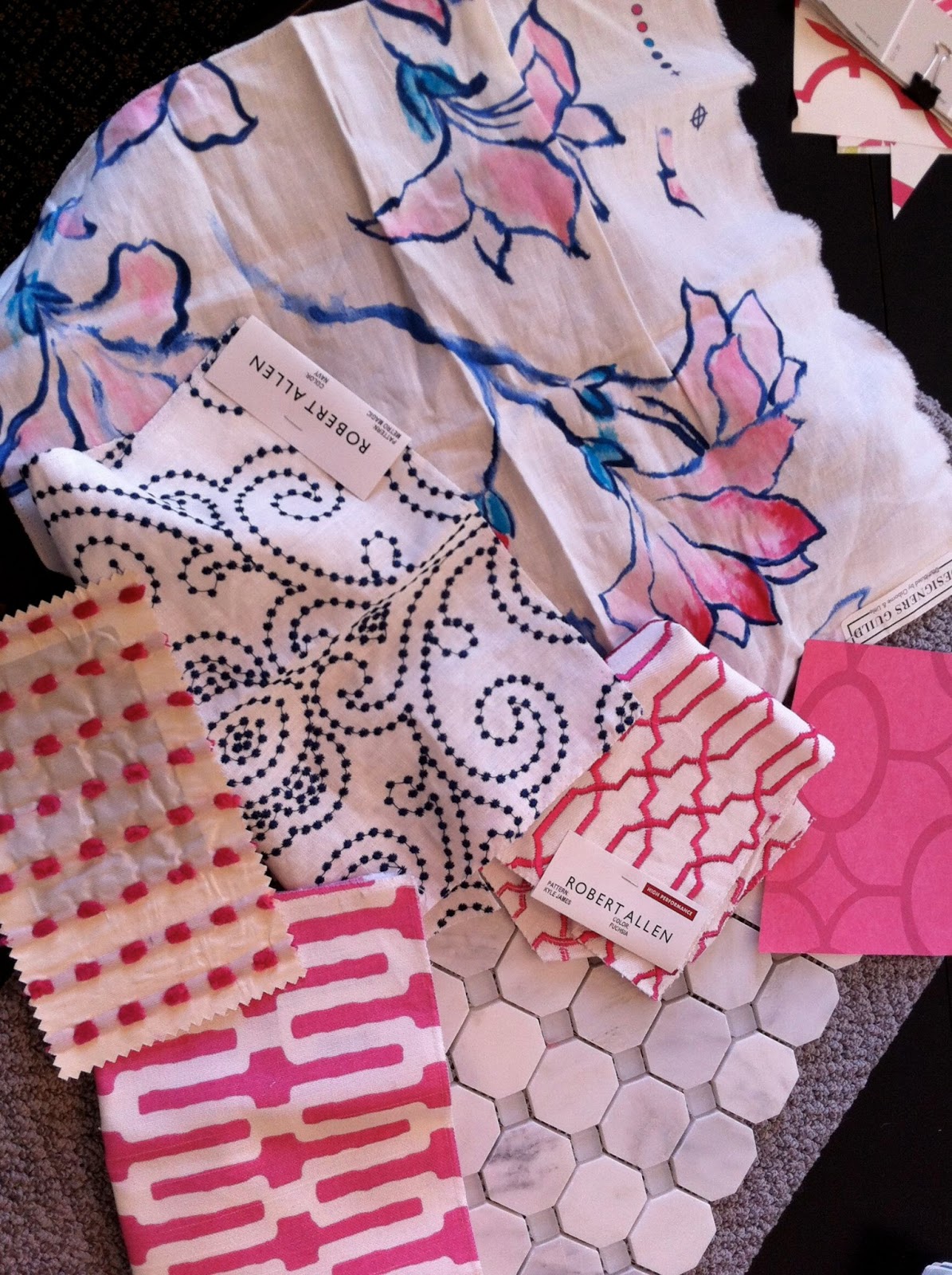
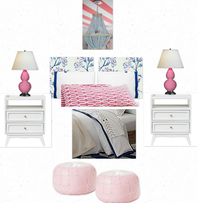
I have to say, getting back into the swing of blogging is harder than I expected!  I have lots of stuff to update you on--client work, projects around the house, new sources, etc--but sitting my butt down in the chair every night, well, that habit was easy to break.

Enter Kai from Love in Idleness, saving me with a Liebster award.


I am going to skip most of the rules.  I'm not going to post 11 random facts about myself (you can see 7 here.)  I'm not going to tag 11 more bloggers.  But I AM going to answer Kai's 11 questions, which I found to be awfully fun.

Ready?


1. What is you favorite black and white movie?
Band a la Part


2. Do you sing (loudly) while driving?  Windows up or down?  People in the car or not?
Yes!  Windows down, unless I'm in the city; then up to spare my driving neighbors, especially when I am singing this.


And in terms of company, only if I'm driving with my favorite girlfriends, and we've got this going on.


3.  What was the most useless class you took in school?
Calculus.

4. What was your best thrift shop score?
A red and white polka dot vintage Yves San Laurent bustier.  It wasn't so much the price as the YOWZA.

5.  Are there more animals in your house than people?
No!  We are a no-animal household.  Though my daughter once tried to trade her (allergic) dad for a cat.

6. What is your least favorite chore?
I pretty much skip the chores I loathe.  I do all the recycling, but I make my husband break down cardboard.

7. When you go on vacation, would you rather drive or fly?
It's the journey.  I am a fan of and believer in the good old fashioned road trip, and I am an expert long-distance driver. (My record: New Mexico to New York in one trip, solo, no stops beyond gas and drive- through.)  That said, sometimes it's the destination.  Flights required.

8.  What is your TV guilty pleasure?
Smash.  But I'm not all that guilty: I'll sing it from the rooftops.


9. What is your favorite thrifty savings tip?
Figure out the sales cycle, and wait.  (e.g. West Elm always has 20% off of something--it's just a matter of being patient until the category you are coveting--bedding?  dining?--gets its turn.)

10.  Do you follow recipes when you cook, or just wing it?
Recipes.  Although I am getting much better at substituting and improvising within a recipe--for a control freak like me, those are some excellent baby steps!  And I am an expert meal-planner, which helps.

11. Why do you like blogging?
Kai snuck a doozy in at the end, didn't she?  I always say that my job has two parts that feed each other: decorating and blogging, and that I wouldn't be happy with only one or the other.  As a writer, blogging provides and outlet and an audience.  As an isolated work-from-home type, it provides a sense of community (and some lovely friends!)

Thanks Kai!


LinkWithin

Related Posts Plugin for WordPress, Blogger...