Thursday, February 25, 2016

Before and After: Traditional!

We keep plugging away, shooting past projects.  It's fun!

This is another project that came together very slowly over time.  My clients had last decorated in the 80s, in a previous home, and they wanted to keep the sense of femininity and tradition that they had had before, but get a thorough update.  The open living room/dining room feels a bit like a formal front room, but the house is a one-level 70s ranch, so we didn't want to go too formal.

Here is the before:


Since we were purchasing almost all new furniture, we had an opportunity to play around with the floor plan, and after looking at several options we settled on this:


Which, as we sourced the actual pieces, got tweaked to this:


So again, the before:
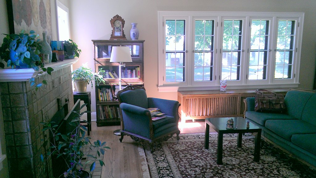


And after!


(One of my favorite finds--a cache of vintage paintings of Paris, found at Clarabel vintage in Minneapolis.  I wanted original art in here but thought the budget couldn't stretch.  Turns out, they spent a lot of time in Paris so the paintings felt special to them.  I had them framed floated on linen in a mix of vintage feeling gold frames, and love the result!)


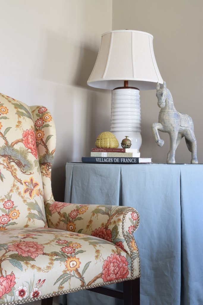
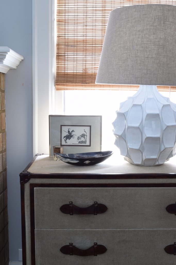
This is DEFINITELY the most traditional space I have done.  I mean:  curved, tufted, skirted sofas!  Chinese ginger jar lamps!  Chintz!  Chandelier shades!  A skirted corner table!  A mirrored buffet! Gilded tables!  Ribbon trimmed lumbars!

That said, I tried to use a light touch in the details.  The shapes are pretty simple and graceful, the drapes are a straight pleat, no frills, and lots of dolis neutrals keep it all pretty grounded.

I also had a hand in their kitchen renovation.  When they started three years ago, a major renovation was outside my skill set, and I recommended a childhood friend and fantastic kitchen designer to work with them.  While she is full service design, the clients wanted me to have a hand in the finishing touches to keep with the feeling of the other rooms we worked on.  I selected the backsplash over the stove, hardware, art, chairs, and had the custom roman shade made.


A pretty big transformation, all in all.


Friday, February 5, 2016

Do over: new photos of an old before and after

Now that we are taking such nice photos of spaces I have worked on, I CAN'T BELIEVE the horrible quality of what I have shared here in the past.

So, while it's not as exciting as a brand new "after," I do feel compelled to share images that do this space justice.  This is a tween girl's room I finished almost 2 years ago!

Before:


After:


Before:


After:


Before:


After:


Before:


After:


 Details:


I loved selecting artwork for this room on a "swim" theme for this committed swimmer.  The pieces are all about girls swimming, but they aren't "sporty" and are varied in their feeling.  One of my favorite things about the room!


(Also feel compelled to point out that I did not style the bulletin board.  I love how she has it--real, casual, and personal.  This shot was an afterthought--Dave caught me taking a photo like this for instagram, and came back to shoot it for real even though we had moved on to other spaces.  It turned out to be my favorite shot from the day!)


(Love this: the wallpaper hanger used the leftovers from papering the cove ceiling to do the inset panel on the back of the doors!)

If you want to read more of the process, go back to this post and this one!

Wednesday, February 3, 2016

Before and After: Clinton Avenue Sunroom

We're getting the hang of these shoot days around here!
Yesterday we photographed the home with the surprise bedroom makeover and the tween girl's bedroom, both of which you have seen here (but the photos were terrible!  Maybe I'll share the new ones, if that isn't too boring.)  We recently completed the sunroom/ home office, so these photos are brand new.  (though again instagram followers got some sneak peeks.)

Here's the before:

Basically a long narrow room with GORGEOUS windows and not much else happening!


And after:


We divided the room into two areas by floating the desk in the middle, behind a loveseat.  The loveseat faces a chair, which we kept in the corner (but created a better proportion--taller and narrower.)

Before:


After:


We also closed up the door on the middle of the windowless wall--it went to the master bedroom but wasn't needed.


After:


That's about where the door used to be.  More space for the fresh wallpaper!  I think adding the trellis paper and removing the window sheers so the mullions are visible were the major transformative elements in here.

Behind the desk we did a console and a pair of lamps, and brought in a prettier chair at the desk.


The pair of poufs tucks under this console when they aren't needed at the coffee table for games.


The best thing about this room?  Apart from closing up the wall and papering, we totally did it on a budget.  EVERYTHING is big box/retail and affordable, but honestly, I don't think you would ever guess!

Monday, February 1, 2016

Before and After: Queen Avenue South

I've been shooting some of last year's projects for my portfolio and a website update, and I'm excited to share these projects here!  If you follow me on instagram (you should!  @hpetersondesign), you have seen peeks of this project, both when it was installed and last week during the shoot.  But I think the full reveal before and after is pretty fun!

This is just the nicest family.  They moved from a small apartment in a bigger city to a much larger tudor home here in Minneapolis.  As is so often the case when we upsize, their home was full of hand me downs and small scale furniture.  Nothing was their taste and nothing really worked.

They wanted a moody palette and masculine vibe, with some hits of color to bring a cheerful edge.

The dining room.  Before:


And after:


before:


And after:


The client picked this deep blue with a touch of green and gray, and I love the impact.  The room is on the dark side, and going dark on the walls kept a cool, moody vibe.

 Before:


And after:


We also played with scale a lot, and I love the contrast of the tall head chairs with the small side chairs.  The oversize gold drum shade makes it work.

A detail:


Living room before:


And after:


We kept the basic layout of the couch facing the lovely fireplace, but we really hit on the symmetry with a pair of chests flanking it, topped with overscale ceramic lamps.  We also did a pair of chairs, and added function by floating a desk behind the couch.

So much of the interest in this project came from texture, like the reclaimed wood and iron coffee table and the mix of linen and leather on the chests.


Before:


After:


Silk curtains in a grey similar to the walls adds softness without contrast and highlights the beautiful window.

Before:


Before:


After:


The sunroom before:


The sunroom was probably the most neglected, with an ikea couch and a small media stand.  The single shutters on each window also chopped up the space, and because they had a tall stack, they blocked the light.

Sunroom, after:


Now, the roller shades are a much simpler treatment on the windows (and they do retract completely).  A slim sectional and pair of leather poufs are great for TV watching.  I'm a huge fan of the patchwork hemp kilim rug--custom made for us in Turkey.

This is one of my favorite projects.  (My only regret is that we did not have the dining room radiators painted the wall color--but that could always happen at a later date, if desired.)  These rooms look very different than if it was my own house, but I love every piece and I am totally thrilled with the transformation!  I suppose that's how it should be with a good design collaboration with a client.


LinkWithin

Related Posts Plugin for WordPress, Blogger...