Monday, December 18, 2017

Before and After: York Ave Condo


Oh, this was a fun one.

The clients decided to downsize from their long-term family home to a "retirement condo" well before they actually retire.  The style of the building--a sort of 60s modernist box--was VERY different from their 1920s tudor house, and they decided to change out most of the furnishings.  They did, however, bring their art and collections--the IDEAL situation, if you ask me.  This way there is tons of personality to get you started, but also the freedom to choose just the right type and scale of furnishings for the new space.

The apartment hadn't been touched, and sported wall to wall carpeting, walls of sheet mirror, a mix of louvered or slab doors and really dinky trim.  The real selling point of the 6th floor apartment was all the light from the large glass doors and windows.  The weird soffit and shelf on the long wall in the living room?  Not so great.


(Beware: cell phone pick below.  I realized as we were leaving the shoot that this was a shot I needed!)


Dark wood engineered floors, new french doors, and amped up trim made a huge difference!


To orient you a bit, here is the floor plan for the open living area:


The kitchen is off the entry, a breakfast room opens onto the dining room, the den is off the living room, and the bedrooms and bathrooms are off the doorway to the left.

The clients managed the construction, but I got to specify materials for the shell.  This made for quite a fun collaboration.  In the decor, we landed on red and teal as a predominant color scheme and brought in both deco and industrial touches, like the deco patterns in the rug and large pillows and the rivet detail on the side table.


The dining room is off the living room but sandwiched between the den and breakfast nook, and gets no natural light.


I knew that removing the sheet of mirror would lose light, so we subbed in reflective materials that were more attractive (and less dated!):  a mirrored buffet topped with a tall mirror to double the light from the crystal chandelier, glass column lamps, and wallpaper with a pattern made from glass beads.  While it is not a sper bright space, it is glimmery and sparkly and moody--just right for dinner parties.  The rug and lamps came from the dining room in their previous home.


The clients found this very cool bar with industrial details at RH, and the extra dining chairs fill out this wall nicely.  (You can see a hint of the breakfast room on the left and entry on the right).  The back of the cabinet is also mirrored.  Since it faces the french doors, it provides additional light during the day.


In the bedroom, they originally thought they would put the bed on the long wall.  


I was super surprised when they went for this layout, which allows a progression from the more public to more private uses of the room:  The desk at the entry for home office, then this seating area (the chairs face an armoire with a TV), then the bed.  


The chairs and rug were in their previous living room--moving pieces from one type of space to another can make them feel new.

Despite the strong color and mix of patterns, the bedroom feels like a serene hotel suite.


(Cell phone pic from the hallway!)

The home office area, with personal photos from their travels over the desk.


The challenge with siting the bed on the far wall came in the form of a way-off centered window.
Window treatments to the rescue!  We did a wall of ripplefold drapery, mounted behind the crown molding and in a color that matches the walls.  Closing them as far as the left edge of the window gives a sense of balance, and when all the way closed it's like a complete fourth wall.


When their grown son officially moved out, we turned the second bedroom into a guest space.  


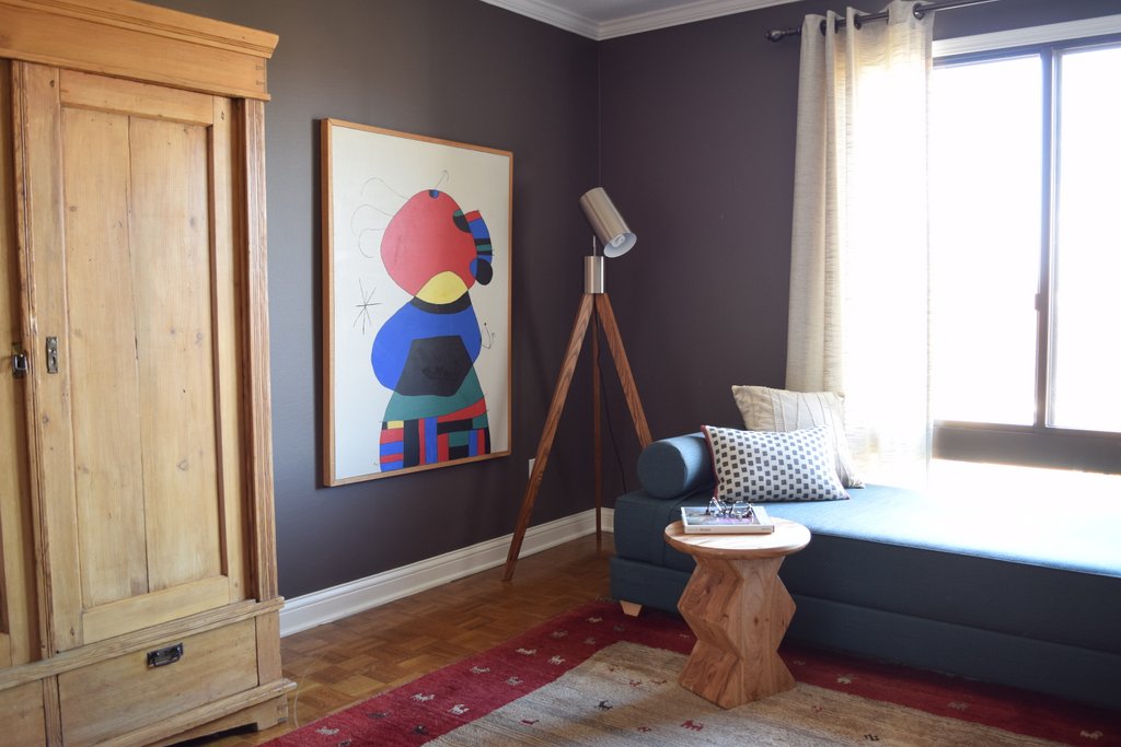
The gabbeh rug, pine cabinet, and vintage eames lounger were existing, not to mention the very cool mask collection.  We brought in a daybed (in teal--with red, it's the throughline color for the apartment) and sculptural pieces like the tripod floor lamp and african-inspired stool.


In the hall bath, my main contribution was the zebra-print wallpaper, which ALMOST didn't go (the husband wondered if it was too feminine), but the addition of the Avedon print of a man shaving tipped the balance.


I always like it when an entry announced the major elements of the whole space, and therefore do them last.


The husband was a rugs dealer when he met his wife, and I loved finding the right vintage rug for the entry--while red persians are common, finding one with turquoise (instead of navy) is more challenging.  The light fixture gives us the gold that repeats through the space, and a hint of deco, which was also a theme.  We took a cute little bench from Wisteria and recovered the plan canvas cushion in a graphic print from Schumacher.  The mirror they originally selected for the hall bath.  A single flat panel on the bifold doors and crystal knobs dress up the wall of closet.


Kitchen before--view from the entry


The kitchen was basically a cosmetic gut job, and led by the clients.  I suggested the material mix--white cabinets, soapstone countertop for drama and contrast, plus glass backsplash and crystal knobs.


Den before

Peeks into the den, after:


The furniture was all existing.  I recommended a moroccan rug and the client found this one.  With this type of layout--an open plan living area and separate private rooms--I like using a light neutral in the large space and deep, cozy colors in the private spaces.  The den and guest room are the same velvety, minky grey-brown.

Finally, I love when I get to do accessories and styling.  By the time we get to that layer, I tend to really know my client's taste and love picking things out for them!  The coffee table is a mix of things they had and items I sourced--but you would never know which is which!


Okay, I'm done.  Perhaps this should have been multiple posts?

Hope you all have a wonderful week (and not too harried) preparing for the holiday break.

Thursday, December 7, 2017

The first office

Well, if you follow me on instagram (you should!) then this is probably a pretty anti-climactic before and after, but alas.

I first leased this space in January, when the puppy made it impossible to go on working form home.  I had looked on and off at small spaces in Minneapolis, but this one was just right: near my kids' school in a smallish and well maintained office building with a "shell" brimming with potential.

The before:


And the after!


This space has good bones: natural light, wood floors, and a very pretty pressed tin ceiling, which does a lot of work adding some charm and character to what really is a white box.  I also love that the paint color is warm and creamy, not a bright stark white.  (Nice job, landlords!)

The downside was how the single window sat way off in the corner and was kind of small for the wall.  


Window treatments to the rescue!  I hung ready-made curtain panels from my best secret source (fully lined, weighted hem, and tab backs, which make for the best non-custom panels), going to the longest standard size that would fit (96").  Then I put a natural bamboo shade at the height of the curtain rod to cover the gap from the top of the window and trick the eye to thinking the glass extends up behind the shade.  I also extended the rod on the left to take up more of the wall.  (btw, the rod was $6 from ikea)


The left panel ended up being centered on the table/desk, which gave pleasing balance where there was none naturally.


That table was a craigslist find for $100.  I loved the large surface (it has leaves for flexibility) and I always think pieces that have pretty details make a huge impact in a small space.  To make it function as a desk, I picked up a $60 file cabinet with drawers from Ikea that tucks underneath.

On the other side of the room, by the door, I created some storage with bins for samples on each current project and topped it with a mirror to bounce the light form the window around the room.


The chair, a south african photographer's sitting chair also purchased off craigslist and recovered in a Kravet zebra print with espresso gimp and black-brass nailhead, was mostly just pretty, but also provided a spot for a kid to perch when dragged to the office after school.


(Fun fact: I sometimes style finished spaces for the shoot and occasionally the client doesn't want the props I bring in.  Check out this house and you will find the topiaries and that awesome mid-century statue!  So glad I got to keep it.  The little silver tray in front of the mirror is also left over form that shoot.  IT serves as a drop spot for keys.)  

I HAD to add a lamp, for function of course, and luckily found this awesome scissor one on final closeout at RH.  Again, in a small space it's great if your functional items can also serve as visual interest.  This guy is practically a sculpture.


Finally, It's no secret that I am a BIG believer in the power of an art wall.  This space needed something big to ground the whole desk area, but I didn't want to spend a ton.  I found a book of world myths for about a dollar at the retrowanderlust warehouse sale, with 18 book plates representing myths from different countries.  I bought up a load of my favorite white frames from Target and had my framer cut custom mats in this awesome army-olivey green.  (I would have just used the white mats that came with the frames, but the opening was too big for the prints.  Since I had to go custom anyway, it was an opportunity to make it LOOK custom and bring another tone to my fairly neutral space.)  Fun fact:  I hung this grid the day I moved out, for this shoot. (with contact strips--no wall damage!)   There is a larger grid of these in the new office space.

In short, some ways to dress a white box and make an office beautiful AND functional:

- Make a small window bigger through the magic of window treatments
- Use furniture from outside the "office" category to create a personal feel
- Use strategically placed frames to create architecture
- Let your lighting serve as sculpture
- Storage can be attractive

And yes, I did buy a white computer to go with the color scheme.

A little more background, since apparently I have MUCH to say about this little space:

I wrote about the coolie shade on the lamp here.  I wrote about the problem of starting with a colorful rug here.  And I shared a design plan here.  (I ended up not too far from this!)

The new space, which is larger and has the bonus of storage, is coming along.  I shared the design board here.


Thursday, November 30, 2017

Wish List

Hi there!

I actually have new content coming soon.  Despite a crazy couple of months, we snuck in a few photo shoots and I'll have some fun before and afters in the coming weeks.

In the meantime, my annual indulgence of sharing my wants with you.  For links, wish list here.  Once again it's looking similar to last year (and previous years!)

1.  A subscription to Galerie magazine.  I devour my shelter mags as they come through the door--which isn't often enough!

2. For some reason I'm really into these asymmetrical tops of the athleisure variety.

3.  Fresh foam booties for dog walking.

4.  All of our everyday plates are chipped.  These are fun possibilities!

5.  Fun every day earrings in mixed metals.

6.  A runner for my stairs.  (Or more precisely, my husband's agreement that I can put a runner on our stairs.)

7.  Funky one of a kind pottery.  One of these crooked vessels from Polly Yates would do nicely!

8.  An investment bag.  The Madewell option has been on my list for years (now available in canvas!) but a friend and client just introduced me to a better option.

9.  Statement jewelry from my friend Tia.  Love the necklaces made from lake superior stones, but the fringe earrings (in nude?  black?) or the half moon earrings would be every-day staples.

10.  A new throw for the living room.  The one I got for my bday 5 years ago is full of holes!

11. Cashmere-lined colorful leather gloves.  A wish list staple.

12.  A Lagatto Romano puppy!

13.  Design books.  This year's crop is looking great!

14. Sheepskin seat covers.  This is really for the doggy.  Not entirely sure if I am serious about this, but there are incredible custom options out there--who knew?

And....I feel compelled to say that this wish list is just that--daydreaming about what I might like but certainly in no way need.  I'm so grateful for all the wonderful thins in my life.  (But this is a fun game to play each year--and amazing how little my wants change!)

Tis the season: what are you wishing for this year?

Saturday, November 11, 2017

Gallery Walls--alternative grids

I'm such a fair-weather friend, aren't I?

Blogging silence.  And now, here I am--asking for your help!  (Well, opinions anyway.)
I've been in my new office space for over a month and finally finding time to hang art and curtains and generally upgrade the feel of the place.

Here's the design board for the general plan:


And the floor plan:


That grid of artwork that defines the conference table area is made of these bookplates from a vintage book of world mythology that I found at the Retrowanderlust warehouse sale. (As pictured in my former space, upstairs.)


I have 19 in total, and I came to the office today (Saturday) to hang it in a tall grid of five-five-five-three.

Well, nothing is quite that simple, is it?

I realized that I wasn't sure I wanted such a rigid grid as I had planned.  Why?  Because I already had a grid of 16 spaces in the expedit bookshelves on the far wall.


So instead of hanging the art, I've been playing around on the computer, deciding on a layout.  

Here's where you come in:  what's your favorite?

My original plan:
(I wanted something vertical, but am limited by the vertical orientation of the prints and the overall height. 4 rows just fit floor to ceiling, with about 2 inches between frames.)


Other straightforward grids:


But then I started to think about ways to add in more dynamic shapes or movement.

Staggered lines:


Center line with "chevrons":


The checkerboard:

The "Butterfly":

...Those are all still pretty geometric.  So what about this?


When I saved the above image, I titled it "breaking free of the grid."  I sort of love how it feels like it just got kind of shaken loose.

Okay: VOTE!

Actually, I think this exercise just told me what to do....but I still want your opinion!


LinkWithin

Related Posts Plugin for WordPress, Blogger...