Monday, August 23, 2010

How to Hang an Art Wall

My first job out of college, I worked for a downtown boutique advertising agency, assisting, and then becoming, the Art Buyer, the person who works with the creative teams and finds the right photographer or illustrator to realize their vision for a print campaign. Photographers like to work editorial assignments for the artistic freedom and the recognition, but they like to do commercial shoots for the big budgets and better fees, so Art Buyers tend to become friends with photo agents and known to agencies. This is all a lot of background to say that when I was about 23, I got a call from Magnum, an elite agency representing the world's best photo journalists, asking to meet with me about hanging a show of Burt Glinn's work at the ad agency. The agent and the photographer came in with a collection of prints from his work in Cuba in the 1960s, and as we worked out a plan to arrange the work, I began to see clearly how a wall of art prints could tell a story, and the way the narrative changed as we created different juxtapositions.

On the day they came to install, I learned a thing or two about the practical aspects of hanging a group of works, the actual nails and measuring, and I have now put the tips into practice in three houses and several arrangements, like this one in the dining room in Boulder.


When we moved into our new house, I had an immediate vision for a wall of art in the office, a more private room tucked away at the back of the house, where there was one large, blank wall. Because the scale of the wall was much larger than the ones I had worked with before, I knew it would take some careful planning. Now, there are entire books on the subject of hanging art displays, but I believe it is largely instinctive, a matter of personal preference in terms of both the aesthetics and, more importantly, what story you want to tell. Apart from feeling it out, there are a few steps that work for me. (You can do this in just a couple of hours, and it's really fun).

1. Choose your work

Most people don't have endless works of art to choose from. When making a grouping, you may just want to use everything you have--you chose each of the pieces, you can probably make them work together. If you do have more to choose from, look for commonalities that tie a group together, whether a color scheme or a subject theme. If there's no theme within the works, you probably want to limit yourself to one medium, say photographs, oil paintings, or works on paper. If all your pieces relate to the ocean (to choose a subject at random), you can much more easily mix a watercolor and a photograph. Keep in mind that the frames are a visual element, too. Some people will suggest framing everything uniformly, but I say, not necessary. You can use uniform frames as a way to make a statement- I once saw a long hallway filled with black and white photographs all framed in red, which packed a totally chic punch- but the general rule of thumb is to choose a frame that is right for the piece, not for a grouping or your room.

2. Plan your composition

This is the fun part. Take all the pieces your thinking of using, and lay them out on the floor. Move them around until it feels like they fit. I usually start with the largest piece, which I like to put somewhere near the middle for weight, and then let the smaller pieces radiate out from there.


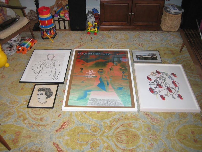
I also think about balance in terms of light and dark, both in the piece and in the frame material, and the density of the image versus the amount of negative space. With a very large wall or a lot of pieces, it's also a good idea to think about creating pockets of order within the larger composition- incorporating pairs or using symmetry in placement, as I ultimately did here in the office.


With fewer pieces, you can create a sense of energy by playing against symmetry. Our final grouping in our Brooklyn dining room had three pieces hung "too high"- not everyone's cup of tea, but in the end I found it more interesting than if it was completely balanced. (And, i will admit, a happy accident-I used existing nails from a previous grouping for one or tow of the pieces on the right, and then just went with it.)


3. Mock it up

Once you have your arrangement set, take a picture: you'll need it for reference later. (It's also helpful to do this while planning your composition- you see things in the photograph that you may not see looking directly at the arrangement.) Now trace each piece on butcher paper, cut them out, and label them. With smaller walls I have generally skipped this step, though the results vary. In our Boulder dining room, one half of the arrangement ended up all scrunched up while the other half had more breathing room between pieces. Oops! I had to swap in a bigger piece on the left to make it feel more balanced.


When you have all your paper cut, refer to your photo and begin adhering the paper to the wall, using some of that sticky tack that won't leave a mark on the wall. It's a good idea to measure the overall dimensions of the arrangement in order to place the first piece on the wall, but eyeballing it should get you pretty close, too (I'm definitely an eyeballer). This is also a good chance to make any adjustments based on what you see in your photos from the floor layout. In our office, I realized that the little square piece at the top of the grouping was too disconnected from the piece around it when centered; I moved it off center towards the other square piece, and I like the energy this ended up giving things.


4. Hang it!

Take a picture of the mock up, too, and use it to finalize things. Without the distraction of the color in the artwork, you might see some wonky things in the layout. In our office, I didn't end up liking the single piece way on the right,kind of hanging out alone, and simply nixed it from the scheme. Make any final adjustments to the mock up, and get ready to hang. Measure the distance from the wire on the back of each piece to the top of the frame, then measure down from the top of the butcher paper to mark the spot for the nail or picture hook. Measure across the paper, too, to find the center. You can pound the nail in and then remove the paper, but if you want to save the paper for another use (fingerpainting!), I recommend hammering the nail in just enough to make a mark, then removing the paper and finishing up with the nail. Repeat. And repeat, repeat, repeat!

Here's the finished product in our office:


It is, by far, my favorite to date. I love the scale and the overall statement, the fact that I was able to collect all of our poster and text-based work into one place, and the accidental color story. But most of all, I like that every single piece here is significant to at least one of us, and most are significant to both of us. The Doug Aitken poster and the small flower drawing beneath it are from Creative time events; Sur Les Paves La Ferme is from the WORKac project at PS1, where Dave worked on the project and I edited the book; the target is from a day Dave spent at a shooting range for a bachelor party and the Fred Tomaselli newspaper print was a wedding present to both of us; the watercolor on the far left was made for Dave by the little boy he was an au pair for in Denmark, and there are three pieces by Clio incorporated, too. (Don't be afraid to mix amateur work in with the "real" art). It was a lot of work to hang this particular wall, especially since I actually did it right for once, but I have to say, I love the result, and the story that it tells about our lives together.

I say, go for it in your own house, and if you do, send me pictures to post!

Sunday, August 22, 2010

Top 10 benefits to living in a new-construction house

When Dave and I were looking at homes in the Twin Cities, we were pretty open to different styles, eras, and parts of town. We made nearly 50 showings over the course of two weekends, and our list included a geodesic dome, a townhouse in a converted mansion, a modern pre-fab, and a 50s rambler that remained untouched since it appeared in Better Homes and Gardens magazine in 1955. We were looking for character, and I held the general belief that character comes with age. So imagine my surprise when we ended up with a house that was built in 2007, and nary a Spanish tile in sight. In fact, in a way what I love about this house is that is is a blank slate, a clean starting point. It has 10-foot ceilings and was designed to maximize light. It has wide-plank, light-wood floors, white and grey walls, and grey and white marble tiles in the bathrooms. I am a self-described maximalist, yet i have purchased a home with no flourishes. The kitchen cabinets do not even have hardware, and the backsplash is simply paint- that's like a dress without ruffles and an ensemble with no jewelry. Over the years, I have come to appreciate good bones, and the freedom of adding the flourishes with fabric and furnishings (and having the ability to change them without a contractor.) When we finally walked into the house after driving cross-country to the closing, I thought about the times that I have been displeased upon similar encounters: the tears shed over the tininess of my first new York apartment (a 300-sf one-bedroom walkup to be shared with a roommate); the sinking stomach upon entering the little brick rowhouse bought--at a price far too high--in the frenzy of the 2004 real estate market.

But this was more like entering my beautiful pre-war park slope co-op, or even our rental house in Boulder: it may not have been certainty at first sight, but it sure was love at second.

Another thing about me: I generally do things the "old" way, or go for form over function. While I'm not exactly a luddite, it drives Dave crazy--CRAZY--that I don't use quick keys to cut and paste. I suppose I am a creature of habit, and see nothing wrong with doing it the old way. So imagine my surprise as we get settled in and I find that the little short cuts and luxuries of modern convenience are a wonderful thing, to be embraced. Keep in mind that Dave and I lived without a dishwasher for 5 years, and when our dinner plates didn't fit in the dishwasher in the Boulder rental, we bought rimless salad plates to stand in. That I watched a TV through static for several years in Park Slope because the look of antennas just drove me to distraction.

So for the past few weeks, I've been mentally debating which shiny new "luxury" features are my favorites. There must be at least ten, which will fit into an inverted list and make a nice little outdated reference (does anyone still watch Letterman?) in keeping with the spirit of being set in my ways.

10. Automated ice-maker

Just in time for Eleri's favorite new declaration: "Cold water please! Ice. In it."

9. Central Air

Okay, we were lucky enough to have this is Brooklyn, but it was retrofitted to an old house, and the cold air came in surges so loud, watching TV involved a major volume control roller coaster. Here? Whisper soft. (This same level of quiet is less of a perk on the dishwasher, which I keep opening mid-cycle because I CAN NOT HEAR IT.)

8. Dedicated laundry room

Not the basement hallway, not a corner of the kitchen (using the dryer as a surface for both folding clothes AND cooling cookies (etc.) = unsavory), no: it's very own room. With cabinets big enough to store all the linens and towels, PLUS drawers and a utility sink.

7. Kitchen Island

The size of Malta. Is that an Island? That's what just popped into my head.

6. A walk in pantry

That you can walk into

5. Walk in Master Closet

Did I mention? You can walk in. To the closet.

4. In-floor heat in the bathroom tile

Okay, I admit, now I'm just showing off. But this is Minnesota, and I'm sure this feature will jump to number one on the list come, oh, February.

3. Basement Playground

Oh yes, it's true, there's a slide, monkey bars, climbing rope, and hanging swing chair built in to the basement. But shhhhh, don't tell the girls. We're saving it for a rainy day. Or, really, for the gym mats to arrive and save us all from the concrete floors.

2. Outlets

There are so many in each room, it's almost confusing to decide which to use for what. (Not always great with options over here.) In Brooklyn, our bedroom has ONE outlet, directly across from where the bed so obviously belonged. We had extension cords just ringing the molding along the floor (and cable wires ringing the crown molding.) Which leads me to the number one most awesome thing about buying a new-construction house:

1. Whole-house wiring

I have been known to nix entire stereo and media components because i didn't like how they looked. Imagine my delight to discover the house wired for a wall TV that was wired for a cable box or DVD player HIDDEN IN A CABINET. Do you know what this means? NO WIRES. We have forsaken our year of living TV free for a 50-inch on the wall, with no visible wires. That's like a his 'n' hers icing on this amazing cake.

Having just written all of that out, I feel like the luckiest girl alive where real estate is concerned. I also feel compelled to say that we got a GREAT deal on this house because it was built in the market surge but sold after the crash, and that we could only afford it because our fortunes went in the other direction with New York real estate. I imagine we'll only have the opportunity of going downmarket once in our lives, and I feel we did well in cashing in the chips.

if you can stand it, there may be a deluge of photos and decorating posts to come.

LinkWithin

Related Posts Plugin for WordPress, Blogger...