Showing posts with label how to. Show all posts

Thursday, January 30, 2014

Split Screen

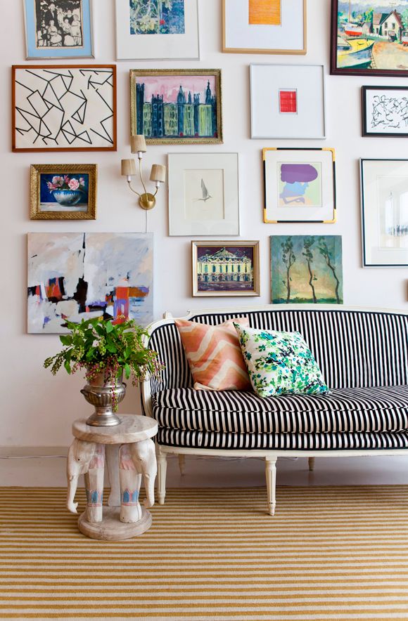
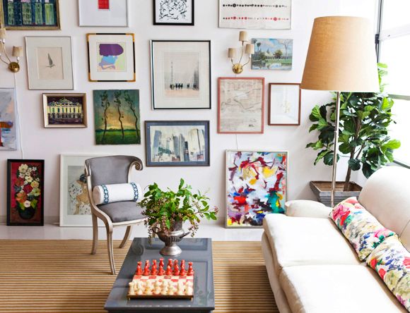
I'm always, always, always on the hunt for interesting ways to hang art.


I spotted this home tour by designer Tara Guerard on Style Me Pretty, via Bryn Alexandra.  I love the way they hung the many-panelled Japanese screen with a little--interruption--from the window.  This may have been a practical choice--if the screen was simply too big for the space between windows--but I will give them full credit for their ingenuity.  This installation gives the screen added energy, and I love the way it calls your attention right on over.

Happy weekend!

Tuesday, April 23, 2013

Triumph!


Once daylight savings set in, and before Minnesota returned to a state of perpetual winter (a winter storm warning is in effect and another 4-6 inches of snow is predicted as I write this, on APRIL TWENTY-SECOND), there was a brief moment of evening sunshine.  This was so very lovely, with one little problem: my children would not go to sleep because their in-progress window treatments let in all that light.

And so, last weekend, I finally made a pair of light-blocking draperies.  People, let me tell you, if you have ever been knocked over in shock at the price of custom draperies, you just need to make yourself a pair to understand, and you will never complain again.  Promise.  (Well, you might complain, but you will know you are not being ripped off.)


Mine are only a single fabric width, only because I bought this fabric a dozen years ago and I didn't have any more.  I used black-out liner, and that business is HEAVY.  I used this tutorial for lining, but made my own pinch pleats instead of using pleat tape.  As it turns out, pleat tape is basically useless if you want any control over the spacing of your pleats--which you do if you want them to fit the window properly.  And if you're going to all this trouble, you definitely want them to fit your window properly.


What this means is that when the draperies are closed, they overlap about 2 inches in the middle, and the return at the outside ends is the right size to actually wrap around the side of the window and touch the wall.

I chose a butterfly pleat, which seems sweet for a girls' room, don't you think?


For the drapery rod, I used this one from Allen + Roth at Lowes, which I blogged about here.  I love the look, and it was very easy to customize the length--my husband just cut off about a foot section and drilled a new hole for the finial.  My big complaint is that the rings do not maneuver smoothly on the rod, and for curtains that get opened and closed daily, this is a problem.  That said, I got the rod, rings, brackets, and finials for $50, about 1/4 to 1/8 of the price of something similar from a higher-end custom line.  So in the future, I would consider using the slightly narrower pole with these rings.

Noe I jut need to revisit the beds.  I've been thinking about tufted headboards in white, natural, or blush pink linen.  But then today I saw these.


Love the shape.  Painted white, I think.

What say you?

Thursday, February 28, 2013

How to Hang a Massive photo wall

Okay folks, here we go.

If you want ideas about how to plan and hang a basic gallery-style wall, you can check out this old post.  If you want a little inspiration, you can check out walls I have done here, here, here, here, and here.  And some other people's art walls that I have blogged about here, here, here, and here.

Today we are assuming you're in it to win it, and talking the logistics of actually planning and hanging it all up.  There are lots, so settle in!

1. Determine your outlines
First you need to decide exactly where you're going to work.  Not jut which wall, but where ON the wall.  No matter what, you want your arrangement to relate deliberately to your architecture.  In this case, we chose the long wall of the conference room, visible from the office entry.  The adjacent wall has a wall-to-wall window, and we decided to create a wide band that basically followed its path.  (I can't believe I don't have a picture of that!)  To create the outline, I measured down from the ceiling to the top of the window, then took that same measurement along the picture wall, and taped a straight (enough) line across with painter's tape.  Then I measured down from that line and taped the bottom edge in line with the bottom of the window, all the way across.


2. Create an organizing principle
Generally, a large group of photos or artworks are going to tell some kind of story.  Your job is to author the story, as it were.  In this case, my job was easy: as all the photos were of one family, we created a chronology.  Since we had a horizontal band, it naturally "reads" as a timeline from left to right.

Once you have your concept, you can decide on frames.  Do you want to unify, or divide, your subjects?  Do you want to call more attention to some subjects than others?  To unify, use matching frames.  To call special attention to one image or work, use a different color, weight, or size of frame.

3.  Divide the space
This is not strictly necessary, but it sure helps, both in keeping organized and in creating a grid to work within as you start to hang things up.  Here I used two pairs of portraits of the patriarch and matriarch, early in their marriage and later in their lives.  (The photos are being worked on, so they aren't actually in the frame yet!  They will also get oval mats to further set them apart.)  Using larger frames and a pair of sconces helps to visually break up a big expanse.  (Mirrors would work, too, or inserting circles or ovals into a field of squares and rectangles.  You get the idea.)


This also helped me in organizing the photographs in to sections.  The far left became pre-marriage, marriage, and life with their first children; the middle is the entire family into young adulthood; the right section features the next generation.

To further delineate the middle section, we chose portraits of each of the five children and printed 5x7s, just slightly larger than the rest of the photos, which are all 4x6.


4. Lay it out
Clear the floor!  It's time to lay it all out.  Even if you have followed all the steps above, there is still organizing work to do.  When I was in the early stages of planning this wall, I considered several options for arrangement.  Once I divided the space with the portraits, my left over space pretty much dictated that the rest of the pictures would fall in to columns around them.


If you are working with photography in frames and need to edit your photos down anyway, you have some flexibility to plan your frame layout first, and then choose the photos to go in to the layout.  But be prepared to change!  I had a layout that I was happy with that had a ton of horizontal frames, only to discover we had more vertical photos.

5.  Prep your frames
This is a step that takes a tremendous amount of time, and people don't realize it.  Again, this applies only when you are framing things yourself.  You need to open up the frame, center the photo, tape it in place, and clean the mat and glass, then carefully reassemble it all.  I mean, you don't have to, but it's kind of a shame to skip it when you're doing all this work.

You will want:


I have always just used paper towels and spray glass cleaner in the past, but it was slow going, and we discovered that lint-free microfiber cloths do a bang-up job on the mats, and glass wipes are far superior to spray for the glass.  You'll thank me for this.  (Or, actually, thank my aunt, who figured this out!)  As for the tape dispenser, you really just need something you can use one-handed; disposable plastic dispensers just don't work.

6. Start to hang
Here's where dividing the space really comes in handy!  where do you start with a project of this size?  Well, in this case, you start with the sconces and the large frames that create the division in the overall project. Then the portraits.
It is critical that you get this spacing right.  Mess up now, and you will be putting a LOT of extra holes in the wall.  With such a wide expanse (my wall was 25' long), tape measures get finicky and the math gets complicated.  I had to re-hang several of these portraits to get it just right.  You can see here that the spacing was off at first:


(Oh, hey, if you look at the left side of the picture, you can see the corner of that window I mentioned.)

To get hanging, you will want:


Okay, duh, you also need a hammer and nails or picture hooks.  

With each picture, use a SMALL and lightweight tape measure to measure your placement and mark the top center of the frame on the wall. Then measure down the back of the frame from the top of the molding to the bottom of the hook, then measure that distance from your mark on the wall, mark with the pencil, hang the frame.  Add small dots of blue stik or other sticky adhesive to the back of the bottom corners.  Use a hand-held level to straighten the frame, then press gently until the blue stik adhered.  This may sound like extra work, but it's worth it: If each frame is level as you go, you have a stable reference point to work from as you hang more frames around it.  One wonky frame can have a ripple effect through the whole wall.

7. Do the math
With a grid like this (or even just columns), hanging the rest of the frames is simple math.  For example, a column of 5 frames in a row will have even spacing--say 1 inch apart.  So measure the frame from hook to molding, add the 1" (or whatever specified space), then measure that distance down from the existing frame on the wall, and place your hook.  Works the same horizontally.

8. When in doubt, level it out.
Yeah, I just wrote that.  Do you see how long this post is?  A trick in keeping a column straight.  Do the math as above for the vertical spacing.  Then, to be sure the frames will line up side to side, use a level to ensure that the hooks are in a vertical line.  Does that make sense?  So, hang one hook, hang the picture.  Then do the matht o place the hook for the picture below it.  Now take the first picture back down, and before you hammer in the second hook, use a long level to line up the existing nail with the spot you have marked for the new nail.  You may need to adjust a bit to the left or right.

8.  Fill it in!


I'm not going to lie: this was a pretty big undertaking.  Once we had our general plan and had all of our supplies on site, it took a couple of hours to lay it all out, finalize the arrangement, and edit the photos.  Then it took about twelve hours to prep and hang it all.  And that was me and another person.

So there you have it.  I'll show you again when the sconces are installed and the proper portraits are in the large frames.  Maybe I'll even use a real camera, and show you the rest of the office, too.

If any of the details don't make sense, or if I need to make drawings to explain the math of it, just let me know! 


Wednesday, October 3, 2012

How to Layer a Space

I have never been a minimalist.  The current trend towards layering--in both home decor and fashion--feels right up my alley.  But it doesn't come naturally to everyone, and I loved the recent piece in Lucky magazine that shows you how to layer an outfit, starting with a great combo of classic pieces then layering on the color, texture, and pattern.  I think what I like most about this approach is that none of the looks are "better" or "worse," rather, it gives you an idea about how to successfully combine elements along the "layered" spectrum, with each look being "finished" in its own right.


(You can also see a little how-to video from the good folks at Lucky, here)  

I thought I would translate this to home, using my mater bedroom as an example.  Ready?

1) Start with great shapes and a hit of interest, otherwise known as a "star."


In my case, the great shapes include an arched chinoiserie headboard, a classic sunburst mirror, a hexagon bamboo side table, and a spindle lamp.  The hit of interest?  Why, my embroidered tapestry of course.

Even at this simple end of the spectrum, I have an eclectic mix of styles and eras, but the white bedding keeps it quiet and the textures play nice--the diamond patterned rug mimics the geometry of the throw and the lampshade.

2)  Layer in pattern and personal effects.


Start to use those clean surfaces!  A white tray on the bedside table is a simple graphic element, and a pitcher of water is a nice touch in a guest room. To the antique cedar chest I added a textured  basket and a stack of favorite design books.  Keeping within my color palette, I added the bold zebra pattern to the bed and another graphic brown and white textile in the basket.  Minimizing the overall palette keeps the layers from getting out of hand.

3) Throw on the texture and mixed finishes


On to the maximalist!  A fur throw, gilded green pillows, exuberant hydrangeas, and leather and silk jewelry boxes push it to the next level.  Again, every new element fits within the existing palette: green pillows pick up the green rug, the orange and yellow jewelry boxes echo tones in the embroidered throw, the brown fur throw and leather handles push brown as my neutral, even the flowers' pink and green is simply a repeat from elsewhere in the space.

For variations on this theme, take look two and  add curtains, layer on a second rug (sheepskin or hide, something organic in shape), and add in sconce lighting over the bed in a metal finish.

And here is a side by side look.


That's not so hard, right?

What about you: do you like to keep it simple, pile it on, or do you live somewhere in between?

Oh, and I posted a little late yesterday.  In case you missed it, check out the board for a masculine living room.

Wednesday, September 19, 2012

When to use an Etagere or a Whatnot

I recently found myself recommending a pair of etageres to flank a fireplace.  The original intention was built ins, but the estimates were starting to come in and, well, it wasn't pretty.  My client didn't want to put his entire budget towards one project in the room, so I suggested doing the furniture, window treatments, etc, and bringing in a pair of etageres as a temporary solution on the fireplace wall.

To which he said "ay-tah-what?"

In modern terminology, an etagere is essentially a shelving unit, open on all sides, with decorative flourishes.  Like so:

Source: Meg Braff in housebeautiful.com via Heather on Pinterest


Out of curiosity, I looked it up in Decorating Defined and discovered that originally, an etagere was specifically: a pyramid of open shelves intended for the display of objects, better known in humbler circumstances, thanks to the Victorian era, as a whatnot.

Like so:

The venerable Albert Hadley via mfmb.com

Today it is a bit more generalized, but the idea is the same.  So when and how does one use such a thing?

Two general rules:

1) You want an etagere where presence is required without bulk


Or when a sculptural quality is called for.


2)  Etageres are still really for the display of objects, not books.

Source: davidmitchelluncensored.com


While objects make the most of the often elegant materials and more delicate profile of etageres, books can overwhelm them:


Of course, if book storage is what you really need, you can make it work. Just arrange the books in smaller, artful piles, and lay them both horizontally and vertically.


While they certainly work singly, I tend to like etageres in pairs. (Though I have a distinct leaning towards pairs, be they lamps, chairs, or artworks.) The can bring an added dose of balance to any room, and flank a doorway, media center, or, yes, a fireplace.

Source: Meg Braff in housebeautiful.com via Heather on Pinterest


Source: google.com via Heather on Pinterest


I'm also a fan of the "mismatched pair," and love Nate Berkus's clever use of an etagere to match the verticality of the artwork in his Chicago living room.


And then of course there is this set of three...

Source: bhg.com via Heather on Pinterest

Naturally, I've been rounding up some affordable options. There are truly gorgeous choices out there, and, frankly, I think an etagere should be stately and beautiful. For this project, however, the whole idea is to do something inexpensive, and there are certainly some worth looking at under the $500 mark.

coming soon....

Thursday, September 13, 2012

A Gallery Wall "Do."

I have hung a lot of art for a lot of people, and I have noticed a common issue:

People tend to hang their art too high.

Lately I've noticed a lot of gallery walls that form a long horizontal block that just floats halfway up a wall.  The arrangement itself is great, the pieces are fun, but it just looks wrong.  Here's the deal: you need you art to feel connected to something else in the room.  Now, I'm not going to show you examples of art walls that are "wrong," because a) who am I to say what's right out and b) at the end of the day it is a matter of preference.  But if you're thinking about creating your first gallery installation, allow me to make my case.

Here are some great examples of gallery walls that reach down low.

Just the right amount of space between the art and the furniture. Bonus points for the incorporated sconces in these three:


via littlegreennotebook.com


Love the asymmetry in this next one. The lowest piece on the left relates the whole gruping to the chaise, leaving negative space on the right, adding tons of energy. But without that low piece?  The whole thing would just float away.


Excellently placed negative space in this one--again, it works because the wall is grounded by the lower pieces, which connect to the desk.


It doesn't take much: see how just those two little hearts hold this whole arrangement in place, even with that high slanted ceiling? (I've been thinking of something along these lines for a girls' room.)


To be honest, I'm not sure you can go TOO low.


Right?

In fact, incorporate propped art as your lowest level, whether right on the floor, on a ledge, or on a piece of furniture, like these:


via littlegreennotebook.com


here


Of course, there are exceptions to every rule.


But the principle is still the same here: it's just that the works relate to the ceiling, not the (more typical)
furniture.  Though the low pieces here are much closer to the couch than a lot of work I see!

Tomorrow I'll show you the gallery wall in my master bedroom--expanded and, I think, better than ever.

LinkWithin

Related Posts Plugin for WordPress, Blogger...