Tuesday, May 31, 2011

The Ottoman

Oh, my cocktail table turned ottoman, you have been an unnecessary saga.  And this has become an unnecessarially long post.

To be honest, I sort of avoided sharing the process as I went, because for a while there I wasn't sue it was all going to work out.  And I don't want to bore you with the details, but I did learn an important lesson or two, so let's get to those.

Here's what I was starting with.


A sort of fruitwood octagon cocktail table with a glass top, which I snagged on a whim for $29 from a consignment shop.  When my husband suggested that the glass might not hold up to a 2 and 4 year old, I decided to turn it into an ottoman, like one I saw on the cover of House Beautiful.

I would fill in the hole with plywood:


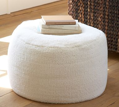
Add a piece of custom-cut 2 inch standard density foam to the top:


And upholster it.

And then the design process began in my brain.  The first big question:  is it all about the top, meaning, do I focus on fabulous fabric with an overscale pattern and even consider skirting it to play up the shape?  Or do I make it all about the base?  I'll share some of the inspiration images that went into this process later this week (a little backwards, I know--this is what happens when bloggers don't blog about projects as they go), but in the end I decided to play up the base.

For my living room, a black base was really the only way to go.  Now, here's where things start to go wrong. I knew that what I really wanted was an ebony stain, but that meant a crazy amount of stripping and sanding, and we're not talking about flat surfaces here.  My husband had a bad run in stripping 80 years of paint off the front door at our Brooklyn house, and did a good job of talking me out of this.  If I wasn't going to strip and stain, then I wanted lacquer.  So I read up on a couple of different lacquering processes, but, no surprise, they all take about 18 steps (with lots of sanding and LOTS of different materials that I did not have on hand), so I decided to paint it.

So this is kind of wussing out, but still seems reasonable enough, right? When we moved into this house, I decided to do things properly, which has resulted in me learning to pinch pleat draperies, painting 4 coats of paint to get an even finish, figuring out how to make pleated lampshades, and more.  In this case, "proper" painting meant oil-based paint.  I went to a couple of stores before I could even find it, and then discovered that a quart is $25.00.  I didn't discover this until after I had a quart mixed, however, and I like to think that the price tag (especially when you throw in primer and natural bristle brushes), would have stopped me in my tracks.  Then, instead of just buying the black off the shelf and adding a few drops of red for warmth, which is what I should have done, I got all fancy and chose a custom color at the suggestion of the (adorable) paint guy.

Black Bean Soup.  That's the color we decided on.  I wanted a very slight purple undertone to work with the wood stain on my side tables.  I cleaned, dried, and primed the whole piece, then opened up the can of paint, which sure did look EXACTLY like black bean soup.  I went ahead and started painting, despite my misgivings about the color, telling myself that the light was bad in the basement and it would turn out all right.

After letting it dry overnight, I brought it up to the living room, just as my husband was coming in.  It was a nice, sunny, day, and what do you think my husband said to me?

"Why did you paint the coffee table purple?"

Uh huh.  Good question.

So I took the 20 minute drive back to the paint store and begged them to make my $25 worth of purple-black paint black-black.  And they tried.  But we ended up somewhere in the region of mud brown.  And this little side project was starting to send me close to the intersection of batshit and crazy.

This post is way too long.  I know it.  Especially for a Monday.  But it would really be dragging it out to break this up into stages, especially after the fact.  I'm almost done.

At this point, I took it up with my husband, who would prefer not to discuss decorating but can see when an intervention is needed.  (Okay, none of this is such a big deal except that I was feeling the investment of time--all the thinking, researching and planning--and money for that damn expensive paint.)  Here's where the first important lesson comes in.  He said to me:  If you received this piece today, in this condition, what would you do with it?

See what he did there?  He removed all of my investment, which was clouding my judgement.

I went to Home Depot to get a can of black spraypaint.  (Thank goodness the kid working the register did not ask for my ID, as the touch screen suggested he should do, because it was in the pocket of the sweatshirt I had worn to the gym, which was at home.)  I bought the cheapest kind, in black semi-gloss.  At $2.99, I considered buying 2 cans, just in case, but then remembered the $25 oil paint.

And, of course, one can was not enough.  And my three local hardware stores did not carry the brand I bought, and there was no way that I was risking two different blacks or two different finishes at this point.  So I picked up my kids from school, dragged them to Home Depot, and bought another can.  This time I DID get IDed, and thank goodness I had retrieved my license back to my wallet where it belongs.

I finished the final coat in one half of the yard while the kids played in the other half, making me a bad parent on top of everything else.


And let it hang out in the living room for a while, to get a feel for the thing.  You can see that the paint is a little patchy in spots, and if this was the final form of the piece it would not do.  But put a top on it, and many sins are invisible.

I realize that I should have just spraypainted it in the first place.  Herein lies the next important lesson for the two of you who are still with me.  When you are doing DIY projects, it is important to consider the original piece when you decide what to put into it.  In this case, we're talking about a solid piece of furniture, but not exactly valuable.  I realize now that while it will end up pretty nice, it never had the potential to be a showstopper, so why treat it like one?  You can certainly elevate a piece with the right materials, but in some cases the easiest and cheapest solution might be the best.

Stay tuned for the upholstery stage.


Friday, May 27, 2011

Flashback Friday: The First Ottoman we Built

While it often feels like I remember every piece of furniture and every home accessory I have purchased (and where it came from and how much I paid and how much I saved from the original price), I sometimes have glaring omissions in my memory.  Like the other day, when I was going on and on about how I would never choose a red couch, only to realize I have a red couch.  I bought it off craiglist for $40 and always sort of intended to get a new slipcover for it (its the super basic couch from Ikea.)  I know it seems crazy to forget about a major piece of furniture currently in your house, but it's in the basement and I rarely use it and really, I wanted something different.  Denial much?

While I was in the process of planning the cocktail table turned ottoman project, I was talking to my husband about it and he answered one of my questions by saying "I don't know--I've never built an ottoman."  Again, I was all, "I know honey, but you can still help me figure this out," and he was all, "I was being sarcastic--remember the orange ottoman?"

The orange ottoman!  How could I forget!  After our older daughter was born, we wanted to do away with pointy edged things, including the coffee table.  When we couldn't find an ottoman the size we desired, we built one.  The thing was over 4' square: how could I forget??


[photo credit: me.  model: Clio and the "make-out monkey".  You're welcome!]

So, how to do it.  Dave built a big box with a flat bottom and an open top.  I used upholstery webbing to make a forgiving top, stapling it to the outside of the box.  We added foam, a layer of batting, and a set of legs we bought online in unfinished pine and stained.  The fabric came from a remnant bin and the nailhead is french trim, which comes on a big roll and you only actually hammer in every 8th nail or so.  I can't remember why I didn't seam the corners, but instead I used a sort of tuck -- it was a casual look that worked but that I probably wouldn't repeat.  The hardest thing about this project was finishing the edges--for some reason, the legs had to be screwed in before the piece was upholstered, so rather than stapling the fabric underneath, I had to staple it right to the edge, with the fabric turned under, and then cover it with nailhead.

All of which is to say, ottoman-building is completely doable, though I think I prefer my new method of upholstering a coffee table.  Much simpler when you don't have to build the frame!

Have you built any custom projects for your home?  Did you forget all about them like I did?

MY in-laws are on their way to town for the holiday weekend.  I'll be back on Tuesday--enjoy it!

Heather

Thursday, May 26, 2011

Little Miss Muffet gets an upgrade

Pottery Barn now makes a tuffet.

Swear to god.  A TUFFET.  And it's faux-shearling.


To be honest, I think its kind of cute, though it also kind of looks like it belongs in a bathroom--doesn't it kind of look like terry cloth?

What, you ask, is the difference between a tuffet, a poof, and an ottoman?  Well, I will tell you.

An ottoman is a cushioned footstoll or a low cushioned seat without back or arms.  A pouf is a broad, backless, usually round cushioned seat.  And a tuffet is a low stool, seat, or mound.  Same, same.

And because I was an english major and love me some OED, let me take this one step further.  Tuffet is from the old french touffe for little tuft.  According to the dictionary, tuffet is "obsolete, except for in the rhyme Little Miss Muffet."  Way to go Pottery Barn, bringing the tuffet back!  Is this just a ploy for originality?  Or can someone see some other reason not to call this thing a pouf?  What's next, do you think: the hassock?

Clearly, I still have poofs on the brain.  It is still someone related to my ottoman project, which is coming along and which, I swear, I will share soon.

Wednesday, May 25, 2011

Multiple gallery walls in one space: issues to consider

Are you ready for more art wall proselytizing?  Well, here we go.

I recently framed and installed 30-some pictures from a local photo contest in the Mendota Heights City Hall.  The municipal building had lots of bare walls, and most of the art that was up had the sort of muted color and generic subject matter that I associate with this hotel art fire sales.  Remember those?

Here's the before:


To bring some life to the space aesthetically as well as a sense of community, they brought me in to make the most of what they had: photographs of their city taken by its citizens.

We decided to go very simple on the frames, and to have all the frames match.  This brought unity to the project and simplifed my job by eliminating one of the major elements to consider (balancing the tones and types of frames in a mixed arrangement),  but the project still had plenty of useful lessons.

1. Groupings should have the same overall height


Just as in furniture arranging, you want to bring the eye around the room in an even, measured way.  Groupings that live at very different heights will create a visual rollercoaster.  In this space, despite a mix of horizontal and vertical arrangements, I made sure that the groupings maxed out at the same height.  This can apply to single pieces in a room or throughout a house where sitelines run from room to room.  When you create a standard height this way, hanging something very low or very hi can be quite fun and unexpected.

2.  Repetition creates rhythm


In a big space like this, there are two viewing experiences: first, the graphic impression of the frames, then the more intimate viewing of the content.  To create a sense of rhythm in the frames,  you can riff on one arrangement in another.  In this case, the arrangement by the front door has three horizontal frames flanked by two verticals, and this relationship is inverted in the grouping over the chairs, which has two vertical frames flanked by three horizontal.

3.  Contrast restful and energized arrangements


The photo contest had three winners in each of three categories.  To delineate the honor, we blew up the winning photos to 8x10.  Originally, I planned to mix the larger and smaller frames, but once I got them all onsite I realized that I had too many to fit on the three walls we had planned to use, so we made a "hall of winners," top.  The arrangement, determined by the orientation of the nine photos I had to work with, feels quite energized.  To calm the eye, I did a straight grid of 6 horizontal images on the adjacent wall.

4. Subject matter/ placement
The content of the photographs in this case fell mostly to two categories: scenic images of nature, and pictures of people and animals.  The scenic pictures could be enjoyed from a distance, but it's human nature to want to see pictures of people and animals that we might know much closer up.  In this case, I grouped the scenic pictures over the chairs, where there is no access to get up close, and placed the images of people and pets over the bench by the conference room, which invites people to take a closer look.

Lots to think about, but when you know the principles to follow, it all gets a little easier.
Also goes to show that you can create a dramatic gallery wall (or group of them) without spending a ton of cash.  They already had the photos, and we used the ReStyle frames from Target, which are about as inexpensive as you can get.  When hung en masse, they have a custom look, don't you think?

If you would like help creating a custom gallery wall in your home or office, email me at heather@heatherpetersondesign.com to inquire about rates.

Tuesday, May 24, 2011

If Leopard is a neutral, what is Zebra?

I love that so many of you were with me that leopard is, indeed, a neutral.  (My favorite response?  From A.J. Barnes, who says he has a list of rules, written down, and the first is that Leopard is a neutral.  I would love to see this list posted on his blog!)

I was feeling slightly less convinced about zebra--I mean, by definition its pretty bold: the contrast! the scale!  But I was just paging through the new issue of House Beautiful when I saw Carson Kressley featured in their bedroom column.  In regards to the pillows on his bed, he has this to say:  "Not that you asked, but I consider zebra a neutral."

What do you think?

From Domino:


From Lonny:


From House Beautiful:


And one awesome sofa from my all-time fave interiors book, New York Living:


Are you with Carson?  While not exactly neutral, does zebra function as a neutral?

Also, an informal poll: leopard or zebra?  Spoiler alert: I'm leopard, for sure.

Monday, May 23, 2011

Too much design?

Do you ever feel like the whole accessible design movement has gone too far?  Like every single product now gets the designy zhush before its sent to production?  Like everything is so cute?  So trendy?  Like there are too many choices?  Observe.

Recently, my office was looking like this.


And like this.


Clearly, I needed some magazine bins.

So I went looking for magazine holders.  Do you know how many choices there are at The Container Store?  About 20.  Okay, maybe not that many, but there are TWO WHOLE AISLES.  There were lots of cute ones, but at something like $10 each, they started to feel like an investment, which started to bring the pressure that they had to work now, and later, and in the elevator.  (Extra points to those who know that reference--leave your guesses in the comments).  And all of a sudden the walls were closing in on me.

I happened to be at Target later in the day, and found that the selection was less overwhelming in quantity, but everything was so designy.  So trendy.  So cutesy right NOW.  And it made me itch for something classic.  Something that wouldn't date itself in a week.  I kind of like these clear acrylic ones that I picked up oh, a decade ago to store my collection of Real Simple magazines from my days as a photo editor there, but they are no longer available.


Mostly what I like about them is the absence of style signifiers.  Oh, of course lucite is its own look, but a clear acrylic box goes with anything and always will because it practically disappears.

Here's the thing.  If you're buying for style over function, and the style isn't going to last, I believe you should spend as little money as possible.  In this case, that meant Ikea, though even at Ikea there were too many choices.  I made it simple and bought the cheapest ones:  the ones made out of finished cardboard, which you assemble yourself,  in a green very close to the green already happening in bins in my office bookshelves, and in the living room right through the doorway.  The look is actually classic, the color works for now, and if I change the color scheme of everything, I won't mind replacing them.  And having the clutter off the floor?  So priceless.


Do you want to know the product that really sent me over the edge?  The one that made me wonder if we have gone off our collective design rockers?  Here you go.


Crate and Barrel Set of 12 Sparrow Clips, $7.95.  I think I saw it in Cooking Light, and I tore out the page because it made me mad.  I love birds.  I love bright colors.  So cute!  But....really?  Do you really need your bag clips in the pantry to be shaped like special little characters?  I don't know.  It just seems so ....indulgent? Maybe its just that I can't imagine a time when my list of bigger ticket needs for the house will dwindle to nothing, and I will have nowhere to spend my dollars but on cute little clips like these.  Or on my kids college fund.  You know, whichever.

What do you think:  Has design gone too far?  Or do you love having so many options for pencil cups and toilet brushes?  I'm VERY curious!

Sunday, May 22, 2011

The One That Got Away

Did you ever do that thing where you fell in love with something vintage--irreplaceable, non-returnable--and walked away to think it over, telling yourself that if it was gone when you returned, it was simply not meant to be?

My mom discovered an awesome sale on Friday.  It was in a little house not too far from mine, and the basement was filled with really cool stuff--everything felt like it had a story.  After making our way through bins of artwork, shelves filled with mid-century tabletop, and some cool old furs, I heard the siren call from across the room.

A lamp.

I made a beeline.

"MOM," I said. "look at THIS!"


I pulled it from its place at the back of the class, turned it around and around, hefted its heft.

But then I hemmed and hawed.  I'm out of money for house projects right about now.  And where would it go, anyway?  In the office, clearly.  The lamp that is already in the office could go in the basement den (and I could sell the pair of lamps already down there).  While that one is awesome, this one is MORE awesome.  Vintage awesome.  One of a kind awesome.

Could I justify buying something for a spot where I already had something I loved? Bringing in something new that would require other changes (the scale of this lamp would require me to figure out the too-small desk situation in the office, pronto.)  And if I WAS going for the double desk, would I want a PAIR of lamps?  Like how about these beauties?


In the end, I walked away.  But all night long, I kept thinking about it.  Calculating how to broach the subject with my husband, whose head might literally explode if I mention one single additional house purchase or project.  (I have him roped in to painting the girls room this week.  I thought it best not to push my luck.)  I resolved to wake early and RUN back to the house and snatch it up.

And then.

I woke up in the middle of the night, sick.  Not to share too much, but there was some toilet hugging involved.  Dave got up with the girls, and when I finally emerged, shaken and weak, at 10:30 am, guess what I was thinking about?  Well, I'll tell you.  I was thinking about how I was going to drag myself out of bed and into the car and how I was going to heft the heft of that awesome teal ceramic hexagonal globe lamp with a hexagonal wooden base all the way back home.

It didn't happen.  I made it as far as the couch, dug up a phone, and called my parents to come watch the girls while I slept in a daze of 24 hour flu, while the sale ended.  This may be the very definition of not meant to be.  But rather than feeling like I have learned some lesson, or that I should just let go because, clearly, it was not mean to be, I am kicking myself for not just buying it in the first place.

And you know what?  After caring for my kids all day (Dave was at work), and taking them out to dinner, and bringing me home some chicken soup, my dad asked me about the lamp, told me to go knock on that lady's door, and even gave me the cash to cover it.

Friday, May 20, 2011

Flashback Friday: Swatch Madness


Okay, I had to go off script again for this week's flashback.  Digging around in my picture files, I found these images from a couple of years ago, and I found them so hilarious, I just had to share.

For the record, these pictures were taken LONG before I had a blog that talks about decorating and such, so why, why, WHY did I need a photo of a bunch of swatches?  It's one thing to use photography as a tool when, say, finalizing layouts for a gallery wall--a photo can help you see things you don't necessarily see in person.  But swatches?  Swatches are so much about color and texture, and a photo (especially with a little point and shoot digital, especially taken by a crappy photographer such as moi) can not communicate these things.

Perhaps I was sending it off to get a second opinion from a far off collaborater (like my mom).  We were thinking about a new couch, and looking at coral upholstery to go on a piece in a room with that rug.  The chartreuse was a possibility for throw pillows or curtains.

We never did go with any of it, and instead, several years later, invested in a brown sofa instead.  I did end up doing chartreuse curtains with that rug, though, in this house, which is two houses later, and I love it.

Sometimes it takes a little time to process, right?

I would love to think that this is normal, though blogging about my decorating process seems to be exposing some of my, um, quirks.  Do tell: do you photograph your swatches?  Do you ruminate for years at a time?

Please say you do!

Thursday, May 19, 2011

Lessons Designers can learn from Comedians

An old friend of mine, who happens to be a (former) stand up comedian, sent me a link to this piece by Michael Bierut which draws out seven lessons for graphic designers from the 1-hour HBO special, Talking Funny.

I love it when people find inspiration for one field in another, and Bierut does a great job of finding common ground between these seemingly dissimilar skills.  This is a little bit of a different post for me today--especially since I'm going to bite my tongue and send you to the article rather than sharing my interpretation or even my two cents worth.

Read it, reflect, let me know what you think.

Thanks Mark!

Wednesday, May 18, 2011

Seasonal decorating

I was thinking yesterday that my favorite living room looks a bit like a winter room with those dark paneled walls and brown chesterfield, and it got me thinking about seasonal decorating.  No, I'm not talking about dressing up the house for holidays (which I don't do anyway), but the way certain rooms can evoke a season: beachy white and airy linen feels summery, while wool paired with velvet and nailhead feels a bit wintery.

I'm working on a guest room and we're taking the inspiration from this painting (which will be reframed).


The lavender, coral, orange and green feels like spring to me, , and I'm glad we're working on it in the spring, when all the store collections will be in synch with a spring scheme.

I'm thinking a lavender block-printed quilt:


Layered over a soft, ruffle-edged duvet:

And maybe some ikat on an accent pillow


Probably some mirrored side tables:


Feminine, a little bit glamorous, and fresh.

This is not a summery house, though.  While it is a california contemporary in architecture, with lots of light wood, the decorating style is updated traditional, with some very elegant pieces--think Barbara Barry--chinoiserie antiques, lots of contemporary art, and some more ornate pieces, like a giant rococo mirror in the entry.

So while I am tempted to do the headboard in tufted lavender linen, with a breezy, open weave white curtain, we may take the sense of spring down a notch, and do grey velvet with nailhead on the headboard, and a shimmery lavendar silk for the drapes.

So You Think You Can Sew a Curtain

In this era of DIY, more and more people are going for the "Effect" of window treatments (And other decorating staples) over the real thing, and while I applaud the efforts and ingenuity of the people getting it done with hem tape or (as I have, admittedly, done long ago), staples, pins, or glue, I think something gets lost when craftsmanship dwindles.

Its like this: my new hairdresser is okay, but my old one was awesome.  The difference?  The new one can block in the shape and generally tame the curls, but the old one delivered the most detailed cut you can imagine, and it made the difference between passable and Where Did You Get Your Haircut?

Our local Half Price Books has an amazing design section (which I am banned from until further notice--every time I go in I spend at least $50.  $50 worth of AMAZING DEALS, but $50 nonetheless).  Case in point: the other day I picked up The Curtain Design Directory, 4th edition, for $4.98, and I have been poring over the vast collection of styles ever since.  (Just to give you a sense of scale, the book is 328 pages, with, in most cases, one style of curtain per page).

Perhaps the greatest thing about this book is the illustrations: simple line drawings that allow you to see the curtain (and accoutrements) rather than getting hung up on the fabric, color choice, etc.  While many of the styles here are quite formal and nowadays many people want a simpler,more pared down look in their homes, it has me wondering where I can put another pelmet box, valance, or tassle trim.


Don't you just love a book that is full of possibilities?

For those of you without a sewing machine or the inclination to teach yourself pinch pleats (it's not so bad, I swear!), there are lots of options.  Last time I was at Joanns, I picked up a little flyer about their new design services--you pick all the materials and styles, they sew them for you.  Same deal at Calico Corners, though of course their fabrics start high and then skyrocket.  Locally, my sister-in-law runs Union Place in Excelsior, where they have been making gorgeous window treatments and upholstery for 3 decades or so.  (Yup, sometimes I go in for a little nepotism).

Of course, you can also ask your clothes tailor if they do work for the home: if they don't, they might have a recommendation, and often the mom and pop shop offers better value than the big chains.

LinkWithin

Related Posts Plugin for WordPress, Blogger...