Showing posts with label process. Show all posts

Monday, March 6, 2017

Obsessed: Coolie Shades

This was supposed to be one of those quick and easy posts where I share my latest obsession: those deeply cone-shaped lamp shades that are, apparently, called coolie shades.

Me being me, this somehow turned in to deep research on coolie hats, both the originals and their interpretation in fashion (particularly popular in the 1940s); the term coolie and whether or not it is considered offensive; and the use of said coolie shades by designers (they appear to be somewhat of a signature for John Saldino.)

This all came from the fact that I want one in my new office, and that the latest issue of Veranda seems extra populated by them.

But really, what (if any) of that are you guys interested in?

So here you go, a round up of some lamps currently available, with coolie shades at various degrees sloped.  I love how architectural and sophisticated they feel, how they balance out fat lamps and give stature to skinny ones (perhaps this was also the appeal of the hats???)


For sources, (fair warning: none of these are exactly budget options), go to the board here and click through.

Here are some as seen in Saladino's work.


Here are some coolie hats in art and fashion:


And with that, let's call it a day!


Sunday, February 26, 2017

Tomboy to teen dream: how to decorate so your kid won't outgrow her room

I recently did some boards for a seven year old self-proclaimed tomboy.  She had been sharing her room with various siblings most of her life, and she was getting a room of her own for the first time.

When I first saw the space set up for her, she had star wars sheets and posters.  Her furniture was odds and ends from other rooms.  She wanted green walls.

Mom wanted to give her new pieces (her sister just got this makeover.)  Right now she wants "boy stuff" but in a few short years, she will be a tween.  (It's crazy how time flies!)  She may hold on to her tomboy ways for ever, but she may find herself drawn to girlier things.  So, how do you decorate for her wants now and plan for the future without replacing everything?

A neutral base.

Here's the room we decided on:


The bigger, more expensive items (rug, furniture, window treatments) are all in the same gender-neutral palette: white, navy, and a sort of greige on the headboard.  The bedding, lamp, desk chair, and paint color satisfy her taste today. (She can also keep the star wars sheets in this design!)

Later, those same items can be changed out to a more feminine (and more grown up) vibe.


I went pink, because it is (for better or for worse) classic "girl," and because I happen to love pink and navy together.  But lavender, yellow, coral, aqua, or chartreuse could all be employed to similar effect.

Paint and bedding have a lifespan anyway, and could use refreshers after 4 or 5 years (and I reused the quilt, which gets less skin contact and gets washed less frequently.)  I added a mirror over the dresser and a pinboard, which reflect changes in how a girl might use her room.  The upholstered, swivel, rolling desk chair is more comfortable for an older adolescent who may have more homework.  So when it comes down to it, these are changes that would happen for practical reasons anyway.  I guess the big luxury is changing out the lamp!

There are tons of great options out there these days that can work for both genders.  Big retailers like PBTeen and Land of Nod unfortunately separate everything into "girls rooms" and "boys rooms," but don't be afraid to cross over!  You may find the perfect rug or quilt (etc) for your girl in the "boy" category.


Wednesday, February 8, 2017

The office part two: Kill your darlings; skin the cat

I was a creative writing major in college.  I'll always remember the admonition of our Senior Seminar professor to "kill your darlings."  This means you have to cut those favorite sentences (or paragraphs, or characters!) that you love and have become attached to, but aren't working or furthering your aims with the piece.

I was always terrible at that.

Last week I showed you a design board for what the office could be, but isn't.  Why not?  Because of this rug.


This rug is my darling.

I got it at the tender age of 24, at the ABC Carpet and Home outlet in the Bronx.  It was my first major house purchase (and remains one of the more expensive things I've ever bought.)  It's big, and Turkish, and I think it represented "being a grown up."  Standing in the vast warehouse and watching the men flip back rug after rug in stacks was intoxicating.  The palette includes colors that are still favorites (aqua! chartreuse! terra cotta!  Look no further than my portfolio to know I love these colors still.) And honestly, it makes a lot of sense, stylistically, in the space I lease, which has very pretty white tin ceilings.


The other reason I based by scheme on this rug?  I already had it, and rugs are expensive.  I liked the idea that using this rug would stretch my budget.  Then I started looking for a table to use as a desk, and realized the rug was kind of bossy, and the table I needed was pretty specific.  A french farmhouse table.  Not too rustic, not too chunky, light of wood tone and elegant of line.  You may be shocked to know that craigslist did not offer up such a table to me, and certainly not at a bargain price.  All of a sudden, I was looking at spending close to $1000 on the right table to work with the rug I already had.  I also started considering splurges on other items that would complement the rug, but which I might not otherwise buy.  I bought chairs to make the rug "more modern" instead of using the Ghost chairs I already own.

When I made the neutral-scheme design board that I shared last week, and realized that the rug didn't belong in my real vision, I had to kill my darling.

And then, in a glorious mixture of metaphors, I remembered that there's more than one way to skin a cat:

Neutral rugs like the ones I was envisioning are fairly cheap.

Craigslist has tables aplenty that work in this scheme (tomorrow I'm picking up a table I previously looked at and passed on because it didn't go with the rug.  It's only $100.)

I'll return the guest chairs I bought, use my Ghost chairs for guests, and get myself an actual task chair instead.

I'll splurge on fabric to reupholster my cool vintage chair, but now I can choose any fabric I want (and I think I might want zebra.)

I'll still splurge on a lamp, but instead of keeping the one I used to want, I'll get one that represents my style, now.

And perhaps the best part?  In this scheme, I can hang any art I want.

I'll be a little sad to roll up the rug and send it back to the basement, though.

Wednesday, February 1, 2017

The Office

Just before the holidays, I signed a lease on a small office space.

I had been thinking about this step for a long time.

First, buying a piano displaced me from my home office.  (Both my girls play and the keyboard wasn't doing it anymore.)  I moved to the basement, which is unfinished but has good sized windows.  I thought I would hate it but with a rug and a little decor, it wasn't so bad.

But then, I started thinking about getting an intern.  I conducted some meetings with my contractor at my kitchen table.  I wondered if I wanted a street level space (walk ins!) or a shared loft (photoshoots!).  I fell in love with the Ivy Arts building.  I continued to work from the basement, in straight view of monkey bars and a man cave.  (True story.)

And then, we got a puppy.

It became both more necessary and more impossible to work from home.  One day in December, I went on craigslist and found a small but charming space with tin ceilings, hardwood floors, and reasonable rent, just a few minutes (and directly on route) to my kids' school.  I met the landlord, also a mother of two girls, also teetering on middle age, also in a newish career.  I hemmed and hawed, but much less than usual.  I signed the lease.  We went to Texas for Christmas.

I forgot what trouble it is to move, even a small move, and if I am being honest (I am being honest), a month after I took possession I am still moving in.

Right now it is lovely, despite the card table I am using as a temporary desk.  Lovely, realistically, because all of my mess and piles and tangles of fabric swatches are still in my home office space.


(as shared on instagram)

I spent more time than usual there today, and as I was leaving, I had this flash of what it should be.


When people say things in magazines like "I work with color all day, I want my office to be devoid of it!"  Or, "I need to come home to white so I can breathe!" I may, in the past, have scoffed.  But guess what?  Today I felt how calm and pretty the office was, and how utterly destroyed that sensibility will be the minute I bring in the half dozen crazy colored rug samples that are currently in the back of my car.

For once in my life, I truly get the appeal of neutrals.

Maybe tomorrow (or soon) I'll talk about what it actually IS and why.  And what we (or at least I) can learn from it.


Thursday, May 26, 2016

The road to the magazine

A number of people have asked how the magazine feature came to be.  When I told them the backstory, many were surprised, in particular, by the timeline.  I worked in the magazine industry ages ago, so I kind of new it wouldn't be quick, but I was still a little surprised myself!

Here's how it went down:

October 2014 (Yes, 2014): I brought in a photographer, the very talented Melissa Oholendt, to photograph my house.  (That alone created a flurry of projects to "finish" the house.)  To find the right photographer I searched sites like Design Sponge for local home tours, then checked out the photo credits.  I loved Melissa's editorial framing and use of natural light, particularly in Emily Henderson's makeover of the Curbly house.

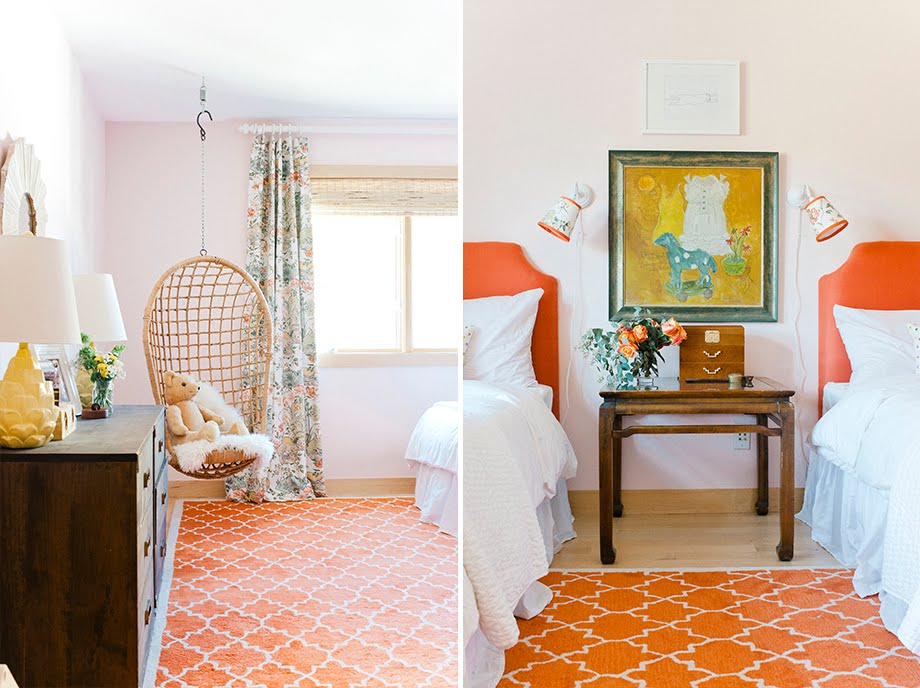
Our shoot was a one-day event, with me doing the prop styling and the flowers and a little art direction.  We shot everything with natural light which meant no light kits and a more minimal set up, so we could cover a lot.  Like EVERYTHING!  A few weeks later Melissa sent me a preview (below) and I about died.  Properly photographed, my house looked like it could be in a magazine!  This was a huge help to me--seeing it through someone else's lens gave me confidence.


Then I sat on the gorgeous photos figuring out what next.  I remembered this article from Sherry Hart, a veteran designer and (hysterically funny) blogger in Atlanta.  The blogging community is SO generous with information and advice!  In the article Sherry interviewed Lisa Mowry, the Atlanta editor for a number of shelter titles, and asked for tips on approaching magazines.  Based on Lisa's advice, I had my husband track down local writers/ contributing editors who worked with publications I thought would be a good fit for our house, and readied my pitch.

March 2015: I sent scouting shots and a list of "reader take away" ideas to the local writer.  She responded immediately and enthusiastically, and we set up a time for her to come by to see the house in person.  When she did, she brought her own camera to take additional images that illustrate how the rooms relate, to give editors a sense of where they could set up cameras.  Then she pitched two magazines we had agreed on, one regional and one national, which would give maximum coverage and would not be a conflict.

May 2015: I got an email from an editor at Mpls St. Paul Magazine, saying they were interested in featuring my home in their Home and Design magazine.  At the time, we talked about shooting within a few weeks for an upcoming issue.  After various emails with two editors over the course of maybe 2 months, we scheduled a shoot with one of their photographers.

July 2015:  The shoot!  Cancelled!  Due to illness.

August 2015: The shoot!  For real!  I did the flowers myself and much of the styling, so I didn't get much in the way of behind the scenes photos.  It was pretty amazing to see the computer set up--especially since my time working in commercial photography was just on the cusp of digital.  Most shoots I worked on still used real film, and we literally didn't know what we had until the photos were developed.


At the time of the shoot, the plan was to be in the March 2016 issue.

January 2016: Moved to the June issue!  Then August.  Then back to June.  I share this because it's so interesting when you think of the complexity of a magazine--it's like a puzzle and all the pieces need to fit.

March 2016: Kelly Kegans, the executive editor of the magazine and the writer for the story, sent me interview questions, some clarifying a bunch of stuff we talked about on the shoot, some new.  I put together a resource guide for paint colors and sources for items in my home (which is in the back of the magazine).

March 2016: I heard from an assistant editor at the national publication--a year after the initial pitch!  They wanted to know if I was still interested, and a feature is under consideration with them.  Fingers crossed!

April 2016: Kelly sent me the story (pretty much as it appears in the magazine) for fact checking

May 2016: It's out!


So all told, this piece was about 14 months from pitch to published.  There's so much that happens behind the scenes--and this is just from my point of view as the subject.

I'm thrilled with the piece and so appreciative that MSP magazine saw something in my home and was willing to put their resources into sharing it with the people of Minnesota.

Hop you enjoyed this little behind the scenes!

Monday, May 9, 2016

Before and after: my new logo!

There's nothing like a deadline to get your butt in gear.

"New logo" has been on my to-do list for months.  Well, okay, years.  The upcoming publication of my home in Mpls St Paul Home and Design magazine (my first glossy!) finally put a new visual identity and a real website in high gear.

My current "identity" was created by a lovely young designer I met through my last job at the Lighthouse Writer's Workshop in Denver, Colorado.  Her work is quite whimsical and vintage-inspired and perfect for the style and vibe of that organization.  I mainly hired her because I liked her and thought she did good work--I didn't think much about whether our styles aligned.  When I approached her about working with me, I remember pretty specifically instructing her that my blog banner and business card should be colorful, approachable, and--get this--not too professional.

Why?

Well, at the time I was hanging out my shingle without real experience in the field.  While I had tons of applicable skills from previous career turns, a great "eye," and years of practice from my own decorating habit, I was highly sensitive to feeling like a "fraud."  I didn't want anyone thinking I was setting out bigger shoes than I could fill.

Now, with a portfolio I am pretty proud of, lovely press (some forthcoming, some pending), and some really great projects in the works, I'm feeling pretty legitimate, and it was time to switch to a logo more reflective of my career now.

Enter 99Designs.

My Aunt Missy first told me about them when she created a logo for her photo blog and work as a photographer.  It is a site where hundreds of designers can submit work for consideration in design "contests."  You select your package (I just did logo design, but you can go for identity, website, etc.), your prize level (I chose "gold"), and write a creative brief.  Then the designs start rolling in!  And roll in they did.  It was crazy--I received a total of 433 submissions. (!!!!!!)

This was a good approach for me because I didn't know quite what I wanted, and having a ton of variety to react to was super helpful in fine tuning what I was after.  I knew I wanted it to be sophisticated but approachable, I liked the idea of a "mark" of some kind, and I wanted it to be clean and modern.  But that can translate a zillion ways.

The other thing I knew was that it was time to put myself front and center.  It was time for Heather Peterson Design, not Love Your Space.


Remember my old design?


Yeah.  My actual business name wasn't even on my business card!  This, too, reflects my discomfort with BEING the brand.  When I worked on the initial blog banner and business card, I wanted to hide behind the tagline.  The funny thing is, I'm not just realizing this in hindsight.  I'm pretty painfully self-aware, and I knew my motivations for what they were at the time.  Thanks goodness that my husband and my good friend Sara insisted that I register the business (And buy the URL) Heather Peterson Design!  Of course they were right, and I finally feel like I've grown into it.

When it came to choosing a final design, I turned to Dave and Sara again, and they were, again, in total agreement about the choice.

I was leaning towards some of these guys:


I think these are BEAUTIFUL logos.  But in the end, the first three felt like they were a little backwards leaning, like cleaner takes on what I already had.  The last one felt maybe just a little TOO clean and modern?

In the end, I'm THRILLED with my choice, which feels like it looks forward, towards the career I am building.  It looks beautiful in all the colors the designer specified--a grey, a blue, and a rose--and she gave me a secondary mark as well.  It is beautiful in white on a color or over an image.  It is clean and modern but not TOO simple.  It speaks to my love of pairs.  Plus, if you've been reading for a while you might know I am partial to the parenthetical expression.  :)


Mostly, it just feels amazing to have this professional look that aligns with the work I am doing.

So cheers to good progress!


Monday, October 26, 2015

The Happy Hallway Gets Happier

If you have been following this blog for a while, you know that I went through MANY different thoughts and ideas for the upstairs hallway.  In fact, I think that darn hallway has gotten more dedicated posts on the blog than any other single subject!  A year ago I finally settled on a plan--and I never really showed you the results.

This weekend, the stairwell got some attention, and the "happy hallway" got even happier.

Here is where I posted about the long process to get to the plan of 100 silly or sentimental family photos.  And here is where I blogged about possibilities for the overall treatment.

Way Before:


Before:


And now:
Striped grasscloth, red frames with white mats.


photos Melissa Oholendt

photo by me, obviously, because it's terrible.

And here's what's new:

I bought a vintage brass chandelier for a steal oh, about FOUR years ago.  I waited patiently until my husband decided he was ready to tackle electric projects.  We thought about using it in the laundry room or an upstairs bedroom, but there wasn't enough clearance.  I finally realized that the stairwell was the perfect spot for it--but then we had to figure out how to get UP there.


Looks like a terrible plan, right?  Obviously the installed chandelier is a bit of a spoiler: it worked!

Action shots:


Putting in the 24 (!!) light bulbs.  Dave thought I should "have some of the fun."  (I am still in yoga clothes from a class earlier, and my arms were not happy about the lightbulbs after a million high planks.)  Not looking forward to the first bulb that burns out.

Meanwhile, I was at Ikea recently and they had a "last chance" on the red Ribba frames in the 5x7 size, so I panicked and bought them all.  Naturally.  I taped up some 8x10 paper to mock up the arrangement.


For these, I used color photos, all from our recent trip to Louisville so there is a color palette and theme.


Hooray!  Happy, happy hallway.

Of course, all of this was supposed to make me want a stair runner less.  But it makes me want one more.

Now, about that flushmount.....


Wednesday, October 7, 2015

ORC week 1: Before and the plans

Here we go!


As mentioned on Monday, I am linking up as a guest to the One Room Challenge this fall.  Yesterday was a delightful day in the blogosphere, checking out the plans of the official 20 ORC bloggers.  Today I get to tell you all about my plans.

I have mentioned in the past that my girls were sharing a room, but that we knew it was not for long.  In the spring, my younger daughter finally decided that she was ready for her own room, too.  We had a photo shoot at the end of summer and couldn't change thing sup, so they had to wait for fall.

Here's what we are working with:  The upstairs of our house has two bedrooms, one in front and one in back, with a bathroom and laundry room in between.  The girls have been sharing the large room at the back of the house, with the adjoining bathroom, and the smaller room is a guest room.

Girls' Room Current:


Guest Room Current


All beautiful photos by Melissa Oholendt

I LOVE these rooms and I'm kind of sad that these are the "before" shots!

But I love my children, too.  And the time has come for this change.

When we first started talking about who would move where, there were a number of conflicting wants to take into account:  Clio wanted a dark blue room (with white curtains and a grey rug), but she wanted to stay put in the big room and keep her twin bed.  Eleri wanted the curtains and chair from the big room, but she wanted a queen sized bed.  And so on.

In the end, it came down to keeping the decorating (paint, curtains, etc) but changing the furniture, or keeping the major furniture elements but changing up the decor.

Here are the possible furniture plans:

Eleri stays in the big room but gets a big bed:


While Clio moves to the small room with a daybed:


OR 

Clio stays in the big room with the pair of twin beds


While Eleri moves to the small room and keeps the big bed:


I also started to play around with how I would decorate both scenarios, re-using as much as possible from the existing rooms.

Clio in the small room:


Clio in the big room:


Eleri in the big room:


Almost the same as Eleri in the small room:


Keep in mind all of this work was JUST TO DECIDE WHO GOT WHICH ROOM.

So I sat down to present them all of this stuff, and guess what happened?

Clio looked at me and said "Oh. Eleri is moving to the guest room."  And she shrugged her shoulders for good measure.

I guess they held closed-door negotations, but I'm just happy to have a decision they both bought in to.  And I never even showed them any of this!

So come on back next Thursday and I'll tell you how the REAL design planning began.

In the meantime, you can check out all the linking participants (like 100 already!) at calling it home.


LinkWithin

Related Posts Plugin for WordPress, Blogger...