Wednesday, June 29, 2016

Hanging Art: Artist Rugs

Much of my energy over the past, well, almost year has gone to one huge project.  It has been one of the most fun and rewarding opportunities I've had--to imagine a large space nearly from scratch, to work with an architect,  to choose all the lighting and hardware and finishes and faucets--but it also means an immersive, ongoing project without anything to really show for it just yet.

Since we've still got months to go, and I don't want to give too much away, I thought I might share some of the concepts and ideas that are going into it.  And the one I'll tell you about today fits right in to my "hanging art" series.

The house I'm working on was built in the 20s in the Edwardian style, but my clients have modern and eclectic taste, with a special hankering for Italian vintage and the 1970s.  (Hooray, right?)  One of the things I've thought about quite a bit is taking strategies from the 50s-70s and doing a modern take.

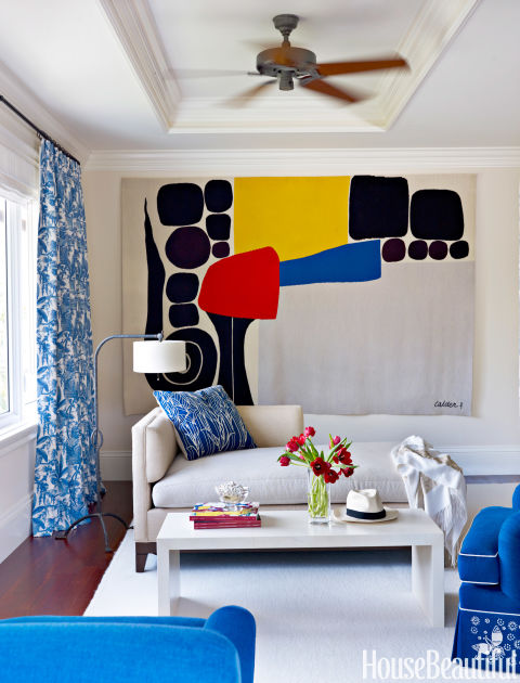
We know I'm a textile person, right?  In the middle of the last century, big name artists like Alexander Calder and Pablo Picasso were making rugs and tapestries as art.  These days, some of my favorite designers use these pieces in their interiors. (This article is interesting on the resurgence of rug art starting in the 1990s.)


(There was a recent hollywood home by Peter Dunham that used several amazing examples, and it's killing me--KILLING ME--that I can't find it.  Here's a lesson: do not recycle your magazines.  the internet doesn't always offer up what you need.)

Anyway.  When I came across One Love, a series of limited-edition artist rugs from Woven Accents, I knew we needed to go for the rug-on-the-wall thing.  The perfect place?  The dining room.  We aren't doing a rug under the table, and there is a large wall that needs anchoring.  Rug art will help with sound absorption, soften the effect of wood furniture, and bring oh so much color to this space!

Alexandra Grant, Self Portrait

I must say, I am VERY excited to see this go up!

Also, if you wanted to go with the original, there is a selection of Picasso rugs on 1st dibs,  and a whole section devoted to artist rugs in the Nazmyal collection.  Fun to look at, even if they're too spendy to buy.

My art history degrees really come in handy sometimes.


Friday, June 17, 2016

Hanging Art: The Row

I'm already bored with this series.  Maybe I should have just done one post that rounded up my favorite strategies with a couple of pics a pieces and boom!  Done.

OR maybe it's just that this strategy ("The row") is the most self-explanatory.  Have group of images, hang them up all in a row.


I think I have only ever used this plan when I already had a group of pieces to work with, like the hunting prints in The Ann Cave, above.  (photographing the whole of that project SOON!  Can't wait to share.)  In this basement, I wanted to create a horizon line to keep the eye moving around the room and detract from low ceilings, connect the couch and chair, and make sense of the window.  It also makes sense with the wall of shiplap to the left.


Same deal in this (impossible to photograph) office.  The client had these beautiful watercolors, and again the line connects the furniture grouping on that wall.


In this bathroom, I wanted art but I didn't want to hide too much of the wallpaper.  I rarely ever hang a pair of pictures side by side (I much prefer to stack them), but here the concept of the row creates a horizontal at eye level, in nice relief to the vertical elements in the room.

That's all I got on that!


Tuesday, June 7, 2016

Hanging Art: The "butterfly"

It has been fun looking back through photos to prepare these posts, and to rediscover some spaces I'd forgotten about!

With the "butterfly" (not a real thing: totally coined by me) I feel like I'm sort of jumping right to the advanced level of art hanging, but honestly, it's the easiest post for me to write next in this series, so there you go.  Sometimes the space dictates the art, but other times you start from an existing collection of works.  While I love a salon-style gallery wall, a collection of similar items in similar frames often begs for some order.  The "butterfly" is basically a balanced, even symmetrical arrangement that wings out from a centerline.

My brother collects baseball ephemera and signed vintage photos.  In his old house, they were largely in an office, in smaller groupings split across several walls.  In his new finished basement, there was a large wall where we could display most of them together.


Because we had even numbers of frames of each size, symmetry was called for.  We tested some options, but ultimately this "butterfly" configuration gave the most movement, while remaining orderly.  (I realize as I type this that it's a bit like having a center justification in text.)


In my parents' hallway, we had a collection of black and white drawings in gold frames.  There were some pairs and some that were the same basic size and orientation.  So, same deal.  (You can read an old post on this one, here!)


In a clients house, we wanted to use some of her kids art over the console in the living room.  She also had vintage posters, so we took advantage of the different pairs.  By hanging them the same (button trees in white, ad posters in black), we got cohesion.


All of those examples were a matter of making a collection shine.

These next two examples took a collection and put them to use around an existing element in the room.

In the former office of Public Art St Paul, I had an uneven number of project photos to hang, and some awkward internal windows to work around.  This arrangement reads less like a butterfly but has the same principle of a mirrored layout and is a bit off-grid.


At this bedroom in my parents' house we had a grouping of six framed prints and we wanted to fill the space above the bed.


The idea was the go with the shape of the headboard.  By staggering the placement of the two sets of horizontals, we got a wider overall arrangement AND we were able to hang everything close to the bed.  (If those side pairs were stacked, they would have been hung higher to avoid overlapping the wood headboard.)

I took a similar tack in this bedroom.  Originally we planned on more of a loose gallery wall, but when we decided to repurpose this bed from the attic, the space between the top of the headboard and the picture rail was pretty short!  Stacking pairs over the dressers fills in the negative space created by the height difference in furniture.  The single piece over the headboard is in related subject matter (they are all prints related to swimming), so the 5 pieces feel like one connected arrangement.


(You can read about this project here and here and see the final reveal here).  But if you look at just one side, you get the Stacked Pair!

Is it weird that I think so much/ have so much to say about hanging art?

LinkWithin

Related Posts Plugin for WordPress, Blogger...