Friday, September 30, 2011

Put a bird on it

I was sourcing a new finial for a Home Goods lamp for a client's guest bedroom (the finial broke, I got $5 knocked off the price, plus a custom finial will elevate the lamp), and I stumbled upon some cray-zay lamp toppers.  Seashells, weathervanes, cats and dogs.  Oh, and the Christmas and Halloween finials really take seasonal decorating to a new place.  But the one that stood out for me the most is this dove.


It has real feathers.

Even if I wanted a bird of this scale and with real feathers, I can't imagine a single lamp that could take it.  Any ideas?  Don't get me wrong, I'm ALL for birds in decor, and especially into those birdcage chandys with birds like this one.  But sitting in the middle of a lamp shade?  I just don't see it.

This place also has some lovely decorative finials in a more traditional mode.  Here are the actual two that I'm considering:


The lamp in question is sort of taupe ceramic with a lavender undertone with a taupey silk shade, all in a vaguely Chinoiserie shape.  There are deeper purples around the room, including some HOT purple leather I got for a bargain--it's going on the seat of the existing desk chair.

There's a Chinoiserie chest in the room, too, with brass pulls.  That brass finial might be just a bit TOO overtly Asian.

Any votes?

All finials, lampfinials.com

Thursday, September 29, 2011

Summer's Last Gasp

All over the blogosphere, fall is being welcomed with photos of fuzzy sweaters, cozy plaid and wool textiles, knee high boots and autumn leaves.

I am in denial.

Fall came hard here in Minnesota.  One day a week or two ago it was 90 degrees on Monday, and we spent it swimming and lazing by the pool, flipping idly through magazines.  Then, that Thursday, a frost warning.  We said good-bye to the garden and got out the girls' hats and mittens.  Now, a little bit of Indian Summer has me hanging on to the last gasp of warm weather (but Saturday it is already October).

I just went though a pile of old magazines and scanned the bejeezus out of them.  As temperatures dwindle, I think I might have to share a summer house or two to ease the pain.

How about this cute beach shack by one of my perennial faves, Peter Dunham, photographed for Coastal Living by Lisa Romerein?


Loving Mr. Dunham's signature mix of ethnic prints, particularly in this navy and red palette that--who knew--is having a moment for me just now.  And of course, it is a shack on the beach.  Designed by Peter Dunham.  What's not to love?

Do you mind if I share these things with you?  I know, in a way, it's a lazy post, just sharing a house published in a magazine.  But it's a lot of work, scanning and cropping and resizing and uploading.  And I wouldn't do it if I didn't think you'd like to see.

So.  Let me know?


Wednesday, September 28, 2011

Finishing touches

It's all in the details, right?
We hear that all the time.  And yet, so often we spend all of our energy, time, and budget getting the big pieces in place in our homes, the little finishing touches can fall by the wayside.

Honestly, I've always been kind of a big picture gal, AND I have always loved flourishes.  You know: sequins, glittery thread, pretty buttons, tufting.  As I've gotten more and more invested in layering on the details in this house, I realize that in the past I've brought in the big-picture pieces with a lot of detail built in.  An embroidered and mirrored bedspread.  Chairs with carved legs or caned sides.  Damask curtains or octagonal tiles.  Now I'm loving the finishing effect of the perfect trim on those damask curtains.  Contrast piping on the cane chair. These details make pieces unique to us and create a level of personality in our homes.

Now, when I pore over images of interiors I love, I'm looking at those finishing touches as much as the overall effect, and I'm starting a new little series to celebrate the unique details, and hopefully inspire you to think of ways you might incorporate details in your own home.

Ready?


I've been toting this image around for a long time.  I'm not even sure where it comes from, but I am a sucker for window seats of any kind, and I love this casual daybed, like an upholstered mattress up on legs.

First, check out the nailhead trim.  Do you see the pattern?  There's a large nail every third or fourth in the row.  Such a nice sense of movement.  Such a great contrast to the absence of detail in the mattress construction (no welt, hardly a visible seam.)

Second, see those yellow pillow squares?  See the extra large welting on the side?  Well, check out the knot it makes at the corner.  Love this.

Third, it's hard to see, but if you look at the edge of the curtain, between that awesome lamp and the daybed, you can see a wide panel of sheer banding on the curtains, with an embroidered fern pattern.  Beautiful.

Finally, what about that row of chunky buttons on the middle cream colored pillow??

I could go on.

I love to talk about this stuff, but let me know if it is boring to you.  I've got a couple of images queued up for the series, and we'll see how you like it!


Tuesday, September 27, 2011

Matters of Scale

One of the more challenging things about design, particularly in this internet age, can be getting the scale and proportion just right in a space.  Floor plans and measurements can tell you a lot, but I always think it's better to be in a home to get a feel for the space.  I mean that literally: you need to be in a space to know what it is to move in them.  And then we do our best to make sure the dining chairs are big enough for the table, the pendants not overpowering to the chandelier, the sofa weighty enough to handle the club chairs, and so on and so forth.

Of course, as with so many rules, sometimes breaking them can make the most unexpected magic.  I love the use of this tiny settee and overscale painting in this Barry Dixon space, photographed for House Beautiful.


Technically, the mirror is "too big" or the settee is "too small," but the result is inspiring.  Here, just the really big mirror and little delicate settee would have created a dramatic effect, but I love the way Dixon pushed it with the tall floor vase, big basket, and small sconces, surrounding the bench and amplifying the effect.

After seeing this image, I found myself noticing this kind of play on scale all over the place, and loving the effects.  When you exaggerate scale, you start to play with the sense of reality, don't you think?  There's a little bit of an Alice in Wonderland quality, and the drama is worth the risk.

Small furniture and really big art:

 [Farrow and Cobb]

[Muriel Brandolini, via 10 Rooms]

Love the addition of those huge glass jugs here, too.


[Gubi Catalog, via The Zhush]

Dramatic fabric on huge windows dominate a pair of tiny but detailed settees

[Elle Decor]

And a pair of huge lamps on a sofa table elevate this chintz living room to a more artful place.


[Lonny]

How about you: do you play with scale in your own home?

Monday, September 26, 2011

Large-scale painted silhouettes

Since I started this blog (and reading dozens of design blogs almost every day), I can't help but become more and more aware of trends.  I have no beef with trends and get in on plenty of them, but I think it's kind of fun to chart their progress.  Sometimes, when a trend feels like it is everywhere but still feels really appealing, it gets tweaked just enough to feel new.  Kind of like how horizontal stripes turned on the diagonal and everyone swoons anew.  For the record, I fully approve of diagonal stripes and swooning for them, particularly when I see this:


Silhouettes were EVERYWHERE for awhile (and yes, I got on board with sweet paper cutouts of my girls, and with botanical cutouts, inspired by these.  If you still want to get on it, tutorial here).  Mostly, the silhouettes were traditional in scale and medium, with variations, like silhouettes cuts from colorful patterned paper or Carter Kustera's painted silhouettes in color on a white ground.  Lately, I've been noticing overscale versions floating around.  Rather than cut-paper, they are painted, like the dog below.

[House Beautiful]

Here's another animal portrait.  Love how the red makes the bear playful.

[Readymade]

There's a pink dog portrait floating around out there, too--my friend Rebecca has it in her living room--but I can't seem to find a picture of it just now.

Abstracts work, too.  The key is in the strength of a solid, simple form.


[spotted on MFMB]

A few weeks ago I watched a little marathon of season 5 of Design Star, and saw this painting, made for a firehouse renovation.

 [via hgtv]

In addition to the fireman silhouette on canvas, another contestant created a silhouette of the skyline right on the wall.  This is part two of the trend: silhouette murals painted on the wall.

Love this Mary McDonald Chinoiserie version from a few years back.


And this sweet pale take in a girls' room.


All of these are totally doable, too.  More Art You Can Make: look at that!

What do you think: are you ready for large-scale silhouettes?

Saturday, September 24, 2011

Small Measures: Poster to Art Wall

[via Apartment Therapy]

A favorite poster (choose a relatively simple composition) mounted on foam core and fragmented.  A one-work art wall.

Friday, September 23, 2011

Art You Can Make: Trace a Classic


I've been stumbling on lots of interesting DIY art ideas lately, and this might be a favorite.  Recognize that image over the console?  It's a famous Vermeer, made even more famous by the book Girl With a Pearl Earring, and the movie poster of Scarlett Johanssen in this same pose.

It's also a cool line drawing spotted in an Apartment Therapy house tour.

To achieve this look, I would either print a blown-up copy of a recognizeable image from art history and literally trace it, or I would use a projector to get it on a canvas (or directly on a wall, like it looks like they did here.)

I like how sort of undone and unfinished it feels, giving some energy to an otherwise finished (and lovely, simple) room.

This will only work with a non-abstract image!  Still life, portrait, landscape, you get the drill.  This will also only work if the image is so recognizeable that the reference is clear.  Like, if it has been on a poster in a museum gift shop, you're on the right track.  Otherwise it will just look like a sort of amateur line drawing.  I think it's also smart to choose a portrait where there is some sense of mystery to the figure.

Some of the biggies of art history that come to mind include:


Whistler's Mother


Picasso's Les Demoiselles D'Avignon


Manet's Olympia


Van Gogh's Self Portrait With Bandaged Ear


The Mona Lisa

I'm completely serious: The Mona Lisa.  Everyone else has knocked it off or incorporated it into derivitave works.  Why not you?

What do you think: could you pull this off?  What artwork would you use?

Thursday, September 22, 2011

Tiny Houses

In the second to last challenge on HGTV's Design Star, the three contestants each got to decorate a "whole house."  Joke was, the houses were less than 100 square feet each.  At first I thought, no fair!  This is not something a designer would encounter in the course of regular day to day business.  And then I thought, well, designers are problem solvers, and really, is this challenge so different than any other?

Meg's was cute enough.


But Karl's was my favorite.  Not that you can tell anything from this picture.


The whole thing reminded me of a trip to Lake George years ago, where I spent half the drive with my head out the window exclaiming at the lake resorts, many of which have a sort of Mama house and then a row of 6 or 7 teeny cabins, each about the size of a freestanding bedroom.  They were So. Dang. Cute.  And elusive on the internet--I can't find a single photo.

For someone who thinks 2000 sf is about the minimum for a family of 4 to be comfortable (I know lots of people have less; we've lived in far less for most of our adult lives), teeny houses are, well, novel.  Not like a REAL POSSIBILITY.

This guy begs to differ.  I saw this little video maybe a year or two ago as part of the Yahoo "Second Acts" series.


He makes a pretty good argument (and how awesome that he built this career for himself).  However, I know myself well enough to know that my real house could not be tiny.  But a cabin could be teensy-weensy.

When I was 25, a friend of mine started selling properties in the Berkshires, and he wanted me to buy the sweetest, tiniest cabin.  Basically just a room with a kitchen in the middle and a sleeping porch.  We called it "Le Cabine."  At the time I thought it was just too small (plus, what business did I have buying vacation property as a singleton of 25?)  But now I like the idea of a vacation property small enough to require very little work.  In the spirit of the tiny house movement, check these out. (Lots of them have stories attached.  The photo itself links to the source.)

Small cabin architecture

tiny1


prefab-cabin-folie

portland_garden_cottages

prefab-tiny-cabin-shelter-kit-2


Farm Buildings into Tiny Houses

That last one is not quite so stylish as the others, but I'm always a sucker for houses made out of something else.  Like the box car house I encountered when on extended stay in New Mexico before I started my Master's Degree.

Finally, I just saw this little cabin on an Apartment Therapy house tour.  Kind of has the wheels turning...


What do you think: would you like a teeny tiny house?

Want to get on board?  Check out Tiny House Talk, This Tiny House, and The Tiny Life.  I'm following them all now, because I am totally hooked! 

Wednesday, September 21, 2011

Some blog updates

While I'm still working on the look and feel of the thing (and seeking code to use my nicely designed buttons for my new navigation bar), I thought I should at least acknowledge some content changes.

So, I went custom domain on you.  That's right: heatherpetersondesign.com.  It's got a nice ring to it, I think.  The blogger address forwards and should still work, but feel free to update bookmarks, etc.

Then, you may have noticed I stealthily added new static pages to make this here blog a bit more website-like. It always had website aspirations, so here we are.  Check out more about me and the design services I offer, and if you feel like a little walk down memory lane, I've given you some quick links to my various bloggie series right there under "series."

What do you think?  Any other improvements you'd like to see around here?  I am ALL ears.

Finished.

Well, of course nothing is every REALLY finished, right?

But my guest room is done for now.  Except for adding classic navy ticking to the roller shade, a la this awesome image from Melissa Rufty.


But for now, I sewed the trim to the curtains and I LOVE the added detail--feels very finished. 


I also made some pillowcases for the second set of pillows, using a raspberry floral fabric I picked up ages ago for about $6.


So here's the overall look now.


I'm sure you are sick to death of seeing this room, but you've come this far with it, I thought you should see the (almost) final state.

It also got me to thinking about how rooms evolve and sometimes you can't force them to be something other than what they want to be.  In this case, I was trying to force the room to be a little more modern, a little more funky, bringing in that multi color ikat on a throw pillow, thinking about bolder fabrics.  But the truth is, this room wants to be pretty.  It kept pulling a little bit, I don't know, French?  And with the floral shams and the frenchy bolster (swiped from the girls' room), I finally gave in.

What do you think?

Tuesday, September 20, 2011

A Gift From Japan

Knowing me quite well, my husband brought home just the right gifts from Japan.  First, a set of these clip on birds like the ones we used in our wedding (because they remind me of my late grandmother and Christmas at her house growing up).


I love the perfect packaging, with the paper "grass" and "flowers."

And second, a Japanese home magazine.  Or catalog.  We're not quite sure.


It kind of has the feel of an Urban Outfitters Home catalog, but the items for sale include some Ikea merchandise, making me wonder if it really is more of an editorial publication and not a single-brand catalog.

Whatever.  I found it really, really interesting to pore over the interiors.  I was most struck by the presence of so many of the trends going on over in this here hemisphere, going on over yonder, too.  The spaces do have what I would consider a Japanese aesthetic, but the trends are sparingly layered on.  I don't know why this surprised me, but it did.

For example, antlers and industrial lighting.


Those overscale wall sconces, an eames coat rack, tons of danish modern.


Framed text.


Black and White Stripes (though I believe these are wood slats or some kind of louvered blinds, not paint.  Cool, right?)


Cowhide.  Particularly striking in a country that once had no cows.  Also, that copper light fixture definitely qualifies as trendy.  (As a side note, I love that the woman in the background is wearing white pants with black elephant silhouettes on them.)


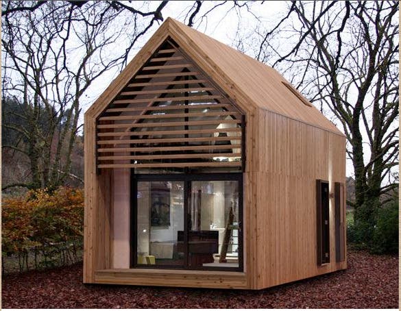
But then, there's something different going on in this next picture.  Foreign, I guess.  Though I never would have guessed Japan as the country of origin in a blind taste test.  What do you think is going on with that crazy wood triangle curtain holder thingie?


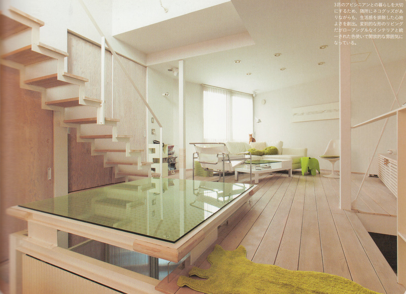
And here I love the sophisticated use of a spare aesthetic and serene palette.  I think that table in the foreground might be the dining room table, meant for floor sitting?  And please note the little chartreuse rug in the shape of a cat.


I think this last picture is so interesting.  So spare, yet the beautiful sport coats are hanging in the open, like decoration.  I wonder if this is a home space or some kind of shop.  It's sort of fun that it's all such a mystery.


What do you think: any interesting details I missed?  Could you live in a smaller, more spare space than we are generally accustomed to in America?

LinkWithin

Related Posts Plugin for WordPress, Blogger...