Showing posts with label art you can make. Show all posts

Tuesday, November 12, 2013

A Quickie (but goodie!)

I'm always thinking about different ways to display art, and in particular, ways to create interesting art displays (or showcase a collection of objects or ephemera) even if you don't have much of an art collection.

I snapped this picture in a Pottery Barn store recently.  I love the way the frames make a sort of architectural installation, and you want to go up and see the images.


The images (or objects) could be anything that forms a collection: special seashells with notes on where they were collected, postcards you send to yourself from years of travel destinations, foreign stamps, bowties, the placecards for special family members from your wedding reception.  This arrangement is all about creating emphasis on a group of things that become more special when placed together.

Installation would be simple: just choose a simple hook, buy in multiple, and add pretty ribbon, twine, or cord to to eye hooks on the back of your frames.

What do you think: if you hung a display this way, what would you put in the frames?

Wednesday, April 24, 2013

I'm no artist


I probably "shouldn't" post this, but I'm gonna go ahead and do it anyway.
After sitting with a construction paper collage on canvas for a while, over spring break the girls and I just jumped in and started painting this giant canvas.

Basically, I chose a palette from the existing sample cans of latex house paint I had lying around (and believe me, there were LOTS to choose from!)  


This is all wrong: one should not paint a pre-stretched canvas using latex house paint.  I know this.  But this project is truly a matter of function, effect, and saving money, so there was no way I was going to invest in a bunch of oil paints and brushes.


I have been living with it in place for a while now to see how I feel about the colors, if it's too much of a pain to move the thing on and off the TV (it's not, though our TV has been broken for a couple of weeks, making it a wee bit moot), and whether I will ultimately feel the need to add a frame.


The gap at the sides actually doesn't bother me.  I do need to add a cross bar to the back to raise the whole thing up a couple of inches though.

Right now, the painting itself lacks depth and detail, but this is really just the base layer.  For now I am deciding how I feel about the base palette, whether to bring in black or gold or both, whether to add a more rigid geometric element and whether to do some embroidery on the canvas.  I know.

I share this today partly because blogs sometimes make it feel like a blogger has an idea and then Poof!  It's finished and perfect.  I tend to think a lot, and some decisions are very slow in coming.  I guess I want to make clear that these things can take time....and really, there's no rush.

Wednesday, February 27, 2013

Progress on the TV art

One of the nice things about projects in your own home is the freedom to experiment on-site.  You don't have to have it all figured out before you start the install.

I mentioned a while back that I wanted to install a giant canvas over my TV, partly to hide the thing when not in use (and perhaps reduce the TV watching that I am engaging in), but mostly to make the room feel more finished most of the time.

I figured out the scale I wanted, my husband built a frame, and I covered it in inexpensive painters canvas (from here) with my staple gun, and hung it on up.  By which I mean I put the cross brace on the back of the frame right on top of the TV.


Without the TV visible and acting as a reference point, I noticed that the canvas feels a bit low.  So there's that.  Especially in relationship to the vertical stack of stamp art on the same wall.


See?  So it will move up, probably with some blocks added to the cross-brace in the back. Speaking of which, I noticed that whatever wood sits directly on the TV will need to be covered in felt, pronto.  No need to scratch up a perfectly good TV.

Before I started painting, I wanted to test out some ideas.  Do not judge what you are about to see.  Since I am thinking about a black and white abstract,  I got out all the black construction paper form my kids' pack and started taping it to the canvas in a sort of geometric way.


The idea is just to mock up the general gist of it to see how it plays in the room and how it relates to the other art and furniture.  I left it up for a day or two to see how I reacted to it as I moved through the house.


(By the way, do you like our state of the art stereo system?  I think my husband got that boom box in the 80s.  It's great for my 4 year old, who loves to play DJ.)

The verdict?  The bold black geometric pulls too much focus.  It grabbed my eye any time I went remotely near.  I'm thinking it needs to be more organic (the geometry mimics the frame stack too much), and medium to large scale (the framed paper is small scale, loose, and busy).  It needs to be a little more delicate, either in color or in line.  Another mock up is in my future.

An important note.  Generally, I would not recommend planning a painting this way.  No, sir.  Art should be art, and should not be "decor."  But in this case, it is a major statement in the space but also the last piece coming in to the room and I don't have any money to buy real art right now, so it makes sense to do something myself and plan it to the room.

Very process-y, right?  I hope it helps to see the thinking process, and to show that, while sometimes things just "work," more often there is a lot of planning and playing that goes in to each design decision along the way.

Tuesday, November 15, 2011

Sew your saying

I'm loving the textile take on all the "word art" that's out there these days.

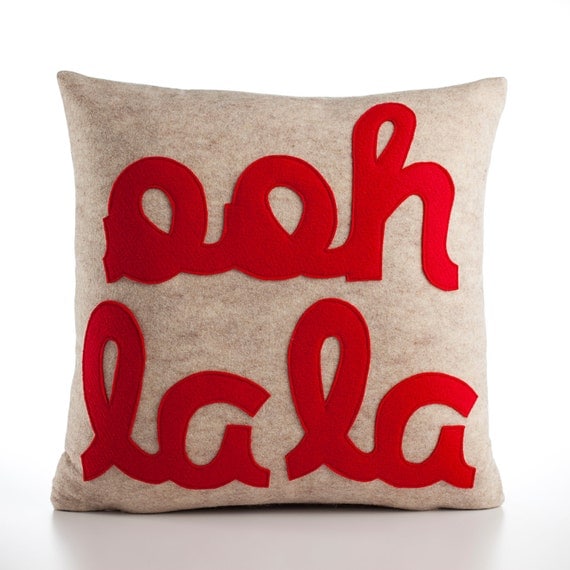
I remember first noticing these felt-applique pillows from this etsy shop when they were featured in House Beautiful a while back.

Ooh la la 22x22inch pillow recycled felt applique pillow - oatmeal and red

I was liking the idea of creating something similar but more in my colors (or commissioning the seller to do it).

And have you seen Muriel Brandolini's custom words wallpaper?  She created the lyrics to a family's favorite Rolling Stones song and applied it to the walls in all sorts of crazy textures.


Well, I just recently spotted these one-of-a-kind embroidered textiles, many of which use popular song lyrics, from Australian shop Castle and Things.

ISN'T SHE LOVELY

Some play around with composition and negative space in quite a fetching way.

I LOVED YOU THEN AS I LOVE YOU STILL

This one makes me hear John Denver in my mind.  (NOT a bad thing, I promise you.)

LET ME ALWAYS BE WITH YOU

There are also non-word compositions that still create a little story.  this one is called Dream a Little Dream.

DREAM A LITTLE DREAM

These are pricey (in the hundreds of dollars), but they use great materials and could be a wonderful gift (even to yourself).

I like the idea of creating your own felt applique of a meaningful lyric, poem line, or saying, and making a throw pillow or framing and hanging it.

So personal.

Monday, November 7, 2011

Art You Can Make: Typography

This weekend we went to the Walker Art Center's Free Family day (first Saturday of the month).  They always have amazing, creative activities for kids that relate to the current shows in the galleries, and right now there is a big graphic design show on.  (As an aside, I was thrilled when my husband noticed that a book I worked on is in the show: Above the Pavement, the Farm, with WORK architecture company and designers from Project Projects).  In keeping with the theme of the show, one of the art activities was to create your own font or typeface out of common objects, and to do your own printmaking.

Let me tell you, we got IN to it.

Typography prints are so big these days, I was inspired by this activity, thinking you could make original works at home--on your own, or with your kids.  It would be fun to take a phrase meaningful to you and your family, but I love that even a "standard" phrase, something familiar in the lexicon, can take on different personalities when hand-printed.  The layout, the shapes of the letters, the colors--it all adds up to something uniquely you.

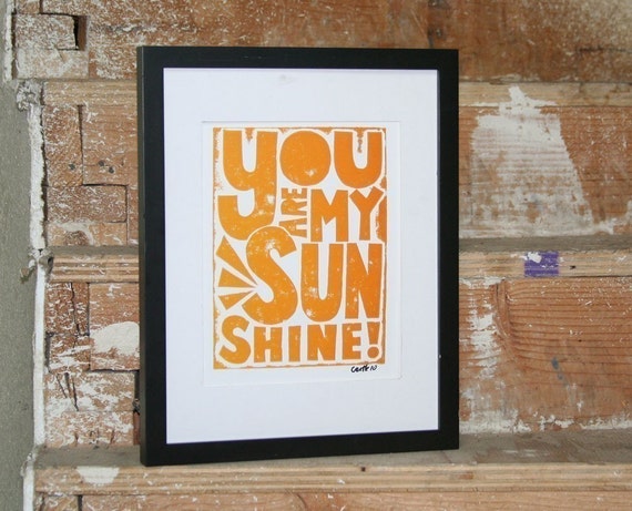
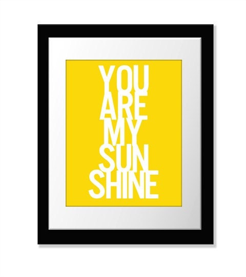
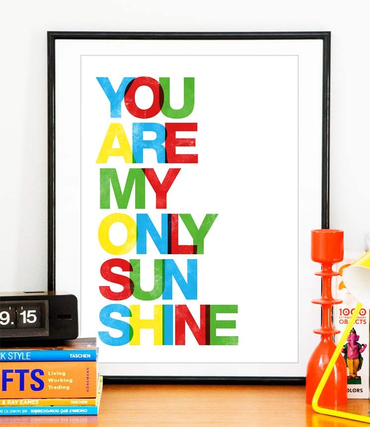
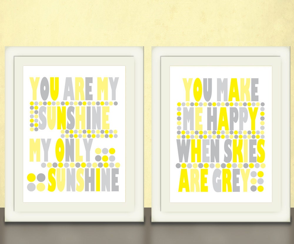
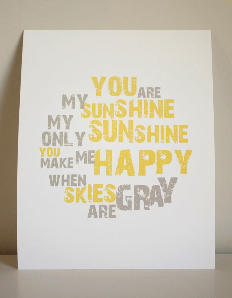
To illustrate, I chose a couple of prints from Etsy with the same phrase.  (There were 540 to choose from for You Are My Sunshine!)

BABY NURSERY ART You are my Sunshine print typography Raw Art Letterpress

You Are My Sunshine Print // 8x10 Inch Fine Art Print // PO // Yellow White // Choose Your Colors // 2/7

You are my Sunshine poster  art print  baby nursery art A4 or 8 x 11

You are my Sunshine & You Make Me Happy art prints in yellow and grey, size 8x10

8x10 You Are My Sunshine print

Fun, right?  Each totally different than the next.

To make your own, you could simply buy a set of stamps (or a couple of sets to break up the sizes and styles), or keep an eye out for vintage woodblock letters at vintage stores.  (I once made monogrammed stationery for a friend this way, and gave her the stationery AND the stamps as a gift.  They look cool on a shelf and that way, you can always make more.)

Or you can make your own letters--this is what the Walker exercise was all about.

As I understand it, creating a font is all about creating a language of elements and applying it to all of your letters.  Dave watched a movie about typeface design, and from this he learned that you always start with the lowercase h: it determines both your straight and curved elements, and sets the height for the set.  (Another aside: Helvetica is a pretty cool documentary about one of the most common typefaces in use, and Typeface, about a type museum in rural Wisconsin, looks intruiging.)

At the Walker, we started simple.  Clio and I created "daddy" and Eleri and Dave created "Mommy."


Then, Clio and I got ambitious.  She chose a phrase from a favorite bedtime song.  We got the poster sized paper and started printing away.


Take me out to the ballgame.  (It looks better in person.  I'm SURE this image is not convincing you to go out and do this, but it's fun, I swear.)

I hung it up in my new hallway vignette just for fun, and I love the idea of creating a more finished piece using this technique, possibly for the downstairs bathroom.


To make our letters, we used a combination of wood pieces and foam blocks, coated them in ink (it was spread out on glass trays), and pressed them on the paper.  Simple.

What do you think: would you get crafty and make your own typographic print?  What phrase would you use?


Monday, September 26, 2011

Large-scale painted silhouettes

Since I started this blog (and reading dozens of design blogs almost every day), I can't help but become more and more aware of trends.  I have no beef with trends and get in on plenty of them, but I think it's kind of fun to chart their progress.  Sometimes, when a trend feels like it is everywhere but still feels really appealing, it gets tweaked just enough to feel new.  Kind of like how horizontal stripes turned on the diagonal and everyone swoons anew.  For the record, I fully approve of diagonal stripes and swooning for them, particularly when I see this:


Silhouettes were EVERYWHERE for awhile (and yes, I got on board with sweet paper cutouts of my girls, and with botanical cutouts, inspired by these.  If you still want to get on it, tutorial here).  Mostly, the silhouettes were traditional in scale and medium, with variations, like silhouettes cuts from colorful patterned paper or Carter Kustera's painted silhouettes in color on a white ground.  Lately, I've been noticing overscale versions floating around.  Rather than cut-paper, they are painted, like the dog below.

[House Beautiful]

Here's another animal portrait.  Love how the red makes the bear playful.

[Readymade]

There's a pink dog portrait floating around out there, too--my friend Rebecca has it in her living room--but I can't seem to find a picture of it just now.

Abstracts work, too.  The key is in the strength of a solid, simple form.


[spotted on MFMB]

A few weeks ago I watched a little marathon of season 5 of Design Star, and saw this painting, made for a firehouse renovation.

 [via hgtv]

In addition to the fireman silhouette on canvas, another contestant created a silhouette of the skyline right on the wall.  This is part two of the trend: silhouette murals painted on the wall.

Love this Mary McDonald Chinoiserie version from a few years back.


And this sweet pale take in a girls' room.


All of these are totally doable, too.  More Art You Can Make: look at that!

What do you think: are you ready for large-scale silhouettes?

Saturday, September 10, 2011

Small Measures: Vintage ephemera

via House and Home

Art should be personal, should mean something to you.  What better way to celebrate travel and events than a display of postcards and ephemera?

Wednesday, August 24, 2011

Art You Can Make: Stamps

I mentioned a stamp project the other day.  It's not particularly innovative: there's no decoupage, or DIY, or staple guns, or mod podge, or rub n buff.  Just some cool images being used as cool images.

When I cleaned out my teen bedroom at my parents house (I managed to avoid it for 20 years because I lived away), I found some rather random treasures.  Including a little stone inlay box that fits in my palm, filled with a small collection of stamps from exotic places.  I have an excellent memory--the joke in my family is that I can tell you what I was wearing on any specific occasion--but I have absolutely no recollection of where these stamps came from, just when I collected them, or why the sudden interest.  Yet I do know, for certain, that they are mine: I remember putting them in the little oval box and worrying about crushing the corners (which I did do.)

I had been wanting a series of something for the long, plain hallway upstairs.  I even bought six Ikea ribba frames in a light wood long enough ago that I could no longer return them (and that is LONG in Ikea years.)  The hallway connects the guest room, with its two fashion watercolor illustration and other works on paper, and the girls' room, with the cut-paper silhouettes, an oil painting, and some vintage works, all paint on paper. I was thinking photography.

But I wanted something very small scale.  I like the idea of intimate works in a hallway, where you kind of have to get close to see the piece.

Enter my little stamp collection.

I went through and chose the stamps that had the simplest, most graphic presence so they would "read" at a bit of a distance, and tried to focus on pieces with colors from the two bedrooms.  I played around with different groupings, and ended up using these:


I love that they are from the 70s (how appropriate to my decor), that a number of them were special edition Olympics stamps, and that several have been canceled.

The stamps were a little TOO small on their own, and would have required special mats, which would have been pricey and/or a mat-cutting pain in the ass (so glad we bought that mat cutter, back in the day).  So I scanned the stamps.  My scanner is not exactly high resolution, so I found I was only able to blow them up a little bit: just enough to be more than a stamp.  Actually, they worked as big as 3x5 or 4x6, but they started to look like postcards, and I wanted to preserve their stamp-ness.  Stampiness?  Essence of stamp.

I printed them on heavy watercolor paper to give a bit of weight and texture, and slapped them in those Ribba frames.


I have to say, I love the way they turned out!  they are most likely temporary, but I'm so happy to have something up on that wall.  The laundry room is in the middle of the hallway, an I love catching a glimpse of these two while I fold laundry out of the dryer.


What a glamorous life I lead!

What about you: any good ephemera to scan and mount as art?

Friday, August 12, 2011

Vintage Educational Charts


This one has been a long time coming, but I'd say that the educational chart trend has hit critical mass.  The official date and time was, oh, this past Tuesday?  I believe these were in one of the One Kings Lane tastemaker tag sales, listed for a cool grand or so.


And just last week, I saw these at Minneapolis's own Hunt and Gather, for less than half the OKL price.


(I will admit, these are quite awesome--and they are HUGE).

Back in the fall, I had considered using one of these in Oliver's nursery,


but Oliver's mom is a teacher and thought this hit a little close to home to have it in her, er, home.

I know I have seen them EVERYWHERE, but in putting together this roundup, my search was not super fruitful.

Let's see.

Steven Gambrel in Elle Decor.


Amy Larocca's house in Domino (I was almost too lazy to scan this one, but you guys are worth it.)


An insect chart in House Beautiful


A Sneak Peek on Design Sponge.


Okay, make that two.


A creepy anatomy version on the Readymade blog (SO sad that Readymade is no more)


This one's not totally what I'm talking about, though.  There seems to be a preference for french educational charts, I suppose because they are in French?  Kind of like how adorable french accents are on little children?

There also seems to be a preference for a black background.  Maybe more dramatic that way.  And for hanging it unframed.  Like this one, from Rue Magazine.


Incidentally, love the black on black.  

Here's one on a blackboard wall, taking the school house thing up a notch or two (via pinterest).


Want one?

Get mammals, here (do you know three potato four?  No?  Well, have fun over there.)
Get botanicals, here.  Oh, they have zoology, too.  

Or make your own and report back.

Seriously.


LinkWithin

Related Posts Plugin for WordPress, Blogger...