
Let me tell you, we got IN to it.
Typography prints are so big these days, I was inspired by this activity, thinking you could make original works at home--on your own, or with your kids. It would be fun to take a phrase meaningful to you and your family, but I love that even a "standard" phrase, something familiar in the lexicon, can take on different personalities when hand-printed. The layout, the shapes of the letters, the colors--it all adds up to something uniquely you.
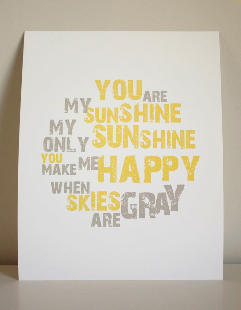
To illustrate, I chose a couple of prints from Etsy with the same phrase. (There were 540 to choose from for You Are My Sunshine!)
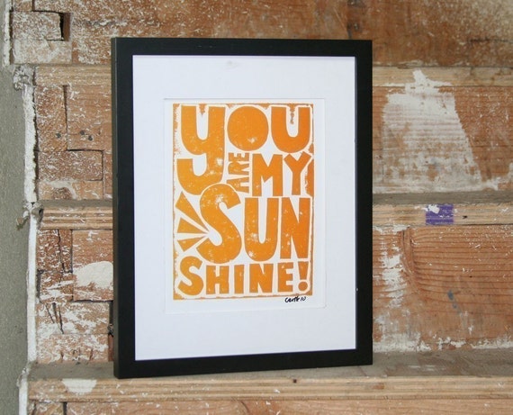
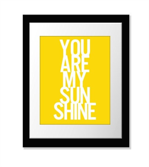
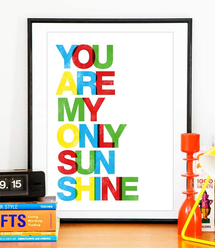
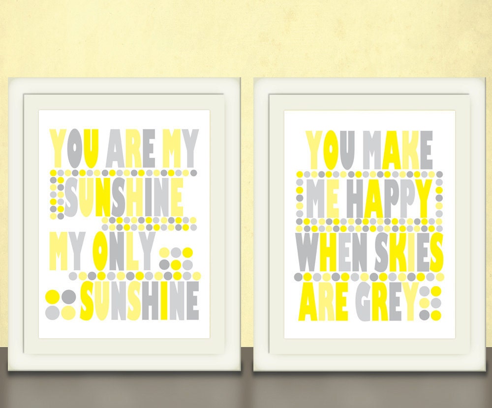
Fun, right? Each totally different than the next.
To make your own, you could simply buy a set of stamps (or a couple of sets to break up the sizes and styles), or keep an eye out for vintage woodblock letters at vintage stores. (I once made monogrammed stationery for a friend this way, and gave her the stationery AND the stamps as a gift. They look cool on a shelf and that way, you can always make more.)
Or you can make your own letters--this is what the Walker exercise was all about.
As I understand it, creating a font is all about creating a language of elements and applying it to all of your letters. Dave watched a movie about typeface design, and from this he learned that you always start with the lowercase h: it determines both your straight and curved elements, and sets the height for the set. (Another aside: Helvetica is a pretty cool documentary about one of the most common typefaces in use, and Typeface, about a type museum in rural Wisconsin, looks intruiging.)
At the Walker, we started simple. Clio and I created "daddy" and Eleri and Dave created "Mommy."

Then, Clio and I got ambitious. She chose a phrase from a favorite bedtime song. We got the poster sized paper and started printing away.

Take me out to the ballgame. (It looks better in person. I'm SURE this image is not convincing you to go out and do this, but it's fun, I swear.)
I hung it up in my new hallway vignette just for fun, and I love the idea of creating a more finished piece using this technique, possibly for the downstairs bathroom.


To make our letters, we used a combination of wood pieces and foam blocks, coated them in ink (it was spread out on glass trays), and pressed them on the paper. Simple.
What do you think: would you get crafty and make your own typographic print? What phrase would you use?
No comments:
Post a Comment
Let me know what you think. I love hearing from you!