Showing posts with label design. Show all posts

Wednesday, December 4, 2013

A plan

While the living room rug continues to confound me, I finally have a plan for the upstairs hallway that is making me very, very happy.

I was (very loosely) inspired by this.


(Muriel Brandolini's old bathroom, published in New York Living, which continues to be one of my all-time favorite design books.)

This wallpaper.


And black and white candid photography (maybe the party pictures from our wedding?), in a staggered line.


Only problem?  Funds for the wallpaper.

Alas.

You know I am thinking about creating my own stencil or block print, right?  Ugh.

Monday, June 3, 2013

My work on Urban Compass

I love dispatches from afar!

I just got these images from NYC.  I worked on this living room, dining room, and an office about two years ago.  The clients' friends just launched Urban Compass, an online neighborhood guide for NYC, and this apartment is featured for Gramercy Park.  So fun!


If you are a New Yorker or planning to visit, you might check out Urban Compass.


Wednesday, April 17, 2013

Choosing a palette for a girls' room

You know that 9 year old girls are my favorite clients, right?

Well, 5-year-olds aren't so bad, either.

I recently completed a plan for a Big Girl Room in a newly renovated house.  Mom spent loads of time and energy managing a gorgeous renovation, and she just needed a little help rethinking her daughter's space.  She wanted modern preppy (leaving the PB Kids and pastel gingham behind), and her daughter's main requirement was bright pink.

With pale grey walls and carpet and white trim and bed, I had a nearly blank slate to work with.  We discussed doing some custom elements, and that meant one thing: starting with fabrics.

I presented my clients with a number of color options, including:

Pink and Orange


Pink and Aqua


Pink, Red, and Navy


And a multi-color approach


As well as pink and grey and pink and navy, not pictured here.

It can be really fun to present options like this.  Some people can be overwhelmed, but it was quickly clear that this client knew what she wanted and we were able to zero in on a scheme.  

Often, I find people just need something (some GOOD things) to react to to figure out what they really love.

What do you think: any favorites?


Monday, November 12, 2012

Three Ways

Hello from NYC!

I'm feeling blessed to be here post-storm, for a beautiful weekend with friends and family.

Before I left home, I was digging through my photo archive for another post, and I came across these images of my living room three ways.  These were taken a LONG time ago, when I was experimenting with different art and accessory choices for an overall look/feel.  The room feels so unfinished to me now without curtains or some of the other layers that have emerged over time, but it's still fun to see how you can produce various vibes around one major piece, like our brown Bantam couch.


In the end, I'd say the living room has progressed in a more eclectic, sophisticated way, and looking back makes me love what it has become.

I think the lesson is that there's no "right" or "wrong," and playing around with all the pieces you have to work with can sometimes yield surprising results--or teach you what your style really looks like.

Am I alone in this?  Or do you play with your stuff this way, too?


Monday, November 7, 2011

Art You Can Make: Typography

This weekend we went to the Walker Art Center's Free Family day (first Saturday of the month).  They always have amazing, creative activities for kids that relate to the current shows in the galleries, and right now there is a big graphic design show on.  (As an aside, I was thrilled when my husband noticed that a book I worked on is in the show: Above the Pavement, the Farm, with WORK architecture company and designers from Project Projects).  In keeping with the theme of the show, one of the art activities was to create your own font or typeface out of common objects, and to do your own printmaking.

Let me tell you, we got IN to it.

Typography prints are so big these days, I was inspired by this activity, thinking you could make original works at home--on your own, or with your kids.  It would be fun to take a phrase meaningful to you and your family, but I love that even a "standard" phrase, something familiar in the lexicon, can take on different personalities when hand-printed.  The layout, the shapes of the letters, the colors--it all adds up to something uniquely you.

To illustrate, I chose a couple of prints from Etsy with the same phrase.  (There were 540 to choose from for You Are My Sunshine!)

BABY NURSERY ART You are my Sunshine print typography Raw Art Letterpress

You Are My Sunshine Print // 8x10 Inch Fine Art Print // PO // Yellow White // Choose Your Colors // 2/7

You are my Sunshine poster  art print  baby nursery art A4 or 8 x 11

You are my Sunshine & You Make Me Happy art prints in yellow and grey, size 8x10

8x10 You Are My Sunshine print

Fun, right?  Each totally different than the next.

To make your own, you could simply buy a set of stamps (or a couple of sets to break up the sizes and styles), or keep an eye out for vintage woodblock letters at vintage stores.  (I once made monogrammed stationery for a friend this way, and gave her the stationery AND the stamps as a gift.  They look cool on a shelf and that way, you can always make more.)

Or you can make your own letters--this is what the Walker exercise was all about.

As I understand it, creating a font is all about creating a language of elements and applying it to all of your letters.  Dave watched a movie about typeface design, and from this he learned that you always start with the lowercase h: it determines both your straight and curved elements, and sets the height for the set.  (Another aside: Helvetica is a pretty cool documentary about one of the most common typefaces in use, and Typeface, about a type museum in rural Wisconsin, looks intruiging.)

At the Walker, we started simple.  Clio and I created "daddy" and Eleri and Dave created "Mommy."


Then, Clio and I got ambitious.  She chose a phrase from a favorite bedtime song.  We got the poster sized paper and started printing away.


Take me out to the ballgame.  (It looks better in person.  I'm SURE this image is not convincing you to go out and do this, but it's fun, I swear.)

I hung it up in my new hallway vignette just for fun, and I love the idea of creating a more finished piece using this technique, possibly for the downstairs bathroom.


To make our letters, we used a combination of wood pieces and foam blocks, coated them in ink (it was spread out on glass trays), and pressed them on the paper.  Simple.

What do you think: would you get crafty and make your own typographic print?  What phrase would you use?


Tuesday, August 9, 2011

Put Your Stamp On It

My husband kind of has a thing for stamps.  He doesn't collect them ,it's not like that, he just gets kind of excited when new collections come out at the post office.  This is one of those utilitarian things where I--the aesthete--would just buy a roll of flag stamps, just your basic little guys that are all business.  But Dave buys them in sheets.  He buys the Simpsons, and Jazz Musicians, and Quilts.  He went to the post office recently and came home with some of the latest designs, including these Pioneers of American Industrial Design.

This image is a larger version of the Pioneers of American Industrial Design (Forever) product.
I love them.  He got extra because he knew I would.

I think the lamps are my favorites, though those bright pitchers are surely in the running.

So tell me: do you buy plain stamps, or do you go for the designs?  What's your favorite?


Oh and p.s., I have a little stamp project to share later this week.  True story.

Wednesday, July 27, 2011

When Function Sends the Dominoes Falling

A couple of weeks ago, the thermostat here in Minneapolis hit 104 degrees, the hottest it had been here in something like 40 years.  Even with central air, my girls' room was an absolute sauna.  I quickly realized the problem: each of their beds sat on half of a floor vent (and the curtain panels hung down on top of the other half.)  It had never been a problem before because we hadn't lived through so much heat in our 10 months in this house.  I happened to be home alone, and in the sweltering heat I moved all the furniture right round, taking me from here,


To here.


(Keep in mind that the room will be painted this color.  Just try to ignore the fact that there is at least one too many dominant colors in this room.)

This was actually my second choice layout from the get go, but with my younger daughter (barely two at the time) transitioning to a big girl bed, it seemed pretty important to have her up against a wall.  (She did fall out of bed the first night with the new arrangement, but only once.  She's a quick study, that girl.)  There are a number of things I really like about this new arrangement, but the change also makes me aware yet again that everything is so contingent in a room, so codependent, if you will.

Some good stuff: I always struggled with the symmetry of the other space, the pair of beds flanking a dresser with a pair of lamps, the pair of curtain panels, the (mismatched, but still) pairing of art, the way each bed had something at the foot.  This way, the pairs get all split up, with the beds facing the lamps and the curtains adjacent.


Better. This arrangement also created a place for that chinoiserie table--my grandmother's--that little vintage ceramic  lamp--my first ebay purchase--and the painting over the dresser, which I bought on a road trip to Taos before grad school, specifically for the future bedroom of daughters I didn't know I would even have.

Also, the space feels bigger.  It always boggles the mind that putting furniture in the middle of the room creates a greater sense of space, but it almost always works out that way.

Some bad stuff.  We lost the little table and stools in the middle of the room, though to be honest the girls never used it and it just became a place to leave crap.  Also, if this had been my layout from the beginning, I would have used an 8 x 10 rug, to better fill the space between the beds.  I would have found a 9-drawer dresser to better balance the width of the beds.  Those are things I can't change just now, but moving everything around changed the relationship of the fabrics to one another, and all of a sudden, I want to futz...

The plaid suddenly feels too close to the curtains, and like the pieces are too big.  What if I put it on bolsters, instead, and put a textural throw on the white bedding?


Hmmm...now the swing chair cushion might need a little plaid, too, instead of the curtain fabric.


Now do I need more color?  How about this hilarious and awesome poof that my mom bought for us at Home Goods?


Hmmm...too much fuzzy texture.  And not sure about the raspberry on the green rug.  What about a graphic striped rug?  (The one I originally bought for this room)


But now is the plaid too much?  How about back to the chartreuse moire?


Of course, in the summer the duvets are mostly pulled back.  


Might be too bare with the bold rug.  Back to green.


Hmmmm...I would love some patterned sheets, maybe a narrow green and white stripe?  Or maybe white quilts to go with the pillow shams.  But I did like the brown and white, maybe a chevron pillow?


hard to see in this shot, but I kind of like it.  Please ignore the butterflies on the sheet covering the box springs: very distracting, I know.

After this little journey, here's where things stand.


What do you think: green rug or striped?  Poof or no?  (It's a closer color match to the headboards than in these pictures.)  Which combination of blankets, pillows, etc is your favorite?

Also, welcome to my brain.  I think the reason decorators have such a hard time making decision in their own house is this instinct to consider (and reconsider) every possible relationship between every element in the room.  Speaking of which, once the walls are pink that dresser might go white.  

Who knows, right?

It took me a long time to understand why Domino magazine had that name, but believe me, I get it now.


Tuesday, June 7, 2011

Building around heirlooms: Quilts

We moved into this house not too long after my husband's grandmother moved out of hers, and we were lucky to inherit a number of special things from her, including a pair of handmade quilts for the girls.  Originally, as I started planning their room, the idea was to build the design around these quilts, and I folded them at the end of the two beds to get a feel for them in the space.  (It's funny: the quilts are two different patterns, and it was immediately clear to me which was whose: the daisies for my older daughter, who likes to garden and wear dandelion crowns, the waves for my younger daughter, who is always making waves.)  As I was thinking on it, my mother in law sent me an email with a few more details about the quilts: how they had been hand stitched my her mother.  In the 1930s.  After that, the first time a little bit of somethin somethin got on them (boogers, maybe?) I put them away for later.

Lately I've been seeing a number of sophisticated rooms that incorporate quilts, and I thought I'd share some inspiration with ideas on how to keep quilts feeling modern.

Minimalist
The elements: low bed, industrial wall lights, spare furnishings, Scandinavian lines


[Lotta Jansdotter's house, via Wise Craft]


Bolaget Inspiration - www.bo-laget.se/inspiration/

[Via Bolaget Bild från www.bo-laget.se/inspiration/]

Traditional
The Elements: soothing palette, simple bedding, fabric lamps shades, clean lines


[via Elle Decor]


[Via House Beautiful]


[Via House Beautiful]

Funky
The Elements: lots of pattern, dramatic shapes, eclectic art


[Annie Selke via Elle Decor]


[Kathryn Ireland via House Beautiful]


[Via Elle Decor]


[Via Architectural Digest]

Look at that last one again.  Fabulous, no?  That's the one that started this whole thing.

So what about you.  If you were building around a quilt, would you gravitate to one of these styles?  Or would you go for the more typical country or shabby chic scheme?

I'll build boards for two of these looks tomorrow, so come on back!


Thursday, January 27, 2011

On ordering Custom Furniture (and settee round-up)

Any time I bring something new into the house, I hate it. Hate it! No matter how much I loved it in the store. This lasts for about 24 hours, and then I start to acclimate to my true feelings, which are usually positive, often love. Does this happen to other people? Am I just that bad with change? A room--a home--is a very dyamic thing, and adding, subtracting, or rearranging changes everything. The way it looks, yes, but also the way it feels, the stories that the objects tell when put in a different relationship to one another. You can bring in fabric swatches, paint large samples, tape off the dimensions on the floor, but you cannot totally predict how a new piece is going to sit in your room.

Hence the nerves around custom furniture. It can't go back. Not only can you not see EXACTLY what it will look like when it is made, you can't see how it will play in your room, and you are stuck with it. And it probably cost more than your last 6 decorating choices combined. (at least, if you shop craigslist and Home Goods, like me.)

So. Our new loveseat arrives tomorrow.

It was, naturally, a saga to choose it. And of course it takes long enough to build the thing that it's easy to forget about it and move on with life. But now it's almost here! Oh, the suspense!

Why was it a saga? Oh, so glad you asked. The short answer is that it was the last thing to come into the living room, which meant there were all sorts of parameters to work around. First, the size. Most loveseats are really not that small. They tend to be at least 60" long and 36" deep, which is really just a truncated sofa and felt like it would encroach too much on the space in the room. We needed more of a settee. Or a sofette. Both of which are slimmed down in all their proportions, and more like 32" deep. After lots of searching on individual websites, I found this blogpost at lolalina, which offers a pretty comprehensive round up. I also found the Sutton Sofette from West Elm and the "mini Sofa" from Pottery Barn.


But most of the companies that make these smaller scale upholstered pieces do not have showrooms in Minneapolis. And my husband felt the need to actually sit on the thing before we paid a lot of money for it. Picky, picky, picky. At West Elm the manager told me they would "never ever ever" get that piece on the floor, but that it was fully refundable so long as I got one of the stock fabrics. (By the way, they now do have it on the floor, and it is incredibly uncomfortable. Bullet dodged.) At Pottery Barn, the mini sofa is catalogue only. I had an incredulous conversation with the customer service rep on the phone, where I kept saying. "so, just so I'm clear, it is impossible for anyone interested in this sofa to sit on it. Under any circumstances. Ever." For a moment, I considered ordering wither of these sofas in stock fabric, sitting on them, and then, if I liked them, sending them back and reordering in the fabric I wanted. But not only would that be insane, it would also take 16-20 weeks by the time both orders were processed.

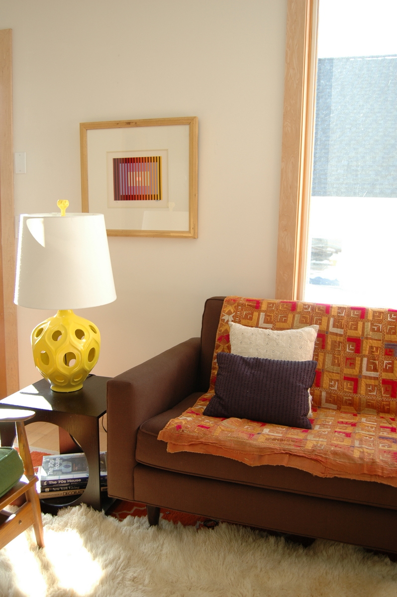
On top of these difficulties, we needed the piece to be pretty from the back. Our living room is really lacking for solid walls, and the loveseat will mark the divide between living room and back hallway, which means we will look at the back of it every time we come in or out of the back door. Almost every model fails in this regard.

So, the frame. I will leave out the dozens of rejects, lest you think I am completely obsessed. These were the real contenders.

The Suffolk, like its name, felt a bit formal with the rolled arms and turned legs, though the contrast seemed nice with all the mid-century lines we've already got going.
I loved the feminine lines of the Azure, and the curved back, but felt that 60" long was pushing it for our space. (By the way, the lavender linen they now stock it in is totally to die for. I would pair it with yellow silk curtains and a white morroccan rug.) Also, you can tell this is not a popular item since they haven't even bothered to photograph the product. There's a rendering of the loveseat on the website, and a photo of the sofa version here.


This little sweetie from Lee Industries, on the other hand, was a bit small at just 50". (And the photo is TEENY. Sorry about that.)


This was better, also from Lee, but still a bit sweet in the arms.


And here we have a winner. Lee again.

Love the curved back and streamlined form, but it still has a more masculine tailored arm and base.

Didn't I make that sound easy? Well, it wasn't. Months, I tell you. It took months to pull the trigger. Partly because--guess what? We couldn't sit on it. So we have taken the exact leap of faith that we said we weren't willing to make from the get go. Like when I moved to Brooklyn in order to have outdoor space but bought an apartment without outdoor space. Yes, just like that.

And then there was the fabric choice. The room has an orange and white rug in a moorish tile pattern, the Bantam sofa from DWR (clean lines, tight back) in espresso, black side tables, and medium wood tones on a danish modern armchair and mid-century wood slat coffee table, along with art in every conceivable color (it works, I swear). So it couldn't really be about color or pattern; it had to be about texture. I told my designer Sister-in-Law about a Maharam fabric I had wanted for our sofa (which cost an arm and a leg.) It was a tweedy brown with glamorous gold thread woven in. Well, lickety split, Maud pulled out a fabric swatch from Kravet that did my description justice. Love at first sight.

But even then, I second guessed. Because while I could picture it on the frame, I couldn't actually LOOK at it on the frame, and the same way that a paint square changes when applied to a whole wall, a little fabric sample looks different on a piece of furniture, and what if I hated it? Even after the first 24 hours? I hemmed and hawed and thought that choosing the same color as our sofa in a different texture would be sumptuous. Espresso velvet. Usually when I come to these conclusions the thing I want doesn't exist, and then it's all, well, I'm off on a wild goose chase again! See you in a month, honey! But this time it did exist, and from the manufacturer who makes the settee, no less. But I'll tell you, in the room it felt a bit dark, like it sucked the light right out of there, and I love the way the gold fleck in the Kravet fabric reflects the light.

And so, tomorrow, I will have to report on how beautiful this thing is in person. And, presumably, how much I hate it. Over the weekend, I will come to my senses, and I will--knock wood--share the love next week.

Oh, and fingers crossed that the damn thing is comfortable. Otherwise, I will never be allowed to sit on our sofa again, having been relegated to the pretty but unusable loveseat for the rest of my days. And this will be just.

LinkWithin

Related Posts Plugin for WordPress, Blogger...