To here.
(Keep in mind that the room will be painted this color. Just try to ignore the fact that there is at least one too many dominant colors in this room.)
This was actually my second choice layout from the get go, but with my younger daughter (barely two at the time) transitioning to a big girl bed, it seemed pretty important to have her up against a wall. (She did fall out of bed the first night with the new arrangement, but only once. She's a quick study, that girl.) There are a number of things I really like about this new arrangement, but the change also makes me aware yet again that everything is so contingent in a room, so codependent, if you will.
Some good stuff: I always struggled with the symmetry of the other space, the pair of beds flanking a dresser with a pair of lamps, the pair of curtain panels, the (mismatched, but still) pairing of art, the way each bed had something at the foot. This way, the pairs get all split up, with the beds facing the lamps and the curtains adjacent.
Better. This arrangement also created a place for that chinoiserie table--my grandmother's--that little vintage ceramic lamp--my first ebay purchase--and the painting over the dresser, which I bought on a road trip to Taos before grad school, specifically for the future bedroom of daughters I didn't know I would even have.
Also, the space feels bigger. It always boggles the mind that putting furniture in the middle of the room creates a greater sense of space, but it almost always works out that way.
Some bad stuff. We lost the little table and stools in the middle of the room, though to be honest the girls never used it and it just became a place to leave crap. Also, if this had been my layout from the beginning, I would have used an 8 x 10 rug, to better fill the space between the beds. I would have found a 9-drawer dresser to better balance the width of the beds. Those are things I can't change just now, but moving everything around changed the relationship of the fabrics to one another, and all of a sudden, I want to futz...
The plaid suddenly feels too close to the curtains, and like the pieces are too big. What if I put it on bolsters, instead, and put a textural throw on the white bedding?
Hmmm...now the swing chair cushion might need a little plaid, too, instead of the curtain fabric.
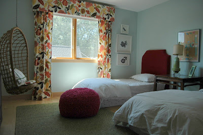
Now do I need more color? How about this hilarious and awesome poof that my mom bought for us at Home Goods?
Hmmm...too much fuzzy texture. And not sure about the raspberry on the green rug. What about a graphic striped rug? (The one I originally bought for this room)
But now is the plaid too much? How about back to the chartreuse moire?
Of course, in the summer the duvets are mostly pulled back.
Might be too bare with the bold rug. Back to green.
Hmmmm...I would love some patterned sheets, maybe a narrow green and white stripe? Or maybe white quilts to go with the pillow shams. But I did like the brown and white, maybe a chevron pillow?
hard to see in this shot, but I kind of like it. Please ignore the butterflies on the sheet covering the box springs: very distracting, I know.
After this little journey, here's where things stand.
What do you think: green rug or striped? Poof or no? (It's a closer color match to the headboards than in these pictures.) Which combination of blankets, pillows, etc is your favorite?
Also, welcome to my brain. I think the reason decorators have such a hard time making decision in their own house is this instinct to consider (and reconsider) every possible relationship between every element in the room. Speaking of which, once the walls are pink that dresser might go white.
Who knows, right?
It took me a long time to understand why Domino magazine had that name, but believe me, I get it now.


I say yes to the pouf! Seems perfect for a girls' room. And I'm digging the striped rug - sort of keeps things from being too precious. But I don't think you can go wrong, Heather, since you have great pieces to be working with. I do love the idea of that dresser in white. And I'm in love with the painting hanging above it.
ReplyDeleteI love how it stands. The plaid on the beds balances the warmth of the curtains. The raspberry pouf against the green rug is lovely, and keeps the space from seeming too stiff.
ReplyDeletePouf and striped rug!! Yes to dresser in white.
ReplyDeleteI agree with kate and Bri--I liked the striped rug better, but I don't think there's a wrong choice here. It just depends how you want the room to *feel*. (how's that for totally not helpful?) I think the stripe feels more punchy and less sweet. Love the pouf either way!
ReplyDeleteabby
I like the striped rug & pouf! I think the dresser going white would be nice, too.
ReplyDelete