
People tend to hang their art too high.
Lately I've noticed a lot of gallery walls that form a long horizontal block that just floats halfway up a wall. The arrangement itself is great, the pieces are fun, but it just looks wrong. Here's the deal: you need you art to feel connected to something else in the room. Now, I'm not going to show you examples of art walls that are "wrong," because a) who am I to say what's right out and b) at the end of the day it is a matter of preference. But if you're thinking about creating your first gallery installation, allow me to make my case.
Here are some great examples of gallery walls that reach down low.
Just the right amount of space between the art and the furniture. Bonus points for the incorporated sconces in these three:


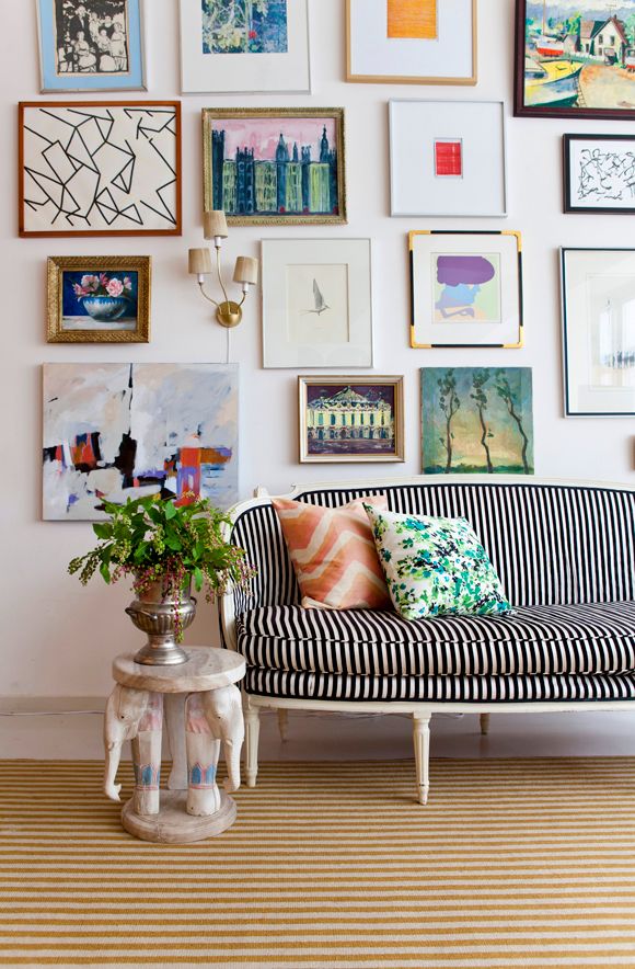
via littlegreennotebook.com
Love the asymmetry in this next one. The lowest piece on the left relates the whole gruping to the chaise, leaving negative space on the right, adding tons of energy. But without that low piece? The whole thing would just float away.

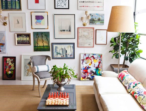
Excellently placed negative space in this one--again, it works because the wall is grounded by the lower pieces, which connect to the desk.

It doesn't take much: see how just those two little hearts hold this whole arrangement in place, even with that high slanted ceiling? (I've been thinking of something along these lines for a girls' room.)

To be honest, I'm not sure you can go TOO low.


Right?
In fact, incorporate propped art as your lowest level, whether right on the floor, on a ledge, or on a piece of furniture, like these:
via littlegreennotebook.com

here

Of course, there are exceptions to every rule.

But the principle is still the same here: it's just that the works relate to the ceiling, not the (more typical)
furniture. Though the low pieces here are much closer to the couch than a lot of work I see!
Tomorrow I'll show you the gallery wall in my master bedroom--expanded and, I think, better than ever.
No comments:
Post a Comment
Let me know what you think. I love hearing from you!