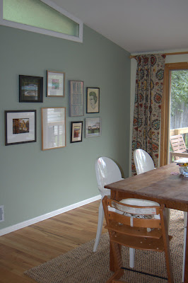
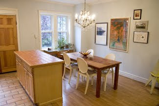
On the day they came to install, I learned a thing or two about the practical aspects of hanging a group of works, the actual nails and measuring, and I have now put the tips into practice in three houses and several arrangements, like this one in the dining room in Boulder.
When we moved into our new house, I had an immediate vision for a wall of art in the office, a more private room tucked away at the back of the house, where there was one large, blank wall. Because the scale of the wall was much larger than the ones I had worked with before, I knew it would take some careful planning. Now, there are entire books on the subject of hanging art displays, but I believe it is largely instinctive, a matter of personal preference in terms of both the aesthetics and, more importantly, what story you want to tell. Apart from feeling it out, there are a few steps that work for me. (You can do this in just a couple of hours, and it's really fun).
1. Choose your work
Most people don't have endless works of art to choose from. When making a grouping, you may just want to use everything you have--you chose each of the pieces, you can probably make them work together. If you do have more to choose from, look for commonalities that tie a group together, whether a color scheme or a subject theme. If there's no theme within the works, you probably want to limit yourself to one medium, say photographs, oil paintings, or works on paper. If all your pieces relate to the ocean (to choose a subject at random), you can much more easily mix a watercolor and a photograph. Keep in mind that the frames are a visual element, too. Some people will suggest framing everything uniformly, but I say, not necessary. You can use uniform frames as a way to make a statement- I once saw a long hallway filled with black and white photographs all framed in red, which packed a totally chic punch- but the general rule of thumb is to choose a frame that is right for the piece, not for a grouping or your room.
2. Plan your composition
This is the fun part. Take all the pieces your thinking of using, and lay them out on the floor. Move them around until it feels like they fit. I usually start with the largest piece, which I like to put somewhere near the middle for weight, and then let the smaller pieces radiate out from there.
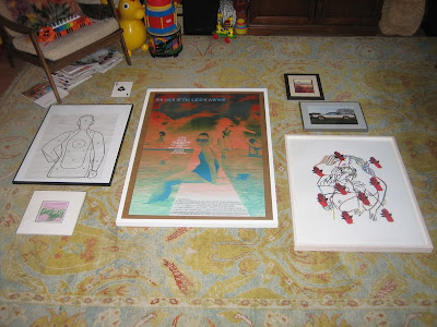
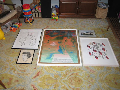
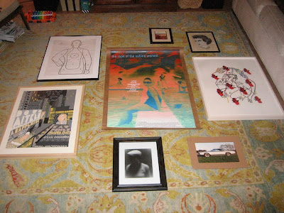
I also think about balance in terms of light and dark, both in the piece and in the frame material, and the density of the image versus the amount of negative space. With a very large wall or a lot of pieces, it's also a good idea to think about creating pockets of order within the larger composition- incorporating pairs or using symmetry in placement, as I ultimately did here in the office.

With fewer pieces, you can create a sense of energy by playing against symmetry. Our final grouping in our Brooklyn dining room had three pieces hung "too high"- not everyone's cup of tea, but in the end I found it more interesting than if it was completely balanced. (And, i will admit, a happy accident-I used existing nails from a previous grouping for one or tow of the pieces on the right, and then just went with it.)
3. Mock it up
Once you have your arrangement set, take a picture: you'll need it for reference later. (It's also helpful to do this while planning your composition- you see things in the photograph that you may not see looking directly at the arrangement.) Now trace each piece on butcher paper, cut them out, and label them. With smaller walls I have generally skipped this step, though the results vary. In our Boulder dining room, one half of the arrangement ended up all scrunched up while the other half had more breathing room between pieces. Oops! I had to swap in a bigger piece on the left to make it feel more balanced.
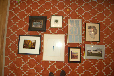
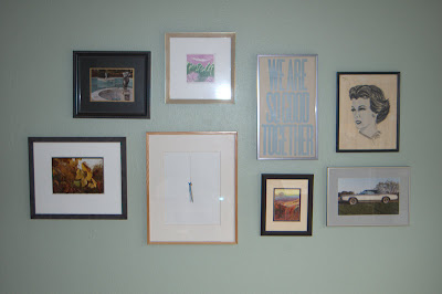
When you have all your paper cut, refer to your photo and begin adhering the paper to the wall, using some of that sticky tack that won't leave a mark on the wall. It's a good idea to measure the overall dimensions of the arrangement in order to place the first piece on the wall, but eyeballing it should get you pretty close, too (I'm definitely an eyeballer). This is also a good chance to make any adjustments based on what you see in your photos from the floor layout. In our office, I realized that the little square piece at the top of the grouping was too disconnected from the piece around it when centered; I moved it off center towards the other square piece, and I like the energy this ended up giving things.


4. Hang it!
Take a picture of the mock up, too, and use it to finalize things. Without the distraction of the color in the artwork, you might see some wonky things in the layout. In our office, I didn't end up liking the single piece way on the right,kind of hanging out alone, and simply nixed it from the scheme. Make any final adjustments to the mock up, and get ready to hang. Measure the distance from the wire on the back of each piece to the top of the frame, then measure down from the top of the butcher paper to mark the spot for the nail or picture hook. Measure across the paper, too, to find the center. You can pound the nail in and then remove the paper, but if you want to save the paper for another use (fingerpainting!), I recommend hammering the nail in just enough to make a mark, then removing the paper and finishing up with the nail. Repeat. And repeat, repeat, repeat!
Here's the finished product in our office:

It is, by far, my favorite to date. I love the scale and the overall statement, the fact that I was able to collect all of our poster and text-based work into one place, and the accidental color story. But most of all, I like that every single piece here is significant to at least one of us, and most are significant to both of us. The Doug Aitken poster and the small flower drawing beneath it are from Creative time events; Sur Les Paves La Ferme is from the WORKac project at PS1, where Dave worked on the project and I edited the book; the target is from a day Dave spent at a shooting range for a bachelor party and the Fred Tomaselli newspaper print was a wedding present to both of us; the watercolor on the far left was made for Dave by the little boy he was an au pair for in Denmark, and there are three pieces by Clio incorporated, too. (Don't be afraid to mix amateur work in with the "real" art). It was a lot of work to hang this particular wall, especially since I actually did it right for once, but I have to say, I love the result, and the story that it tells about our lives together.
I say, go for it in your own house, and if you do, send me pictures to post!

Looks great and def. going to use your tips!
ReplyDeleteThanks for sharing. I would like to do a hobby room with this type of wall art arrangement using select DAF boxes. Thanks for sharing the all-too-important how-to. If I ever get such a wall produced, I will link back to you AND send photos.
ReplyDeleteair jordan 11
ReplyDeleteair max shoes
instyler ionic styler
seattle seahawks
fred perry polo shirts
arizona cardinals
winter coats
louis vuitton handbags outlet
marc jacobs
michael kors outlet
karen millen uk
beats by dre
michael kors handbags wholesale
soccer jerseys wholesale
lululemon pants
tory burch outlet online
gucci outlet
tiffany and co
golden state warriors
winter jackets
mm1111