
Here's what we chose:
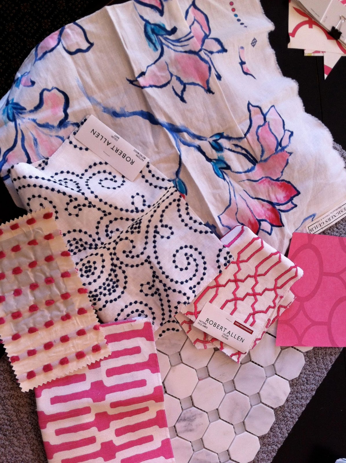
That white linen with the navy embroidered pattern (middle, Robert Allen) will be draperies. The top fabric, a scrumptious watercolor lily print from Designer's Guild, will make euro shams. The furry pink dot on the left is intended for a bedskirt (though we may go retail), and the graphic pink trellis options are, well, options. The pink wallpaper at right is for the en suite bathroom--I'll show you that plan tomorrow.
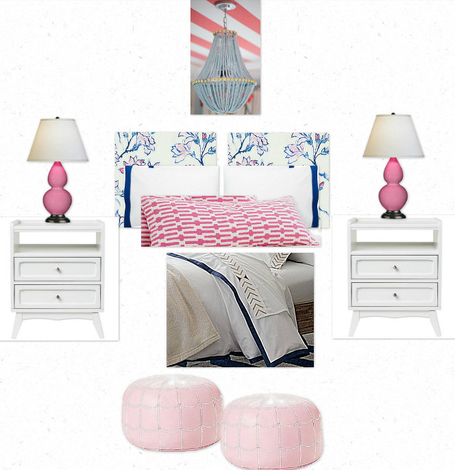
Even with these colors and patterns set, there is still plenty of room to create different vibes. Here's how.
Preppy Cottage

mis-matched nightstands and a shabby chic chandelier give this space a fresh take on cottage. All the graphic punches of solids keep it from getting too sweet.
Regency Glam

The bits of bling (chandelier, nightstand hardware) add glitz, while the coordinating geometric motifs reference Hollywood Regency style.
Eclectic Bohemian
Pink leather poufs and a bead chandelier are beachy global, while the masculine bedding and mid-century inspired nightstands keep it down to earth.
Preppy

Seeded glass lamps, chunky navy nightstands, pom pom pillows, ribbon trim shades on a classic chandelier, and those french ticking stripes on the bench--very preppy "Nantucket"! All of a sudden, this is my favorite. How cute is the little pillow in Lulu DK's "love" embroidered print for Schumacher Child?
It's amazing how much the look can change, even with the same colors, same base elements, and even some of the same prints, don't you think?
You have some great fabrics picked. I'm loving the eclectic bohemian look !
ReplyDelete