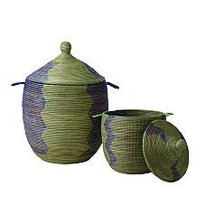
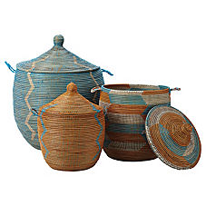
Everyone is going ga ga for Serena and Lily's Senegalese storage baskets, and I will admit, I'm joining the hype. After the prevalence of African stools and textiles such as kuba cloth over recent years, African baskets seem like a natural trend, especially when done up in such fun colors.
Available here. Only problem (can you guess?) The price tag.
Amber over at Amber interiors took matters into her own hands when she found a similarly-shaped basket at Home Goods, and improvised with tape and spraypaint.
Pretty cute, right? (Tutorial, here.)
When I first saw the Serena and Lily version, I was immediately reminded of the Asunden collection at Ikea.
While they don't come in a large storage size, the type of weaving and the shape of the lidded bins gives the same feeling. I bought the group of three (above) back in the fall, and have been using the smaller ones to hold toilet paper in two of our bathrooms (there's no closed storage), and the lidded one for trash in our master bath--love that it's covered! There are also these bath accessories:
And this individual lidded basket
The best part? The set of 3 is $34.99, the pair of bath accessories is $9.99, and the lidded basket is just $6.99.
Sold.
Thursday, June 30, 2011
"Senegalese Storage" the Ikea way
Wednesday, June 29, 2011
The Pouf Solution
Now that my living room is mostly pulled together, I go back and forth between feeling like I can just be done for a while and feeling like I really need to figure out the extra-seating-in-front-of-the-fireplace problem. For those of you new to the blog, I was feeling that leather poufs would be ideal but, lacking the funds, I set out to find another solution, like floor pillows. After researching all these little square ottomans, I thought I would just make some. In fact, I asked my mom to save clothes that would otherwise go to goodwill so I could use them for stuffing. (Although my research also suggests that the ideal stuffing for leather poofs is garbage bags. Lots, and lots of garbage bags.) I figured I could make the square ones with the stitching on the outside edges of the seams. I was even thinking about giving fabric dye another go round.
Well guess what? Better Homes and Gardens went me one better. In the current issue feature, 50 changes under $50 (which featured a number of my fave bloggers, including Jenny and Gabrielle), they showed some DIY burlap poufs.
How perfect are those? There are full instructions on the website, here. I will be tackling this, well, after I paint the girls room. And create art for the upstairs hallway. And sew pillows for the guest room. And so and and so forth. The best part is, if they don't end up feeling right for the living room, they will be great in the girls' room. Win, win.
But when I finally take it on, I'll tell you all about it. Is it a deal?
Labels:
Better Homes and Gardens,
DIY ideas,
ottomans
Tuesday, June 28, 2011
Zebra Ottoman Two Ways
I thought this was going to be a challenge, partly because I'm not much of a zebra girl, but it turned out to be sooooo much fun. Part of the point of this (new) series is to show very different ways of working with an element that tends to pop up a lot, and here I do think I pulled off two looks even though I chose to stick with the same color scheme. Maybe not as divergent as the minimalist and maximalist rooms I built around quilts, but different nonetheless.
First up: Trad.
I'm liking the way the green chairs and the paintings pop, along with the zebra, against a neutral ground, and all the curves, in the turned ottoman legs, the gold side table pedestals, the english rolled-arm sofa (did you know Pottery Barn makes one?), the double gourd lamps, and that crazy chandelier. The sisal rug and the wood of the bar cabinet are a needed natural element.
And then: Well, Trad. How about trad rad?
This one's definitely more to the modern end of the spectrum with all the clean lines and streamlined shapes, not to mention the matte black side tables and the jungle photography art and the amazing lucite base on the ottoman.
It's no surprise that I'm drawn to this cream, brown, green,gold (and orange) color scheme, considering my recent focus on my living room, which has this palette, and I have to say, the nude lamps in the first scenario and the cream chairs in the second are totally getting me right now (both from Mitchell Gold, by the way.) I sort of feel like I would like to live in the second one now, and maybe move into the first one in my 40s. You know?
As a side note, I would probably not actually do solid brown curtains in these rooms. While I think they work just fine, it's sort of a missed opportunity. In the second room I might use Alan Campbell's petite zigzag from Quadrille.
In the first, if the windows were by the chairs, I think I'd do a cream linen with a leading edge trimmed out in something with lavender. Just saying. It's tough to do "custom" curtains on olioboard.
What do you think? Do you have a favorite? Is there something you'd like to see "two ways"? Just let me know!
Monday, June 27, 2011
West Elm: My picks from the new collection
I'll admit it: I have kind of a love-hate relationship with West Elm. I never have success when I go to the actual store, I think their furniture is, by and large, uncomfortable, badly made, and over priced (hmmmm... laying the groundwork for future blog sponsorship), but I do think they do an amazing job with accessories, accent furniture, and textiles. They manage to be very fresh and current without feeling too trendy. When they send me emails about what's new, I actually open them. Such was the case last week. There's some good new stuff. Ready for my picks?
I've really been loving small-scale checks (remember the lampshade fabric for the guest room?) This grey and white palette feels fresh enough to work in a masculine or feminine setting, and of course I love the quilting and the way they styled it against a navy wall.
This table reminds me a bit of the World Market campaign desk I put in Melissa's living room plan, but I love how airy and delicate the metal legs are.
The almost-African pattern on these new woven rugs feels just right.
I am 100% in love with these vases, especially the big one. I was just thinking that I needed pieces that were a little off-kilter, I'm such a squarer of corners and believer in symmetry (or balanced asymmetry.) They're even called "Discord vases," and while I don't need any more discord in my life, I could use just a touch more of it in my decorating.
And then on the other hand, the appeal of perfect symmetry, perfectly gorgeous colors, and the exact right finish to the surface. These are called "egg vases," and are, appropriately, teeny.
Have you ever used a sun print kit? I gave one to my husband for his birthday once. I love the application here, and if I was in the market for some china (I decidedly am not), I would LOVE to pair these with my royal Copenhagan Blue Fluted Mega.
It would be such an organic counterpoint to the graphic pattern of the china, but the equally saturated blues would balance nicely. I may not set the table with them together, but the West Elm ones would be such an unexpected grace note for dessert.
Have you seen the new collection? Any favorites that I skipped?
All images westelm.com
Oddly enough, I can't share the prices on these because the day I was browsing their site, the prices were coming up in an unknown currency and everything numbered in the thousands. Weird, right?
Happy Monday!
All images westelm.com
Oddly enough, I can't share the prices on these because the day I was browsing their site, the prices were coming up in an unknown currency and everything numbered in the thousands. Weird, right?
Happy Monday!
Sunday, June 26, 2011
Small Measures: Striped Springer-style console
[here]
Curved consoles turn up on craiglist in horrible finishes. Good solution: bold stripes. Want modern? Ghost chair. More trad? Sleek brown leather wing chair. Done.
Labels:
console,
DIY ideas,
small measures,
stripes
Friday, June 24, 2011
Size matters
Yesterday I mentioned my desire to cover a wall or two with a large-scale hand-made wall treatment, and did a little round up of the first of two trends I'm finding myself drawn to: the large-scale graphic pattern with hand-painted appeal.
The second trend can be summed up in just one word: overscale.
I've been seeing a number of interpretations of this huge Moroccan pattern around blog-town.
And I like this more delicate version, from hgtv
Which kind of makes me think of this beautiful trompe l'oeil mural of picture molding, which is not the same but feels related, somehow.
While we're talking delicate, I recently re-found this image, an old favorite from House Beautiful, and I'm loving the giant graphic, but especially the movement in it.
Of course, scale has been used lots lately to punch up the power of stripes, and, unsurprisingly, I'm liking giant painted chevron and herringbone, a la the painted floor by Mary McDonald on this week's Million Dollar Decorators (which I don't watch, lacking Bravo, but recaps of which I find highly entertaining here, here, and here.)
Herringbone. I love how the added borders here make this feel so sophisticated.
Hmmm....I felt really energized writing yesterday's post, and I'm kind of boring myself now. As lovely as these options are, it must be more proof that the all-over graphic from yesterday is the way to go. Unless....
Hmmm.....
Now I have a dilemma on my hands.
What do you think?
The second trend can be summed up in just one word: overscale.
I've been seeing a number of interpretations of this huge Moroccan pattern around blog-town.
[here]
And I like this more delicate version, from hgtv
Which kind of makes me think of this beautiful trompe l'oeil mural of picture molding, which is not the same but feels related, somehow.
[here]
[House Beautiful]
Of course, scale has been used lots lately to punch up the power of stripes, and, unsurprisingly, I'm liking giant painted chevron and herringbone, a la the painted floor by Mary McDonald on this week's Million Dollar Decorators (which I don't watch, lacking Bravo, but recaps of which I find highly entertaining here, here, and here.)
[here]
The mix of colors here, and particularly the color gradient of pinks and reds, feel far more interesting than the two color zig zags that are everywhere just now. Another way to set it apart?
[here]
Hmmm....I felt really energized writing yesterday's post, and I'm kind of boring myself now. As lovely as these options are, it must be more proof that the all-over graphic from yesterday is the way to go. Unless....
[here]
Now I have a dilemma on my hands.
What do you think?
Thursday, June 23, 2011
Loving Graphic Wall Treatments
So, you may have noticed that stencils are kind of a trend. Probably because wallpaper is "back in a big way" but not super affordable. (I'm not quoting anyone directly there, by the way, it just feels like I've heard or read that phrase a gazillion times in the past year.)
I have two big walls that offer up molto opportunities for some creative stenciling--the laundry room upstairs and the back wall of the office--and I'm just now discovering a trend in the designs I'm drawn to. Okay, sort of two trends.
It kind of all started with this image, seen in a sneak peek on design sponge and ohdeedoh (which came first? Who can say).
I love the effect of the overall triangle pattern, which the homeowner drew and painted by hand. And I found myself having the urge to do something similar with a hexagon shape, like the bigger, more colorful cousin of the backsplash we added to our kitchen. Kind of like a painted version of this.
I love the more limited color palette in this one, and the way it is so hand made yet almost feels digital in the color gradients. I also like that the pattern does not go all the way to the edges. Cool, right?
This next one uses simple squares, but ramps up the interest by using gradient colors.
So pretty. This is from Dwell Studio, and I am remembering a similar wall treatment in a loft that, I believe, belongs to Christiane Lemieux, though I could be wrong. I can picture the living space perfectly--maybe it was in Elle Decor? Anyone? (But I digress.) Also, I wish I could be okay with this bed being nowhere near centered on the wall treatment, but I'm not. Call me rigid. I won't argue.
Anyway. Then I saw this one on Apartment Therapy last week, in a house tour.
I have two big walls that offer up molto opportunities for some creative stenciling--the laundry room upstairs and the back wall of the office--and I'm just now discovering a trend in the designs I'm drawn to. Okay, sort of two trends.
It kind of all started with this image, seen in a sneak peek on design sponge and ohdeedoh (which came first? Who can say).
[here]
This next one uses simple squares, but ramps up the interest by using gradient colors.
[here]
Anyway. Then I saw this one on Apartment Therapy last week, in a house tour.
[here]
Which feels really hand made, and also does the work of a wallpaper while celebrating its stencil-ness by stopping short of the edges of the wall. Here's a detail.
[here]
And then today on Apartment Therapy I saw this fabric stencil project, which similarly shows its hand. I would love this on a wall.
[here]
And just to throw something vintage in there, because you know I love to look on back to the good old days, I found this.
[here]
This treatment is made from wood, which is awesome, but I can also see painting a tone on tone pattern to create a similar optical illusion. I love the geometry of this, but the overall effect is kind of quiet. Which might be a good thing.
Or, how about doing the opposite, and going kind of loud?
[here]
Did you ever play that drawing game where you create a shape, draw a point in the corner of the paper, then draw lines from every corner of your shape to the point, to create a 3-d object? No? It's fun. This painting kind of reminds me of that.
So it appears that I need to tackle the office and/or the laundry room with a large-scale, overall graphic pattern that feels hand-made, whether hand painted, stenciled, or block-printed, and that it should perhaps use gradient or tone on tone color. Sound good?
So that narrows it down. Guess I'll get designing!
Oh, but there was that other trend emerging in my inspiration files. Come on back tomorrow and I'll round it up.
Labels:
laundry,
laundry room,
office,
wall treatments
Wednesday, June 22, 2011
Ta Da!
At long last, the ottoman is done.
Maybe.
Shall we review? (Is it embarrassing to admit that I am seeing this in my mind as a flip book and the song running through my head is that old Music Together classic, Happy Puppy Dog?). Here goes.
In the store
Glass = Dangerous for kiddos. I know, let's make it an ottoman! Cut wood.
Get foam
Paint Frame purple. Oops! Spraypaint black.
Reupholster with the wrong fabric.
Reupholster with the right fabric.
Freehand some rub n buff. Oops!
Tape off the stripes and try it again
Ah, finished. No?
More gold = More tape. Lots and lots of tape. Table bondage.
Perhaps should not have done this step under the influence of a glass (or two?) of wine.
But it turned out okay and let's be honest, I will probably not fix it. One more time: Before.
And after.
Love it, hate it, or total ambivalence, you gotta admit it's quite a big change!
Oh. Why is it only maybe done? Well, I'm thinking all the gold precludes the need for nailhead trim, but I'm going to live with it for a while before I make the final call.
What do you think?
Thanks for sticking with me on this one. I'm usually a done-in-a-day, for-better-or-probably-for-worse kind of a gal when it comes to projects, so this one has been a bit of a stretch.
What about you: are you in the middle of any interminable projects these days? Do tell!
Labels:
after,
before,
DIY projects,
living room,
ottomans
Subscribe to:
Posts (Atom)