
The pinterest challenge deadline is tomorrow. Have I started? No. Well, yes. I haven't started executing, but I have done a whole lot of percolating.
Remember I showed you this picture?

Not really going to happen. My husband hated it, and I do think an all over pattern might feel chaotic once the kids start pinning up their art, which is, of course,a big part of the point.
Instead, we started talking about something like this.

(Apartment of Eve Ashcraft, paint and color expert, as seen in the New York Times.)
I like the clean, modern look of it, and the reference to chair rails. It also makes sense with the existing art hanging in a line down my long hallway wall, and giving the kids access to the whole bottom half of the wall makes a kind of practical sense.
As I worried about what color (Hirshfields had a great neony yellow on the cheapo mistint shelf), I stumbled upon this.

And I became instantly obsessed with a bold pattern, but only under the chair rail. Everywhere I looked, there seemed to be contenders.

This one is from Olive Leaf stencils. Being short on time, I would have to make my own version of the stencil or tape it out. I was thinking almost all the triangles would be one color (maybe the navy from the guest room?) with a handful of hot pink ones throw in at random, which could be magnetic.
Then, I was perusing Melissa Rufty's portfolio this afternoon, and I spotted this cool grid of circles and squares.

And on bijou and boheme I spotted these big circles in stripes, with the metallic finish an obvious choice for the metallic bits, and the scale both super awesome and easy on the painter.

And then, looking for an image to upload, I was reminded of this one, hanging around my inspiration folder for ages.

But then I got distracted by the idea of something a little more organic, like a hand-painted version of this sort of faux-bois silk?

The problem with most of these, for me, is that they may look cool, but from the viewpoint of a gallery space for my kids, they don't make any sense. Where do the pictures go? What is magnetic and what isn't? If it's not clear to me conceptually, it certainly won't be clear to my kids. (I remember an assignment in art class when I was 17 to make a painting from a patterned piece of fabric and a little figurine. Everyone else made random abstract pieces, but mine had a narrative. The floral print fabric became a curtain, the little figure, which happened to be holding a hot dog, became the waiter pushing through the curtain into the restaurant.)
Anyway, then I saw this, a somewhat unexpected image from designer Muriel Brandolini.

I like the simplicity of the lines, and how it sort of references, in paint, these picture rails.

So it seemed like skinny magnetic stripes at random intervals below the "chair rail" would be a good solution. I started thinking about this fireplace makeover I spotted a week or so ago on kfd designs blog, and how much I loved the color combination.
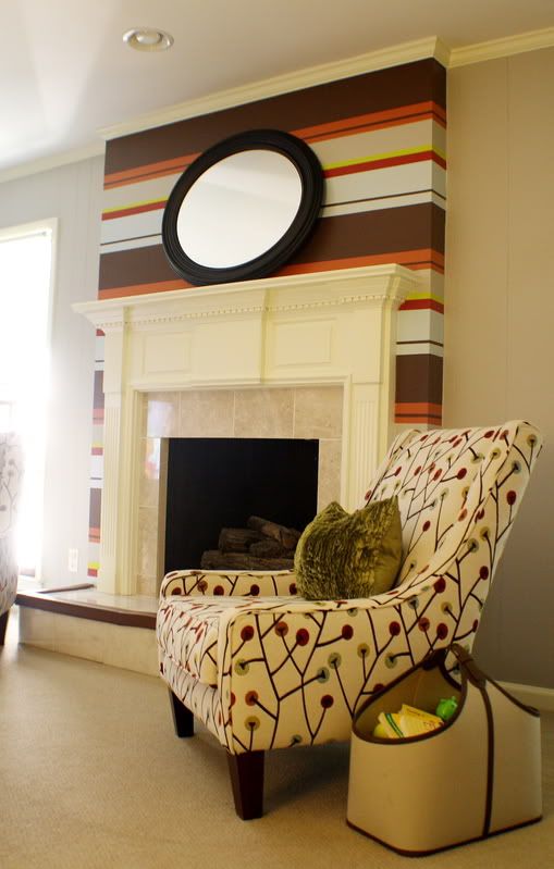
In my house, I was thinking about pulling together the colors that run most commonly through the spaces: raspberry, green, gold/yellow, and either navy or peacock blue. I would keep all the stripes uniform, about 2-3 inches thick, but at somewhat random itervals.
However. This plan was feeling just a bit--I don't know, somehow both flimsy (in weight) and rigid (in structure) to me.
So then I found myself thinking back to my earlier plan to go diagonal

(Markham Roberts)
in a two-tone raspberry stripe

(Domino)
But feeling unconvinced.
Tonight I was following a happy path of posts through the linkwithin gadget on the blog Sketch 42, and I spotted this.

It's even kind of my colors. Makes me think of my parents' northern California home in the early 70s--as I understand it, there were some rockin' paint treatments in that place.
So now I'm thinking some combination of diagonal and horizontal stripes, where the diagonal stripes are visible from the downstairs hallway and the horizontal section, closer to the girls' room, is magnetic.
But likely I will percolate overnight, and in the morning, when this is posted, it will all look different once more. And I may come back to this.
But what color?
I have to say, it's a good thing no one had to follow my path as I wrote papers about god versus nature in renaissance literature, or the oedipal complex in Art Spiegelman's Maus. I would have bored you all to tears.
But perhaps I have now, too.
You can do it!! Sending good thoughts your way :-)
ReplyDeleteI do love the stripe idea, but the triangles from olive leaf might be my fav. (maybe some of the triangles could be randomly above the chair rail line, and those could be magnetic??)
GOOD LUCK!!
eileen
www.acreativedayblog.com
So happy to see I'm not the only one that quadruple guesses personal design choices, not because I don't have faith in them, but because I have about 7 million of them floating in that little head of mine. Hazard of the business I'm afraid :)
ReplyDeleteLive Inspired,
Heidi
athousandlaughingstarfish.blogspot.com