
In her boys' room, she has second hand dressers and beds. They all have great lines, but she wonders what she should paint and what she should sand down and re-stain. With all the DIY up-cycle action going on out there, I think lots of us can relate. I think there's a thing that happens when too many items in a room have been messed with. Some kind of DIYitis. It's all about knowing when to stop.
A couple of decisions have already been made for the small room, which helps to limit the seemingly endless possibilities when it comes to customizing your pieces. Amy has this adorable red and white animal silhouette bedding from Ikea (I love that it's reversible so the two boys can have a same-but-different look). She has also promised her 4 year old that the accent wall will be painted orange.
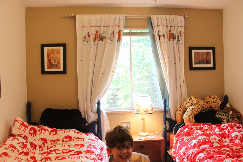
The closet doors can't function properly with the bed placement, so they need to be left bare or replaced with curtains. Since it's the first thing you see when you enter the room (the image below is hsot from the doorway), curtains are the way to go.

And finally, Amy's husband does not want to paint the bed frames white.
With two bold colors already in the plan, the goal is to work out a room that can stand up to the highly saturated colors and bold shapes, without, as Amy says, looking like a circus.
While the options are nearly endless, I like three directions.
1. Bold and Sharp
A healthy dose of crisp black and white stands up to the red and orange.

Painting the bed frames a semi-gloss black makes them stand out against the orange wall (bonus: use spray paint), while painting the dresser orange brings that bold tone to the other side of the room. Mostly white curtains give some relief against the accent wall, and horizontal striped curtains on the closet carry the bold scheme to an otherwise all white wall. Soft baskets to corral stuffed animals add a needed organic touch while repeating the black and white scheme, and the alphabet art brings just a touch of red and a tonal grey to the walls. With this scheme, I love the idea of painting the inside of the door with chalkboard paint.
2. Build a natural base
Stripping and staining the beds and the dressers in one cohesive tone makes warm wood a major feature in the room. With wood as the base, there's more space to play with a mix of colors and pattern, and adding navy to the orange and red mix feels classic.

I like the mix of three different navy and white patterns--the stripe curtains for the closet, gingham or buffalo check at the windows, and stars on the lampshade--to keep it from looking too matched, and the art carries the red from the bedding to the walls. The art, like the bedding, is all about line and silhouette, but this is balanced by the natural elements, including the organic weave of a nice big basket for toy storage. That shiny orange lamp brings our accent wall color across the room.
3. Go tone-on-tone around the room
In such a small room, it's no surprise that Amy doesn't want to paint all of the walls orange. But a consistent paint treatment around the room can make a space feel larger. By using a softer neutral two thirds of the way up the wall and topping it off with orange, Dakota gets his bold color but the room doesn't go into overdrive. I would not use molding here--just tape precisely and the effect is much more modern and streamlined.

In this case I would use either grey, as shown, or a green on the olive to khaki spectrum, and paint the beds one tone darker than the walls for a tone-on-tone effect. Then the key is to keep it streamlined, with wide-striped panels in the same neutral base plus white on both the windows and the closet door. Bring the orange back on the dresser for a color-block effect, and add roller crate storage for a natural, rustic touch. (Added bonus: the crates can slip under the beds when not in use.) With the color block being the main motif, the art needs to be softer and more realistic than in the other looks. A black and white portrait of each of the boys above his bed, framed in red (or wood), is just the right touch, and a wall sconce from ikea over the dresser has an organic feel, like tentacles, breaking up all the blocks.
One more thing.
Dina over at Honey and Fitz recently rounded up some of the best dresser transformations around the web. How amazing is this ship cutout?

Did I mention that our reader Amy is an artist? Well, she is. I wouldn't recommend this for just anyone, but I know Amy could pull off a dresser transformation along these line, and the room is so small, each piece could be considered a statement. She would choose a motif meaningful to her family, but this gives you the sense of it.
What do you think: Do you have a favorite?
Amy has her work cut out for her, but hopefully this helps her pull together a vision to work towards. I had so much fun putting this together!
Do you have a design dilemma that I can help with? Email me at heather{at}heatherpetersondesign{dot}com
All 3 designs are interesting, but I would vote #2 - hands down. #1 and #3 look very nice, but they strike me as being a little too "staged". #2 looks to be very well put together, but still focused on the boys. :-)
ReplyDeleteso, initially i like #1 best, but i think i lean more toward #2 myself. i think i may try yo do the blue dresser with an image (i was thinking maybe the flat irons), and stripping the other dresser. i also love the roll away crate idea. i'll send pictures as i get things done.
ReplyDelete