Monday, August 8, 2011

Office Progress


Oh, boy.  I'm about to show you something slightly horrifying (okay, at least embarrassing), and it is only Monday.

I gave you a peek at my office a while back, and mentioned plans to double the desk space to accommodate two work stations.  When we bought this house, little did we know we'd need two stations as we started two businesses and had two grown ups working from home.  Thankfully, this office is huge and right off the living room, an unusual scenario to say the least.

This was the workspace scenario before:


And here it is after:


I'm sort of covering my eyes with my fingers to look at this.  I'd like to claim that we JUST put the second desk in and we are still getting settled, but that would be a bald faced lie:  it has been weeks.  And weeks.

We filched the additional grey filing cabinet from my childhood bedroom (after I cleaned out the files, which included the program from every play I ever saw, among other long-lost "treasures".  Yikes!).  We bought a pine board from Home Depot and applied three coats of varnish, with some light sanding in between.  We put the board on the filing cabinets.  This is a project with a very low "difficulty" rating.

I like to think it kind of looks like the office of a small (and poor) but up and coming architect.  Clearly we have some organizing to do, but here's the real problem:  that Ghost chair, while lovely and stylish, is horribly uncomfortable for sitting and blogging and sourcing fine finds for my clients all the livelong day (and night).  Ideally, I would get another chair just like the one in there, not so much because I need everything in pairs (though that is certainly an affliction), more because there's already a lot going on in there.


The busy cowhide.  The bright colors in the art wall.  The orange chair itself and the bright yellow lamp.  And I love it all.  (Except the clutter, but that's not staying!)  What else could you really throw in there but another Eames office chair without things going off the rails?

Well, here's the problem:  our chair is fiberglass, like the vintage ones.  It is from Modernica, the owners of the original Eames mold, and we bought it through Modlivin, an AWESOME store in Denver.  Shortly after we bought it, the mold BROKE.  And while Modernica does seem to have a bunch of them still on hand, there do not appear to be any orange shells left.  And while the molded plastic ones that everyone sells have their place, yes, they really just aren't quite my thing.  Which means I am about to sign over hours of my life to obsessive ebay searching for a vintage orange fiberglass Eames shell armchair.  How's the for a list of keywords?  (Or maybe I'll call Modernica in the morning during business hours and see if they can hook me up.)

I'm sure I'll break down and come up with another solution, but for now, this is my plan, and I'm sticking to it.

Well: the Indigo shell is nice, too.

So, tell me: is your office just as messy?  Please tell me it is.

Saturday, August 6, 2011

Small Measures: Ombre Dresser


Like a paint deck writ large, for the price of a few sample pots.  Hard to improve on this watery palette: perhaps pink, a sunset?

Friday, August 5, 2011

Twin Canopies

For some reason, I have always loved a pair of twin beds in a guest room or kids room.  Maybe it has to do with my general love of symmetry and pairs of things: chairs, lamps, sconces, art.  (More on that next week.)  Maybe it has to do with my grade school friend Ania Burhardt's amazing blue and white room in her mother's Lake of the Isles house which had--you got it--matching twin beds.  I was nine the first time I slept over.  A very influential age.

At any rate, when I rearranged the girls' room to accommodate the vents, I feel like I gained some things (the ability to close the curtains, a bedside table for the girls, etc), and lost some things.  I mentioned here that I would have done some things differently had I planned the new layout from the get go, and today I'm sharing my biggest lament.

If I had started with the girls' beds floating in the room, I would have considered canopies.  Of course, I could still do this, but it would mean a different scale headboard.  It would mean taking down the cornice and drapes and replacing them with a tailored shade.  It would mean time and money that I don't have to spend.

So I'll just live vicariously through the designers who have done this well.  I was inspired by this amazing little room in a recent Architectural Digest, and it prompted me to pull images of other rooms with simple, flat coverlets (duvets may be a thing of the past), and smaller-scale canopies.  I love, love, love this look.


Architectural Digest


Melissa Rufty in House Beautiful


shopgramercy.blogspot.com via pinterest


Tom Scheerer spotted on Nest Egg via pinterest


Architectural Digest

What do you think of this look?  Do you have a favorite?

Thursday, August 4, 2011

Hot Pink!

I think I need this for the girls' room, don't you agree?

Shocking Pink Afro-Archival Print   SALE... Buy two, get one free


Spotted the artist yesterday on Abby's blog, A Delightful Design.

Wednesday, August 3, 2011

Resource Round Up: Bloggers doin' it for themselves

I was at Target the other night, lamenting the lack of new shelter mags.  For some reason, it feels like AGES since I got a new glossy in the mail.  But guess what?  The interwebs is alive with the sound of pages turning.  Just in case you haven't seen, read, devoured them already, here are a few for your reading pleasure.

From Down Under, and featuring bloggers such as Anna Spiro, Caitlin Wilson, and Danielle Oakey, check out Adore Home


From Janell, DIY blogger extraordinaire at Isabella and Max Rooms, comes issue 2 of House of 50

House of Fifty Magazine

From bloggers at The City Sage, Coco+Kelley, Plush Palate, and Design Love Fest, comes the 6th issue of Rue


From Toronto, the latest issue of Covet Home, which goes inside one home per issue.

And new-to me Entra Magazine's Summer issue, discovered through Sue at The Zhush.
(While you're out exploring the hinterlands, perhaps you would like to shop her store, here.  But be warned:  you will likey.  Do not blame me if you want, and want, and can not have.)  While I'm disclaiming, Entra has a $12 subscription fee, but you can preview the first 100 pages gratis.  Isn't that nice of them?

Oh, and then there's Kirtsy.  From the likes of Design Mom and others.  Still figuring out what it is, but thinking I like it.

Go forth and be inspired.  Love 'em?  Hate 'em?  Report back to me, please.

Tuesday, August 2, 2011

Reader Design Dilemma: Mixing other rugs with zebra hide

The maid of honor from my wedding just happens to be gut-renovating a 4-story brick corner townhouse in Jersey City.  I just happened to stay there on my recent City visit.  We just happened to talk (and talk, and talk) decorating.  It just so happens that this friend, Marni, and her husband Matt were on a Genevieve show on HGTV, though for some reason her episode is not available online.  HGTV, throw a sister a bone and get this episode up for me to see.

Here's the backstory.  The house is only 16 feet wide, leading to a number of design dilemmas.  On the parlor floor, the space is open plan, with living room and dining room sharing space front to back, and a (gorgeous) kitchen up two steps behind that.  Each of the living spaces has a non-working fireplace is grey-washed brick, with a small hearth.  In order to fit a full-sized couch in the living room (this to-die for specimen, in black leather), it had to overlap the hearth.  A rug as wide as the sofa would cover up the hearth and encroach on the fireplace's space.  (In the colloquial, the rug would be all up in its grill.)  This combined with the fact that Marni has always, always loved black and white stripes in general and zebra stripes in particular, the answer was clear.  A zebra-printed cowhide (thanks, West Elm) will have a lot of presence in the room, but the irregular shape will work around the floor plan issues.

With the open floor plan, Marni was wondering what in the heck she could put on the floor in the dining area that would stand up to, but not fight with, that zebra hide.  Naturally, I had a few ideas for her.  In each of the boards, I'm showing Marni's existing chandelier, fan, dining table, couch, and side table.  Some pieces (coffee table, case goods) and layered details (art, accessories) are missing, obvs, but I'm throwing out some options for the big remaining purchases: dining chairs, rug, and living room armchair.

First up: Go tonal, but equally bold

marni 2

The grey and white of this rug is tonal to the black and white, and the bold, overscale diamond can keep up with the graphic pattern of zebra stripes.  Throw in super bold color on your chairs, and you're all set.  Kapow.

Numero Dos: Deep color, strong pattern, chrome finish

Marni 3

Here, the strong color and pattern of the rug stand up to the zebra, but everything else goes tonal, with acrylic chairs that practically disappear and a modern classic panton chair in metal-finish base and magenta fabric.  Glam rock.


Third time's the charm: Loose pattern grounded in black


Marni


Here, rather than a bold graphic pattern, I suggest something looser, more organic.  While zebra is striped, it is the most organic stripe around.  I let the lavender color take center stage and paired it with modern white leather chairs with warm wood legs and brought the sense of detail, whimsy, and femininity into an armchair with swirled arms (yes, that's the technical term), turned legs, and a slew of nailhead.  This feels like the most "subtle" version to me (if you can call a room with a zebra hide "subtle"), or perhaps I mean "refined."

So what do you think:  if this was your house, which scheme would you choose?

I'm having a lot of fun helping Marni with this fabulous project.  Hopefully we'll post some results here and there as progress is made.  Enjoy!

Monday, August 1, 2011

On DWR

I remember when I first discovered Design Within Reach years ago and asked the question so many of us ask: how, exactly, is this bazillion dollar [insert item here] "within my reach"?  Gradually I came to understand that the name (and ethos) of the company has nothing to do with affordability, but instead with making select classic design directly accessible to the consumer.  As many of the big names of the last century became more and more popular in this one, I came to appreciate the service that DWR offered, even if it came at a cost.

But then, for several years it felt like the company hit a big slump.  Nothing was new.  Or at least, nothing felt fresh.  My catalog compulsion meant that I looked at every page of every catalog the company put out (and they put them out quarterly, plus special editions), but it all felt like basically more of the same.  So I was thrilled to get the latest catalog this weekend and to feel inspired as I turned the pages.  Not only have they managed to put key pieces of the Vernor Panton collection back in circulation, but they have also introduced new designs, new designers, new textiles, new materials.  The catalog itself is lovely (though I don't understand the more avant garde spreads), and you can check it all out here.  My favorite spread is on page 16-17.  I think you'll see why, but if you take a look, tell me your favorite.

I'm a nerd and like to spot the new collections (just ask my brother, who has, on occasion, quizzed me on the names of sofa styles in the Room and Board catalog and challenged me to pick out everything new, a challenge I happily accepted--and dominated), and today I thought I'd share my favorite new things from the catalog.  I know these are not "within reach" of most of our budgets, but I still find the design integrity of these products exciting and aspirational.

Who's with me?

Nube Armchair in Sarah Morris Fabric

Nube armchair in Sarah Morris fabric, here

Lancaster Chair

Lancaster Chair, Michael Young for Emeco, here (saw this in person in NY and it's totally fab.)

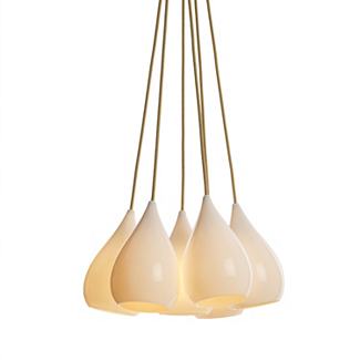
Drop 1 Pendant, Grouping of 6
Drop 1 pendant, group of 6, Peter Bowles for Original BTC, here

Unfold Pendant
Unfold pendant, Form Us With Love for Muuto, here (saw this in NYC, too, and the rubber material is awesome.  Also comes in black and in bright blue)

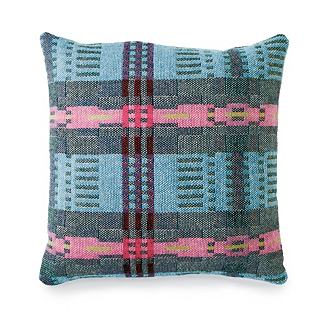
Bora Da Pillow
Bora Da Pillow, Donna Wilson, here.  (Love that this is from a young textile designer and that it is Welsh for "Good Morning" or "Good Day."

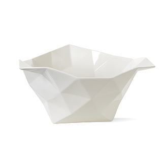
Crushed Bowl
Crushed Bowl, JDS Architects for Muuto, here.

Loving this new crop, primarily for its breadth and vision.

Thoughts?

LinkWithin

Related Posts Plugin for WordPress, Blogger...