Monday, October 31, 2011

Skulls

When we lived in Colorado, we stumbled upon an amazing Day of the Dead celebration at the Longmont Museum and Cultural Center, where, among other things, we got to decorate sugar skulls.


When Design Within Reach included a blown glass skull in their email today, it got me thinking about adorned skulls in art.
skulls

top, L to R: DWR, Damien Hirst, Mexican skull encrusted in turquoise, Gabriel Orozco
bottom, L to R: Jim Riswold, Mark Kilner, Subodh Gupta

Maybe next year we'll make glitter skulls.

Happy Halloween!

Saturday, October 29, 2011

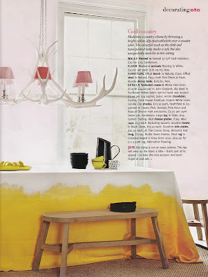
Small Measures: Dip Dye Tablecloth

via Living Etc.

Great plan for the holidays: dip a big linen square in seasonal color.  A neutral on the tabletop, then rust, teal, emerald, marigold, or pumpkin skims the floor.

Friday, October 28, 2011

Pinterest Challenge

Oh, lord, I'm about to do myself in.

I have a list of projects a mile long (including several Halloween costumes on the docket), and I know myself well enough to understand I work best with a deadline.  I like to have just enough pressure to make the magic happen.  (I will ignore how dirty that sounded).

Enter the pinterest challenge.

Not too long ago, Young House Love and Emily Henderson and Bower Power and Making a House a Home challenged themselves to pin something they loved on pinterest and turn it into a DIY project.  With a deadline.  My husband and I just agreed to magnetic paint as a solution the the problem of the children's art in our house.  Avert your eyes if clutter makes you itch, but this is what we are dealing with.


That's right, a pile of artwork bigger than our smaller child.  Taking over one of the extra dining chairs.  In the room where we spend the most time.  Do you have ANY idea how much work it is to avoid this pile when taking pictures for this blog?  It's a problem.  Plus, you know, the girls would love to have their work displayed in a place of honor.

So, some wall in this house will get the magnetic treatment, and some kind of visually pleasing somethin' somethin' on top.  Possibly the upstairs hallway, possibly the laundry room.  Dave nixed my plans for the blank wall next to the refrigerator (though it is clearly the superior choice.)  What can I say?  Marriage is about compromise.

So, what will I do with my magnetic paint?  Possibly magnetic stripe(s), vertical, horizontal, diagonal, it's all fair game.  A shape on the wall, a full-on magnetic surface with frames painted out. Or how about something crazy like this?


That's just a quick little Sunday afternoon project, right?  (The original source MUST be Martha Stewart, don't you think?)

See a bunch of other inspiration on my pinboard, here.  What do you think: any favorite treatments?

And more importantly: can I pull it off by Halloween?

Come back next week to hopefully not watch me crash and burn.

Thursday, October 27, 2011

Winner! And Transitional Spaces: church pew in the entry

You guys.  First of all, I knew Autumn had quite a following over at Design Dump, but I had NO idea how loyal her fans are.  So many of you followed her over here yesterday, my page views were off the charts.  Not that I sit around looking at page views or anything, but the new blogger format shows you a little graph on your overview page when you log in to post, and I couldn't help but notice the spike.  Thanks for visiting, and I hope you'll pop by again!

And of course, the giveaway winner.  By random number generator, the winner is comment 5, Barb.  Send me and email at heather[at]heatherpetersondesign with your address and your jewelry choice.  Thanks again to Tia at silvercocoon for offering up such great options!

Please enter brief describe for image here ...
here

Between two guest posts and a giveaway, feels like my load has been a little light around here, so today I'll share a little peak at a new development in our home: can you guess what it's about?

One of the best things about moving home has been closer access to some phenomenal hand me downs.  My parents have some stylin' taste, and lucky me, everything that was hot the first time they decorated a house is hot again now--and they kept a LOT of it.  Someday I will share our (disastrous) basement, home to a 70s orange acrylic modular shelf that my parents picked up in San Francisco in the early parts of that decade and a black and white RUBBER dining set that may be a product of the 80s, and was our kitchen table when I was growing up.  Hot.  I also recently picked up a brass standing lamp for my bedside, which was both a practical necessity and quenched the brass lust.

You know what else my parents had lying around the garage for the past 20 years?  An old church pew.  No joke.  They've been cleaning out the garage and asked me if I wanted it.  Fast forward through measuring, debating the merits, cleaning it up (thanks Dad!) etc, and they brought it over this weekend.  My friend Sara and I were recently talking about transitional spaces, and the way they often get short shrift because people spend so much time and energy decorating their main living spaces, when it comes to hallways, landings, entries, bathrooms, etc, there's not a lot of anything left to go around.  Do you see where this is going?  We have a big ole empty front hall, plus an inherited bench.  Two plus two equals awesome.

I will say, one of the things I love about this house is the open feel and spaciousness--even the front hall is like six feet wide--and while I wanted to leave plenty of breathing room, I also want all the spaces to feel finished.

For context, this picture was taken from the entry.  You come in the front door, there's a closet on the left, then the door to a bedroom, then those stairs.  The right side is a blank white wall.  To sort of connect the dots, here's a view of the dining room.


You can see the corner of the stairs on the right there, and the blank entry wall is basically to the right of that big window.  Make sense?

We placed the pew directly across from the stairs.  You know that feeling when something new comes into an empty space?  It feels big and awkward and like it's eating the air.  We lived with that for a few days, and then yesterday I grabbed some stuff around the house to give it context and make it at ease.  Of course I did not take any before shots, but you'll get the idea.

 A framed photograph, ikat throw pillow, and three baskets for boots and mittens.


A garden stool for dropping mail and keys when we come in the door. (Yes, also rescued from my parents garage.  That one called for a bottle of brasso, but cleaned up good.)

Or how about my awesome hand-me-down poufs!  Extra seating when we need it, out of the way when we don't, and somehow the mis-matched leather works just right here.

For context, here it is from the dining room.
It feels close, but not encroaching.  The photograph over the pew is one Dave took on a bike ride we took together a million years ago, along the west side highway in Manhattan.  It's a dilapidated dock or bridge that is half falling into the water.  It was the last picture that hadn't been hung anywhere, and at first I thought I would replace it with something a little more modern and graphic and colorful to better bridge this vignette to the modern bits and pieces right next door, but I'm kind of loving how it works with the patina of the pew and the leather poofs.

You know what makes me happiest about this?  (Other than the price tag?  Nothing beats a FREE transformation.)  The view from upstairs.  We have high ceilings and this sort of massive staircase, and before it was all a big blank.  Now, when I round the corner to come down with a basket of laundry (yes, my life is so glamorous), I love seeing this sign of life.

My husband is not totally convinced--mostly, I think, because he's not sure the look is in keeping with the rest of the style of the house--but I love a good eclectic mix, especially when the unique pieces have personal meaning.

Paint the pew, you say?  Not a chance!  Some things are meant to be honored as they are.

Okay. I guess I missed all the over sharing I usually do--that was a LOT of words!

Thanks so much for reading!

Wednesday, October 26, 2011

Design Dump: Design by the Numbers

Do you read Design Dump?  You should.  Interior designer Autumn Clemons is super stylish but also budget minded, and not afraid to share her sources.  She also has a great sense of humor, and I am a big fan of her "Buy this, not that" series.  Check out this transformation:

Before: a standard dining room


After: a fabulous library!


Hard to believe it's the same space, right?  Amazing how the dark color actually makes this room feel twice as big.  Ready for some advice from Autumn, "by the numbers"?


design dump

Decorating really is not an exact science, but remembering a few simple ratios, and numbers, the task can seem a little less daunting. Take these for instance:

1/2
when hanging a curtain rod above a window, try to make sure that it is at least 1/2 way between the top of the window casing and the ceiling or crown molding. doing this makes the windows appear taller. I often install rods within just an inch or two of the molding.


2
Consider adding a pair of items in a room to help create balance. Usually, the first thing that comes to mind is a pair of lamps, but also consider adding a pair of chairs, mirrors, or even larger pieces of furniture like bookcases.


In this room, several pairs of items including lamps, chairs and oversize mirrors help create balance.


1 can equal 3, 4, 6 or even 12
If you have one large piece of art that you would like to display, consider splitting it up and putting it in multiple frames. doing this not only makes the piece feel more prominent, but also keeps framing costs down.

(images: 1,2,3)

thanks so much to heather for having me today! happy decorating!

-autumn clemons

Go visit Autumn on her blog, and say hello!  Thanks for visiting, Autumn.

The rest of you: don't forget to enter the silvercocoon jewelry giveaway.  It ends tonight at midnight, central time.  Winner announced tomorrow.  See you then!

Tuesday, October 25, 2011

Hallways: Intense Color

It feels like the projects are piling up but the time, energy, and weather to do them is NOT.  Yesterday I grabbed a couple of cans of spraypaint for the eames chair legs and some magnetic paint to turn the wall next to my refrigerator into now-you-see-it now-you-don't kids art display.  Last week I was grabbing paint samples for a client and found a quart of Benjamin Moore oil paint in just the right yellow for the drawers of the campaign dresser in my girls' room.  And the week before that I found fabric for lumbar pillows in the master bedroom and the living room.

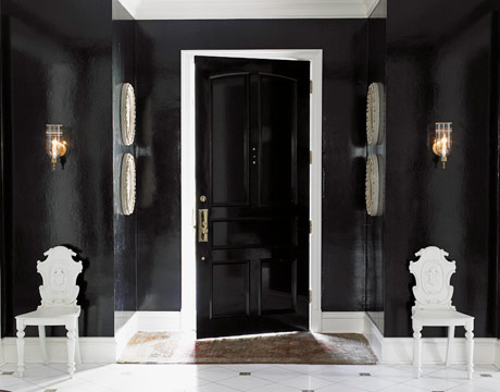
And yet, instead of DOING projects, I seem to be PLANNING projects.  Still thinking about the upstairs hallway.  Since I can't afford wallpaper in the hallway just now, how about some vibrant paint?  Maybe even lacquered?


House Beautiful

Hmmm....this is either Miles Redd in House Beautiful OR Martha Stewart Living knocking off Miles Redd

Miles Redd, king of hallways

Home of Tory Burch

Steven Gambrel, via Luster Interiors


Southern Accents


Never shy of color, I love every single one of these, but I also know this solution will not work in my house.  These are successful in part because of interesting architecture--contrasting molding (or molding painted to match, like the last image, above) and my modern house has vaery clean, simple lines.  In a sea of color, most of these spaces have also treated the doors in interesting ways, again contrasting or coordinating (or tricked out with miles of nailhead) and my doors are a lovely birch and not to be treated in any way.  

What do you think: is it too much for you?  Or could you take the heat in the hallway?

Did you miss yesterday's post?  If you're in the market for some awesome free jewelry, enter the silvercocoon giveaway here.

Monday, October 24, 2011

Giveaway: Modern Jewelry from silvercocoon

Let's kick the week off right, shall we?  How about a giveaway?

You know what I need?  (and probably you, too)?  Some fresh, modern jewelry to amp up my wardrobe.  Like, just for an example, the fabulous pieces from silvercocoon, a Minneapolis-based design-architecture-jewelry-creative collaboration studio.  Made by hand from a range of materials and modern techniques (lasers are sometimes involved), these pieces are bold and fresh, and jeweler Tia is a mighty fine lady.  If you frequent your local art museum shop, you may have seen the line in person--the Walker Art Center shop is where I first spotted some must-have felt necklaces, before I got a peek at her studio and went ga ga for, well, everything.  You can see Tia's full line here, but for now I suggest you focus your attention on the following pieces; the lucky winner will choose between these four:


Drop earring in clear acrylic

Cloud earrings in golden leather

Hive bracelet in color of your choice (subject to availability)


Topo bracelet in Matte Black

If one of these must be yours, do one or more of the following, and leave me one comment for each action.

1. Follow this blog through google connect or Blog Lovin'
2. Like Love Your Space on Facebook
3. Post a link to this giveaway on your blog or facebook page
4. Like silvercocoon on Facebook
5. Follow silvercocoon on twitter
6. sign up for the silvercocoon e-newsletter

So many ways to enter!  Giveaway ends Wednesday 10/26 at midnight, central time with random number generator fun times.

But wait, there's more.  Do you know Fab.com?  Daily sales at a discount on the One King's Lane Model, only most of the merchandise is from small shops, with tons of hand-made options in furniture, jewelry, art, and home goods.  Let me tell you, it is aptly named.  Right now, silvercocoon jewelry is available on Fab.com at up to 75% off retail.  AND.  If you use the code  http://fab.com/fr4ccm when you sign up for this (free) site, you'll get a credit for $10, making Tia's jewelry practically free.  But you have to use the code today, so hurry on over, sign up, and buy some jewelry.

Don't forget to try to win some here, too.

Feels like Christmas.


Saturday, October 22, 2011

Small Measures: Map Screen


via Elle Decor

Old screen + old maps + mod podge (or glue and varnish clear coat) = cool new statement.
(Tear your eyes away form the killer gallery wall!)


Friday, October 21, 2011

French Provincial (ish) kitchen, three ways

Over the past couple of months, I've been working with a client in New Jersey to help pull together textiles and other details for her gorgeous, formal home, which she has bee steadily renovating.  Her kitchen renovation is beyond beautiful, and while I can't share images of the space for now, I can tell you it has carrara marble slab countertops and backsplash, custom cabinetry in a pale yellow glaze with just the rigth amount of molding and flourish, and one of these.

Citeaux

In basically that color.  Except it has more brass fittings.  Could you die?

The kitchen also has a small breakfast nook with large windows.  My client needed a small table, four chairs, a pair of counter height barstools, pendant lighting over the island, and lots of soft fold roman shades.  We wanted a slightly french vibe and traditional but not too formal. Ready for some choices?

While I did present options for fabric, I'm just going to share the winners.

This for upholstery:


(here's a detail, such a pretty linen, and just the right smidge of blue)


This fabric for soft fold roman blinds


(slightly lighter in real life)

With some beautiful braid trim in blue and mushroom, seen in the boards below.

So.  Furniture.

Options 1: Feminine. 
Love the curvy legs on the chairs, the rush seat and turned leg on the barstools, and the combo of a chandelier over the island with a sweet leafy cage fixture over the pedestal dining table.

Heide Kitchen Option 3


Option 2: Masculine.
Okay, not exactly MANLY, but it feels a bit more tavernlike to me, with the iron light fixtures, squared off chairs, and parquet-top table.

Heide Kitchen Option 4


Option 3: Classic modern.
Love the simple form of the pendants over the island, and of course we know I love lantern fixtures.  That little pedestal gets a glass top for the table, and the cross-back chairs are classic bistro. (I found a ton of great sources--I'll round 'em up next week.  My client says go for it).

Heide Kitchen Option 2
What do you think: have a favorite?

I have to say, I'm having SO much fun working on this project, especially since the style is so different from my own house.  My family always jokes about me wanting it both ways, and if I had another life, I would totally do a gorgeous, formal, traditional house like this one.  I'm so jealous of the damask-printed grasscloth wallpaper in the living room, just to name one thing.

Have a great weekend, and don't forget to come back Monday to check out the fabulous jewelry I'll be giving away!

Thursday, October 20, 2011

Design Rules from Danielle Oakey

I'm so happy to have my blogroll back on the blog!  I took it down when one of the links was causing google to tell people not to come to my blog, but that's all cleared up.  While it was down, I missed some of my usual reads, but also discovered some great new ones.  Check it out.

A long-standing blog on my roll is Danielle Oakey Interiors.  Danielle is a young designer in Utah, mom to preschooler Emory, and works magic in her own home on a student budget (her husband is in med school).  How cute it Emory's room? (And Emory, for that matter?)

oakey-1-540.jpg

So when I decided to bring back my 3 design rules series from the summer, Danielle was the perfect place to begin.  I'm so glad she's visiting today!


danielle oakey interiors

Hi, I am Danielle from Danielle Oakey Interiors.
I am happy to be here sharing a couple of my top design rules.

1. Spend money on textiles.
Designer fabrics can transform a space.
You may only need a couple gorgeous throw pillows to update an entire room.


{image via Lonny}

2. Don't be afraid to take risks.
If you love it, go for it.
Taking risks can be scary but the payoff is big.


{image via Lonny}


3. Combine cool and warm colors in every space.
It is really important for every room to have a good balance of warm and cool colors.
This is one of the first things I consider when designing a space.


{image via Lonny}

Oh, and my number one rule is, don't be afraid to break the rules!
Have I confused you yet?
Thank so much for having me Heather!
xoxo,


Now I'm thinking through my own home, wondering if I have enough cool colors around the place.  It's always so fun to hear top rules from fellow bloggers and designers.  Autumn from Design Dump will visit us next.  And if you missed it this summer, check out Carol from The Design Pages, Anne-Marie from 10 Rooms, and Elizabeth from Modern 24/7.

Come on back on Monday, too, for a giveaway you won't want to miss!

Wednesday, October 19, 2011

Boobs on Etsy

I spent the morning serving as a model for a little photo shoot.  My husband's business is going to be featured in the "Open for Business" segment of the Pioneer Press, and they wanted to show the Rolfer at work.  (Rolfing is a kind of deep tissue body work.  So 70s.  So niche.  So Dave.  You can read more about it on his website, here.)  Typically the work is done in underwear, and while we modified a little bit to a sports bra and yoga pants for the sake of decorum, I have to say, I was pretty well aware of my exposed midsection as the photographer snapped away.

On the way home, I couldn't help but think about bodies in artwork.  My husband just walked in on me scrolling through nudes on etsy (looked on with interest, naturally) and when I said "blog post," he said, "what is it, boobs on etsy?"

Why yes, yes it is.  Well, and butts.  Let's not discriminate.

I have to say, I'm a fan of nudes and like seeing them collected alongside other art, but this may not be for everyone.  What do you think?

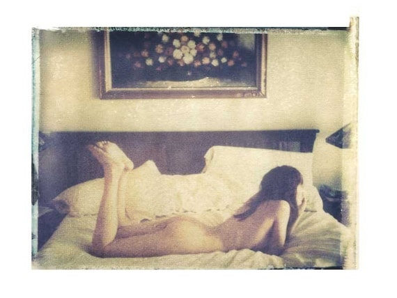
Love the lighting on this one

film photo analogue nude photograph 30x40 cm

here

This could be mixed in a gallery wall with classical nudes--drawings as well as photographs of classical sculptures
Original Fine Art Drawing - Female Nude - Charcoal - 9.5x7 inches

here

The color on this one feels modern to me
Original Mixed Media Watercolor Study Sketch Figure Nude Drawing Art by JUURI Size 14x20

$35, here

Love how clean and simple this one is.  The lighting is lovely on her gorgeous skin.
Simple Nude Portrait

$36, here

A little more arty lifestyle, like an editorial in Nylon

Starting at $20, here

For my own home, I would love one of these soft-focus photographs with a lifestyle vibe.  In fact, my birthday is coming up and I'll take that first one, the polaroid transfer.  Please and thanks!  I have a lot of fabrics and artwork with fairly hard lines and sharp focus; I could use a little softness like this around the place.
11x14  polaroid transfer of nude on bed-signed by artist
$95, here

8x10 - Nude Girl Walking Into The Woods - Fine Art Photograph

$65, here

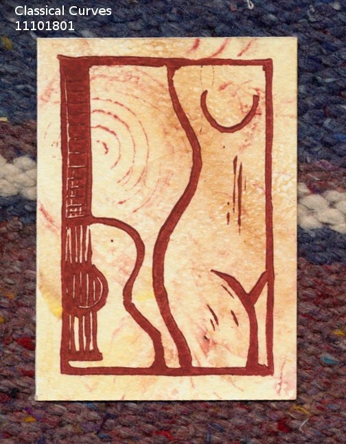
And if the thought of a REAL naked person is tricky for you, I love the idea of an illustration.  The first feels kind of cubist, like early Picasso, while the second has a bit of a deco vibe.
Classical Guitar and Nude original relief linocut and gelatin print aceo 11101801

Linocut, $10, here

Jade Daydream
Starting at $50, here

What do you think: do nudes so it for you?  Or do you prefer your art a bit more chaste?

Either way, check out all the great artists who sell their work on etsy, as well as limited editions at sources like 20x200 and Art We Love, and support emerging artists!

Lots of affordable art here on the blog these days.  Tomorrow I'll be back with a guest post from Danielle Oakey (are you excited?), and I'll be sharing some client work process soon, too.

LinkWithin

Related Posts Plugin for WordPress, Blogger...