Tuesday, March 26, 2013

I've always wanted to


I've always wanted to wallpaper a room in book pages, and today I am doing just that.  this is just the sample board.  We're doing the bathrooms (above a tile base) in a restaurant with a London Deli vibe.  I found AMAZING books at the local vintage book emporium Midway Books, including one called At Home With the Royal Family that has appendixes listing all of the Queen's household.  Things like Swans, Keeper of The.  And Travelling Yeoman.  And another with line drawings of all the grand old houses of London.


Can't wait to get started!

Monday, March 25, 2013

The Photographer's Daughter


Loving these photographs--recreations of classic paintings by a father-daughter team in Australia.
See all the work, here.

Saturday, March 23, 2013

Small Measures


Via Design Sponge

A collection of shadowbox frames wrapping a corner take it from awkward to feature.  Simple.  Lovely!

Thursday, March 21, 2013

West Elm Summer Preview

As always, lots of good stuff coming from West Elm this summer.  A few of my favorites in color:


And black and white:


Check out all new items here!

Wednesday, March 20, 2013

Project Hallway

Confession:  I hate my upstairs hallway.  It is 16 feet long, with a continuous wall on one side and lots of doors and stairs and stuff the rest of the way around.

A while back, I did this to it.  (There was a lot of process first.  Round ups of inspiration here and here, too.)  It was better than before, but still....eh.  This is a lesson in the down side of compromise.  I wanted a magnetic wall somewhere for the girls to hang up their art, my husband wanted that out of sight, and, against my best judgment, the upstairs hallway magnetic strip was born.

Here's the thing, though.  No one uses the magnets.  And while I love chartreuse (do you?), I would prefer either a neutral or a pattern now that the rooms opening off the hallway are navy and pink.

Here's the other thing.  I have to spend the tiniest amount of money possible on this project.

I better get to the options/ pictures. ideas a little faster, huh?

Option 1:  Framed wallpaper panels

First thought, grasscloth:

The Hunted Interior

via My Little Happy Place

But of course a large-scale pattern would be nice, too:


Nate Berkus


via Sadie and Stella


Option 2: Upholstered panels/ ribbon trim


via Little Green Notebook


Option 3: Chair rail

This strategy is all about dividing and conquering.  By adding the chair rail, I can use a little bit of wallpaper, either above or below, and smaller framed artworks will work (larger framed artworks being too expensive.)

Wallpaper below:

via Door 16

Wallpaper above:

via Martha Stewart

Decorative moldings below, stripes above:

via House to Home

Moldings below, upholstered wall above!

Tory Burch

Now, the down sides/ realities:

Wallpaper panels work best when they have a story going on, like chinoiserie murals, at which point we run in to a money problem.  The examples above work because they all have furniture and art to populate the halls.  With plain old framed wallpaper I am just not as interested.

via Babble

via A Storied Style

Moving on.

Trimmed, upholstered walls would require 12 yards of fabric, dozens of yards of ribbon/trim, and a LOT of nailhead.  That adds up, fast.  Also, I'm not the best with straight lines.  I could skip the trim and go for an amazing pattern, like this.

via Sara Gilbane Interiors

But that means more than 12 yards of fabric that is muchos dineros.

As for the chair rail sitch, well, it's just not that exciting to me, and bring the added problem/project ("opportunity"?) of finding or making 5 large-scale pieces of art.  

In a case like this, I always think it is good to figure out what you REALLY want by asking yourself:

What if money were no object (though it is)?

What if I didn't have to do the work myself (though I do.)

In that case, I'm pretty sure I would have the wall upholstered in a beautiful indian blockprint fabric, with contrast ribbon trim and really big fat nailhead.  I would put my grandmother's gold tole sconces on either end, flanking an enormous, gorgeous painting or mirror.

So......is there an inexpensive way to accomplish that?


Monday, March 18, 2013

Reader Design Dilemma: Black in a girl's room

I recently got an email that went a little something like this:

I have a perfect Reader Dilemma for you: The kids decided to switch back to each having their own room, and my 5-year-old is over-the-moon excited about painting her room BLACK.  Right now, it's the perfect shade of age neutral green.  Her idea is that if the room is pitch black, silver stars would show up better.  Do I let her do it, or talk her out of it?!

The reader was taken aback when I said, Do it!

Here's how:

Natural


Take the edge off the black with lots of natural tones and natural materials:  an antique pine dresser; linen headboard, lampshade and curtains; woven rattan swing chair; and sisal or jute rug.  

Then add in some modern shapes, like a simple round mirror, a geometric white lamp, and a retro-modern flushmount fixture (the little perforations mimic the stars on the ceiling).

To make it fun and youthful, add color and whimsy in bedding, accessories, and art.


Bold


As another tack, double down on the boldness of black walls with graphic patterns and strong solid colors.  

Make sure you mix static patterns (stripes, ribbon trim, chevron) with those that have movement (the star wallpaper on the ceiling, the floral bed and floral elephant print).

To keep it from getting too crazy, take your palette from one print (in this case the bed fabric), drawing a couple of the colors out in solids (pink chair, chartreuse lighting).

Finally, keep the shapes simple and streamlined, and keep it real with one or two natural materials--here, the flokati rug and wood dresser.


Romantic


Finally, for the girly girl, a different kind of drama.  Instead of stars, use a gold leaf pen to draw constellations on the ceiling (think grand Central Station), then repeat glamorous gold around the room (mirror, chandelier, throw pillow, accent table.)

Match the drama of black with dramatic pieces, like a four poster bed, overdyed rug, and black velvet chairs.

Ivory bedding and curtains with voluminous ruffles break up the darkness and add more than a dash of romance.  Tie it together with little details: the black edge to the curtains, the stars falling in the background of the art nouveau print.

Have I convinced you?  Would you dare try black walls in a girls' room?

If you want another blogger's take on black--in a nursery!--check this out.

Friday, March 15, 2013

Sneak peak

Oh, what a BIG difference some little changes can make!


Painting that red accent wall the same creamy, peachy yellow as the rest of the kitchen dramatically lightens everything up and makes the existing hand-blown glass pendants shine.


Getting the dated, dark fabric off the banquette (plus steaming and re-wrapping the foam) makes the seating nook so much more inviting.  (And of course I love a good banquette with ticking stripe and a mix of fabrics!)


And off-white faux-ostrich vinyl makes some ho-hum craigslist chairs and barstools very stylish indeed.

These were the fabric stories for this kitchen--I think my client done good with her choice!

It just goes to show, you CAN work with what you've got.

Thursday, March 14, 2013

Cafe chairs

I am a big fan of what I think of as the "frenchy cafe chair."

I recently used Serena and Lily's riviera chair in this client's kitchen.


(There will eventually be a blue, skirted, backless bench on the window side of the table.)

I just noticed these new cafe chairs from a very affordable source.


It's the "Almsta" chair from Ikea!  $99.  I would love to see a bunch of these at a table paired with a built in banquette, kind of like this.


Someone go ahead and snap these up!

Wednesday, March 13, 2013

Play

I have a client right now who calls the work we're doing "play."
As in, "why don't you pick up some extra throw pillows and we can play."


Having an overall plan for your home is an excellent idea, but you need to leave room for serendipity.  Plus, most of us can't afford to do everything we'd like to at once, and need to re-think items we have.

When I moved the orange moroccan tile rug up to the girls room,  I pulled the jute rug from the guest room and put it in the living room temporarily.  You know what?  I LOVE it.  And I was wrong: it's not too small.  Without all that strong color on the floor, there's space for color on the wall.  How about using my embroidered african tapestry as a wall hanging (like I did way back when), to hide the TV?


That wall hanging was most recently on the master bedroom bed.  How about taking the kantha quilt from the living room and using it there?


Borrowed the new leopard pillow from the guest room, too.  Love it.  Too much green?  Flip the quilt over.


Grab the striped lumbar pillow from the guest room.  And so it goes, on and on.

Fun, right?

When you buy things that speak to you, over time, you end up with a collection of things that all work together--because they all fit your aesthetic (even if you don't think you have one).  Just like colors, objects and textiles take on a new life depending on what they are paired with.

It also helps to have a whole-house color palette, even if it's loose.  Because I have the same base of colors in most rooms, most things I have can be swapped around for completely new looks.

What about you: anything "migrate" in your house recently?

Tuesday, March 12, 2013

Tabletop

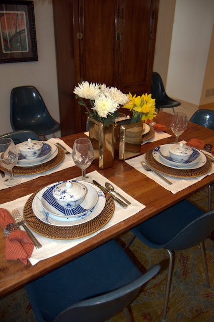
I got a few hours of "me time" this weekend.  Is it crazy that I used it to haul out my china and have a little tabletop shoot?


Probably.

Crazier still that I left the house midstream to buy flowers?  Or that I realized when I was ready to snap the pics that my camera battery was dead?

So lo and behold, bad phone pics of a lunch for no one.

Why?  Partly because I got some new plates.  You know how I was talking last week about mixing sets?  Our china is the Royal Copenhagen Blue Fluted Mega, largely because my husband lived in Copenhagen for a year and has been to the factory, but also because they are so gorgeous, and who doesn't love an updated classic? Here's the deal, though: at $100 a plate, we had to choose wisely.  So we chose dinner plates and salad plates and mixed in a less expensive pattern from the same company, like these little covered bowls.


And we mix in some vintage, like these white china lotus bowls (fun fact: I have three sets in three sizes.  One I bought myself, one my mother picked up for me at a vintage shop, and one belonged to my husband's grandmother.  None knew about the others)


Throw in Dave's grandmother's delicate silver, waterford water goblets to honor my Irish heritage, collected-over-the-years pieces like the shell napkin rings, and some Nate for Target clearance sale vases, and you've got yourself a real high-low eclectic personal mix.

But I digress.  None of our bowls is really an appropriate soup bowl, so when I saw these blue and white japanese-inspired bowls at West Elm on sale for about $2 a piece?  I bought ten.


When Dave and the girls came home, we had "fancy lunch," albeit on a modified china set up.


Sunday, March 10, 2013

Lonny's big news

Did you see the new issue of Lonny?

There was a bedroom in the contents that made me think, where have I seen that before?

Well, it was the Editor-in-Chief's own apartment.  Every time they feature Michele Adam's newest digs (by my count, this was at least the third feature in as many years), I gag.  Not because her work as a designer is bad--it's just fine.  But really?  Three major features on your homes in your own magazine?  (Not to mention the numerous spaces she designed that were featured--talk about conflict of interest.)  Is there a word for nepotism when favoring not a family member but yourself?

Maybe that's just me.  (Is it me?)  I have total respect for a couple of kids who saw a niche in the market and launched a new genre.  Total respect.  But this kind of ruins it for me.  And really, this NYTimes article didn't help, either.

Yet I was still surprised to see that big changes are afoot at the magazine.  Adams (and co-founder Patrick Cline) are stepping down, "to pursue other projects."  Adams will be replaced by a print veteran, and I am curious to see what she does.  Lonny has developed such a clear and specific aesthetic, and for better or worse, it's hard to imagine retaining it with a new team at the helm.

I know you are all readers of shelter pubs.  Are you interested in the people and politics behind them?  I'm curious what you think about all this.  Do tell!


Thursday, March 7, 2013

The Best Laid Plans

I got moving on this plan for the girls room, ordering the rug from rugsusa while they had a 50% off sale.


Only guess what?  The rug is not a sunny golden yellow at all.  It is more of a pale/bright citron.  Total green undertones.  And while I LOVE all forms of citron and chartreuse, the yellows I was planning to bring in are distinctly golden/orangey yellows.

See?


Here it is a bit more pulled back:


It doesn't look TOO terrible in these pictures, but it really doesn't work.

My original plan for a makeover in this room involved using this fabric that I have had for more than a decade:


And bringing up the orange rug from the living room (with the intention of buying a natural/ jute rug down there.)  I would use some blue linen velvet that I got at an estate sale to re-do the headboards.  Kind of like this.

 (Ignore the fabric on the cornice--it's really just to hide the strong floral going on underneath.)


Pretty, right?  I love orange and pink together.

But then of course I also got to thinking that the citron rug was awfully pretty with the chinoiserie curtains.


But of course this means that I don't get to buy a rug for the living room.  And it is a little softer than I intended.  And look how GREAT those other floral curtains look with the existing headboards.


Right?

So now I'm confused.  Love it all.  If I am returning the rug I need to do it lickety split, so I would love your opinions.  Keep in mind that the brass chandelier comes in here either way, so it will spice up the softness of the chinoiserie, and the campaign chest can be painted any color.

(I will also mention that I have a terrible cold and have been very fuzzy headed.  This is how I spent my "sick" day on Tuesday: carrying hugely heavy wool rugs up and down a very tall staircase!)

Please, help me decide!


LinkWithin

Related Posts Plugin for WordPress, Blogger...