Thursday, December 19, 2013

The Advent Calendar

Last year, there seemed to be tons of posts about home made advent calendars.  This year?  Not so much.  Perhaps I am a year behind the times.

We are not religious and don't celebrate the actual season of advent.  Last year I put together a countdown calendar with the intention of celebrating the holiday season in general and making sure I was present with my girls at a very busy time of year.  In addition to small treats (a candy cane, a chocolate snowman) and stocking stuffer type objects (Christmas themed pencils and socks), I was sure to include activities and experiences.  A winter walk and instant cocoa.  Ornaments signaling a trip to pick out the Christmas tree.  A book of carols to learn and sing together.  Last year was about the plan and the content.  The execution left something to be desired.


(Though the bulletin board was useful for holiday cards as the bags got used up.)


This year I decided to repeat the plan from last year, and even some of the content -- yes, we have Christmas socks again, and a winter walk with cocoa.  Having the days figured out left me a little more time to make the calendar itself.


I took brown paper lunch bags and put a number on each one.  The numbers were freehand cut out from some holiday themed scrapbook paper that I picked up at Target.


I simply glued them on in a jaunty fashion using a glue stick.

I made the decision this year to have the numbers correspond to the day they are opened on, rather than starting from one.  Last year it got really confusing because the numbers were just off by a day or two, so we were opening bag one on December 3.

To attach them to the wall, I simply used blue sticky stuff on the lightweight ones (like December 24, which has photographs of my husband and I on Christmas eve when we were kids).


For the heavier ones I used command strips.


On day one, the girls decided they wanted to keep the tree intact, so we have been carefully removing the staples and re-sticking the empty bags to the wall each day.

The girl LOVE starting their day opening the bag.


Christmas is soon.  How are you counting down?


Tuesday, December 17, 2013

Two Ways: Patchwork Rug

Oh, folks.

You know, sometimes I just get hold of an idea and I can't let go.  Did you ever have a worry stone?  It's like that: I just keep rubbing away at it, but for all the rubbing the thing stays whole.

After obsessing about the use of patchwork in Kathryn Ireland's work, I did a little round up of patchwork products.  And maybe it would have stopped there, except I saw this room in the portfolio of designer Brooke Wagner.


See what she did with that patchwork rug?  Well, I just had to give it a try.

Haven't done a "two ways" post in a while, so here we are.


I like the idea of letting even a neutral patchwork rug stand out by keeping the palette simple and the shapes sculptural.  In the above, the black is a nice contrast to the softer greys, and every shape is interesting without adding too much busyness or competition, and the wood tables warm things up.

Then again....


sometimes the more the merrier, right?  Here a rug patched from overdyed vintage kilims is accent-sized to keep the color in check.  The furniture shapes are interesting (and fairly traditional), but the palette is consistently quiet.  All the better to shout with accessories, no?  Each and every fabric relates to the colors in the rug, keeping things just this side of cuckoo.

I never would have thought about a patchwork rug for myself....but now I'm kind of digging it.

What do you think:  tight palette with high contrast, or full on color?


Monday, December 16, 2013

Get the Look: Patchwork

It's always interesting to see the way elements that have been around forever come in and out of favor, and get re-interpreted, whether in the way they are made or the way they are used.

While perusing my new Kathryn Ireland book from my birthday wish list, I noticed her use of patchwork, a trend I had been noticing sort of out of the corner of my eye.

When I went looking for it, I was amazes at how many patchwork products are available right now.

Get the look:


Chair: Anthropologie, Quilt: ebay, Chandelier: Urban Outfitters
Mirror: Pier 1, Pillow: Shop Latitude, Screen: Pier 1
Pillow: Kathryn Ireland, Chair: nuLoom, Pouf: Pier 1
Rug: kilim.com, Chair: rugs usa

Chair, Chandelier: West Elm
Pouf: anthropologie, Rug: ABC Carpet
Chair: Zinc Door, artwork: Urban Outfitters, Chair: vive decor
Rug: Pier 1, Armoire: West Elm, bedding: Crate and Barrel, pouf: World Market

In addition to the straight-up patchwork offerings, I like the application of the patchwork concept to furniture like the armoire shown from West Elm, where each drawer and cabinet is treated to a different wood tone, or the colorful chandelier from Urban Outfitters, where the color is applied by area. 

I also came across these chairs from anthropologie, which take the concept of patchwork but abstract it.  Rather than pieces actually patched together, they created a screenprint of layered or patched pieces--in this case, photographs and drawings.


What do you think: would you use patchwork in a room?  Would you go old-fashioned or new-fangled?

Friday, December 13, 2013

Trending

My aunt sent me Kathryn M. Ireland's latest book for my birthday.


("What does the M stand for," my 5 year old wants to know.)

Of course I have been tearing into it like the crazed disciple I have become, and I've noticed something that Kathryn M. Ireland uses a lot, and often in different ways.


Do you see it?  (Did I make it too obvious?)  I can't find my favorite example on line and, quite frankly, I'm feeling too spent to bother with the scanner.

Maybe I'm just tuning into it because it's something I'm seeing everywhere lately.  More on that tomorrow.

Wednesday, December 11, 2013

Happy Birthday to Me

Oh, birthdays.

Let's just say turning 39 was not my finest moment.  Sigh.

But, I made a rug decision and said rug is now in the house.  So there's that.


It is SO pretty, but jury's still out.  I meant to avoid the Beni Ourain train, but looks like I hopped on the Marrakech express.

I had just been admiring this house in House Beautiful, and it feels like this could be an inspiration in terms of palette, texture, and overall slightly global vibe.


I'm just not sure it's enough color for me.

What do you think?

Monday, December 9, 2013

The (totally pie in the sky unrealistic) birthday wish list


My birthday is tomorrow, and though we don't really do presents too much for birthdays these days, I thought it would be fun to collect some of my wants list in one place.

Yes, that's a $6000 rug.  Yes, the wallpaper and Indian prints are to the trade.  Yes, the lampshades are $375 and I'd probably just make my own.  But the candlestick lamps (two please) are from World Market, and the earrings and necklace are from etsy, and books are always a good option, especially the ones you can find used on ebay for a song.

We're wishing here, right?

Friday, December 6, 2013

Art You Can Afford: Ashley Barlow

This morning my husband handed me a little square business card with super cute graphics, and said," there's a pop up shop next to work.  I think you would like these."

Right you are!

Ashley Barlow offers small prints at super reasonable prices through an etsy shop, too.  Check out some of my favorite pieces (these are the originals not prints):

Untitled

Collections

Play Time

Custom pieces, sold

Summer Camp

I love the use of vintage photos paired with a paint approach and palette that feels very contemporary.

Surely there is someone on your list who could use a cheerful, quirky print for the holidays?


Thursday, December 5, 2013

It's Baa-aack

My all time favorite chandelier, that is.


Various retailers have gotten in on the reproduction-crystal-ship-chandelier bandwagon from time to time (I almost bought a cheap one from PBTeen for my girls' bathroom before they disappeared.)  Well, I was delighted to discover that Z Gallerie has them back again, though sad that my plans have gone in another direction and this puppy--even if I could afford it--no longer fits in.

Do you have long term wish-list  items that you stalk?

The holidays are coming.....


Wednesday, December 4, 2013

A plan

While the living room rug continues to confound me, I finally have a plan for the upstairs hallway that is making me very, very happy.

I was (very loosely) inspired by this.


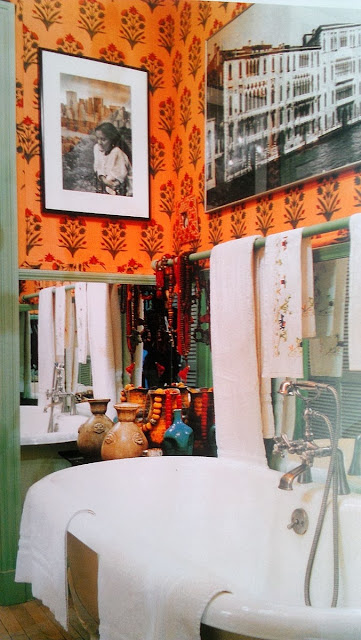
(Muriel Brandolini's old bathroom, published in New York Living, which continues to be one of my all-time favorite design books.)

This wallpaper.


And black and white candid photography (maybe the party pictures from our wedding?), in a staggered line.


Only problem?  Funds for the wallpaper.

Alas.

You know I am thinking about creating my own stencil or block print, right?  Ugh.

Tuesday, December 3, 2013

What would YOU choose?

Oh, people.

I am stumped.

I came back from our long weekend away refreshed, and with clarity on what I want for most of the remaining projects in my house.

MOST.  But not all.

The living room rug continues to plague me.  I think this is largely because rugs are such an investment, and I buy good ones once every 10 years or so (with smaller/cheaper ones thrown in along the way as needed).  So unlike paint ($50 and a couple of hours of my time), the rug decision feels weighty.

Here are the current choices.


Clearly I have decided on a vibe, and no, it is no longer the thing I was so sure it was going to be back in August.
Any of these rugs work with the look, and with the room, which currently looks sort of like this.  


(Ignore the colors in the painting and throw pillows--all changeable, friends.)

My issues with the rugs come down mostly to color and the challenge of photos.

The middle rug is called "blue" but looks grey.  Blue works, grey doesn't, and it is not returnable.  The bottom rug ties all the neutrals of the room together perfectly--but is the background too yellow?  My husband fears it will blend (badly) with the floor.

And the top rug?  Oh, the top rug is my favorite.  It is vintage.  It is ivory (ish) with the black and orange of the coffee table and the red I am bringing in to the overall color scheme.  In fact, before I priced it, I said this was it if I could afford it (I can).  But it is 7x9 and I would need to layer it over a sisal, a look my husband does not love.

So tell me: what would YOU do?

Monday, December 2, 2013

Get the Look

Welcome Back!

I spent the past 4 days almost completely unplugged from work, and I am feeling refreshed.  Hope you can all say the same.

I got an email from a reader yesterday asking if I had source information for the rug in an old post.  The image is from an old issue of Chicago Home and Gardens, and while I suppose I could go dig up their "resources" and see if they listed the rug, my gut is that it is custom, high end, or both.  The reader wondered how she could get the look.


That rug looks like a patchwork cowhide, which adds really interesting texture.  But it is really the graphic pattern that the reader is after, and there are plenty of black and white tile-style rugs out there these days.


Not bad, huh?

This was a fun challenge because frankly, I'm betting that everything in the inspiration space is custom or vintage.  I was talking to a new long-distance client the other day who had interviewed local designers and was dismayed when each of them started in on designing custom furniture.  I share the belief with this client (and many others!)  that a great, custom-feeling room can be created without the major expense of all custom everything.  

I will admit that the big miss for me in the above is the wing chair--the fabric is obviously a different kind of pattern than in the inspiration shot, and the shape is not quite as interesting, but it gives the overall effect, and the neutral ties in to the West Elm curtains and the Safavieh ottoman (from Sears!).


With the little grouping on the side, the inspiration chairs are vintage, but these camel leather sling chairs give a similar vibe.  In fact, I think I like them better because they do not introduce chrome as an element in the room.  I threw in a second rug options because, well, there are so many out there to choose from!

What do you think?  I'm still on the fence about the very mismatched chairs, but it is fun to push out of my comfort zone.

I should be around with new content all week.  Hope to see you back tomorrow!


Wednesday, November 27, 2013

I am Thankful


A heartfelt Thank You to my fabulous family, wonderful clients, and all of YOU readers.

Enjoy this holiday season!

with love,

Heather

Thursday, November 21, 2013

An Office Transformation

I have just been kicking myself lately.  I never seem to remember to take the oh-so-important "before" shots.  I'm usually so excited to start a job, I sort of just dive right in.

Let's just say that this office looked like this before.


White walls, fluorescent lighting, commercial carpet, aluminum blinds.  Okay, the actual office is a little less NYC, a little more suburban midwestern office park, but you get the idea.

And now:


Welcome!

This is the office of a small family foundation, and it needed to feel comfortable, elegant, and classy, and to reflect the family in general and the foundation namesake in particular.  In my inspiration, I found myself thinking of Nate Berkus: masculine, traveled, neutrals and textures--only with a little less modern edge.  The photo above is the view from the front door.  When you come in, there is this seating area to the right.

The mix of antique walnut, leather, velvet, mohair, antiqued mirror, gold, and blue and white pottery feels collected and a little old money to me.


That small angled wall is actually an interior floor to ceiling window with that chicken wire glass and terrible aluminum blinds.  The blinds are NEVER opened, so instead of turning the angle into a feature, we decided to make it "disappear" into the wall, and softened it up with a pleated flat roman shade in a Schumacher silk the same color as the walls.

One of the fun things about this project was using the art that the foundation had collected one way or another over the years.  These Native american watercolors are beautiful, and helped set the color palette.


In the seating area, we swapped out the big fluorescents for recessed halogen floodlights, and supplemented them with wall sconces and table lamps.

I blogged the frame transofrmation (above) here, and the massive gallery wall here (and here.)


I'll be back with a few more details and ideas on accessorizing an office space.  And someday I will learn to not only take "before" shots, but to take a decent "after" shot as well!


LinkWithin

Related Posts Plugin for WordPress, Blogger...