Showing posts with label living rooms. Show all posts

Wednesday, November 16, 2016

Tangletown Traditional: Living room sketches

I shared some sunroom sketches for this house the other day.

Today I've got some living room design sketches for you.

I have to say, despite my personal funky-eclectic taste, this sort of "fresh traditional" scheme is a real comfort zone for me, and I love to use it in older homes.  My approach in this case was to choose pieces whose lines felt traditional but not overly fussy or formal, and fabrics that feel young enough for the family that lives here.  The color palette comes in part from other choices we've made, like the tones in the wallpaper in the entry.


The living room opens to the right off of this foyer, with the dining room directly across the way.


I wanted to pull in the brown, coral, and blue in different combinations


The client and I are both loving the first option.  

What do you think?

Wednesday, August 24, 2016

Before and After: Bloomington Avenue


This reveal is a long time coming!  We shot the family room months ago but just shot the living room and bedroom today.  If you follow me on instagram or have looked through my portfolio, then some of this is not new to you.  But the living room came out so pretty, it's worth a peep!

My client originally called me to work on a previous home.  A while after our initial consult she called to tell me she didn't need to redecorate, she needed a divorce.  (Amazing how often we humans try to solve the wrong problem!)

Once she was settled in her new home, we got to work together, making the space into something that reflected HER taste and her new life.  I think this is such a great example of the power of decorating.  We did almost nothing architectural (just a built in window seat in the family room), but paint, furnishings, window treatments, and a little bit of styling can completely transform a space.  We hardly even changed the furniture arrangements!  I think my favorite thing about this transformation is that we didn't buy a lot--instead, we transformed her old things into something she could love anew.

These "Before" shots are before she bought the place:

Living room before:


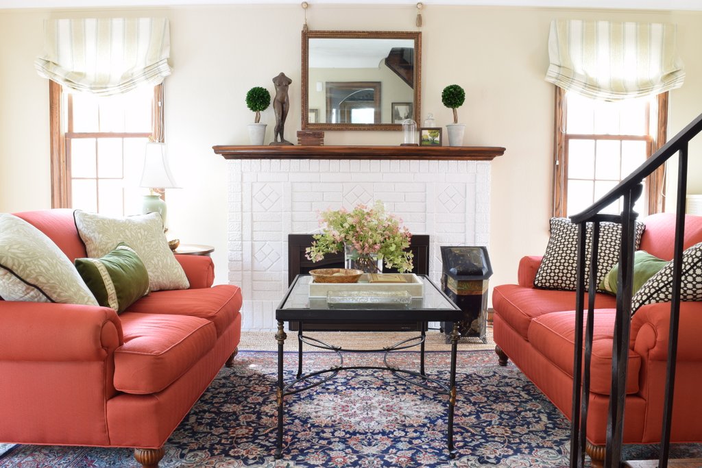
Living room after:


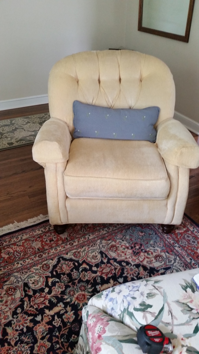
 The new wall color is SO much more complementary to the beautiful woodwork.  Rugs are miracle workers.  And of course I love a solid dose of color like those revamped loveseats.  (Here is the loveseat before!):


Looking into the room (back) before:


Looking into the room (front), after:


A few other details, just for fun:


How about the family room?  This was a 1950s addition to the older home, built over a garage, and it had all the trappings of that decade, with wood paneling, acoustic tile ceiling, and scalloped window cornices.  It's a big room but it wasn't being fully utilized.

Before:


After:


We updated the woodwork, added a window seat, wallpapered over the ugly ceiling, and painted EVERYTHING the same mossy green color. (Coincidentally, I chose the same color from her old living room, but it reads very different in this light-filled space.)

Before:


After:


Woodwork before:


And after:


(I loved styling the shelves with her things.  And those bolsters with the perfect fabric placement at the ends are one of my favorite things in the room! And also we shot on such a snowy day you really can't see the window treatments, which are such a pretty striped linen.)

View from the couch Before:

And After:


We masked the weird bump out in the wall with the enormous custom wood entertainment unit she brought from her old house.  You can see how much the all-one-color paint trick helped this side of the space.

I mentioned before that we transformed a number of her old pieces.  I think this is the most dramatic.

Ottoman before:


Floral, skirted, button/channelled top, and two rows of traditional cording.

Ottoman After:


Black faux-hide fabric, squared corners, no skirt, and two rows of jumbo sized nailheads.  You would NEVER know this was the same piece!

 Armchairs before:


Armchairs after:


LOVE the black piping defining the arms.   (I often have some small regret on a project.  In this case, I REALLY wish we had done the buttons in the chair backs in black,  My client wasn't into the buttons in the original chairs though, and would have preferred to have none, so we made them in the same fabric to let them recede.)  You can see the dotty fabric a little better in the image below. 


So much better, right?

After completing those two spaces. the client came back to me for a BUDGET makeover in the bedroom.  We did a lot with a little.  

Bed before:


Bed after:


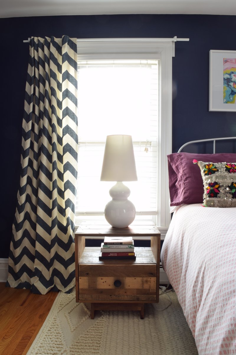
Much of the budget went to stripping the wallpaper and having the space professionally painted.  This weird grey, with some purple undertones, does such a good job of cooling down the room.

Before: the bed was on a strange angle.  Rethinking furniture placement went a long way here.


After:


The dresser stayed where it is, but we added radiator covers, pretty breezy curtains, and a reading corner (with a high quality, low-price chair and ottoman from a consignment store)


This was the view in the door before:


That poster was the inspiration for the feeling and palette in the room.  We reframed it and hung it on that wall.  It's not quite enough to hold down that wall and needs some eventual companions, but for now, it's still an improvement!


There you have it!

I'm exhausted.


Monday, April 4, 2016

Before and After: Contemporary in Jersey City

Well hello there!

What a busy month it has been.  Last week was my girls' Spring Break, and we headed to our old home, New York City.  The impetus for the trip was photographing a project I finished a while back in Jersey City, but then we almost didn't shoot it!  I'm so glad we made the time in the end, even if it was a very quick venture and I didn't do as much styling or get as many details as I usually would.

Ready for the tour?

The space is a tall and narrow brownstone which got a modern update but kept many original details intact.  My clients planned the major architectural changes on their own and brought me in to help decorate the entry, living/dining room, powder bath, master and guest bedrooms.

I shared some of the design boards and floor plans along the way:

Guest Room
Living room/ Dining Room
Master bedroom

Now for the before and after!
(A major caveat: these clients have great taste.  They had JUST moved in so everything is VERY unfinished in the before photos.  Lucky for me--the "Afters" look that much better!)

Living space before:


From the front entry, you looked at this stairway; the door to the left looked into the living room.  That whole wall got opened up.)


And after:
(We flip flopped the layout--living room went to the front windows and dining room in the middle, next to the kitchen.)


(I can't believe I didn't take my coat off the hooks in the front hall for the photo!  And missed an angle that shows the chartreuse wall color in there.)


Before again, looking towards the front of the house:


And after:


 Living room before:
(you can see the fireplace at the left edge of the photo for reference.)


Now the dining room:


This is such a good example of choosing carefully in a space with few pieces--the special items like this leather-front sideboard and the fabulous chandelier can really shine.

GUEST ROOM

This is the first space we tackled, on the top floor of the house.  We used the existing bed but put it on the window wall.  I had them take the accent wall color on to all the walls.  From there it was all about textiles and texture!

Before:


After:


MASTER BEDROOM

This one was the most challenging.  Obviously these clients love color, but they wanted a calm, soothing retreat for the bedroom.  The trick?  It couldn't be boring.  So we chose pale neutrals and brought in interest through the details--wallpaper that makes a quiet statement, studded lacquered bedside tables, a fabulous mirror, etc!  


After:


Before:


After:


Let's see a close up of that fireplace:


Before:

After:


I also love that wool geometric runner that runs up both flights of steps.  Great pattern, but subtle, as it is tone on tone.

POWDER ROOM

There's no before, as this space is brand new-- carved out under the stairs.  It's teeny tiny and SO cute!


We used the same cement tile here as in the entry.  We should probably look at that again, no?


One funny thing about this project--though complete for a while now, this is the first time I saw it with all the changes and selections we made!

I love all my projects, and have enjoyed sharing some more traditional spaces lately.  But this one is closer to my own style, making it that much more exciting.  Sometimes I do this weird thing where I think about which magazine a space would best fit it, if it were to be in a magazine.

I think this one is SO domino.  Don't you agree?


LinkWithin

Related Posts Plugin for WordPress, Blogger...