
On Friday, I went for a follow up visit with a client to hang a family gallery wall and basically zhush the place up (though as it turned out, my client had everything looking fab when I arrived.)
This was a family home for years, but with the grown children out of the house, the parents were ready for "real" furniture and a place that felt all theirs. The space we started with was dark, the furniture bulky.

Our goal? To lighten everything up, create distinct areas, and maximize the square footage.

I think we succeeded!
1. Lighten everything up.
The biggest change here was to go from three wall colors in earthy tones to a single hue that is much breezier. One color is unifying, key in a small space, and a light creamy green is very fresh and soothing.
The furnishings and textiles are also lighter, with a neutral base that allows the greens and blues to come forward.
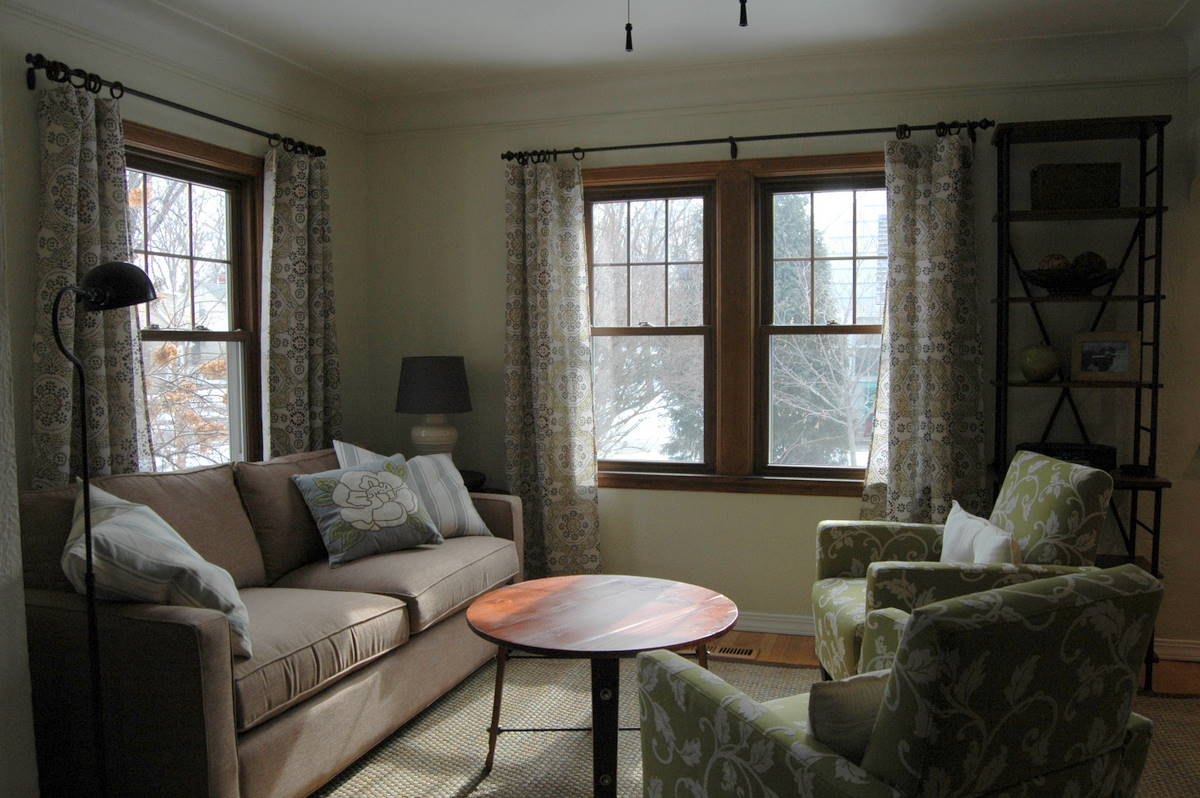
2. Create distinct areas.
Before, the sectional wrapped the room, and the area rug was oriented in the middle of the space, making the entry, living, and dining areas all function as one. It may seem counter-intuitive, but in a small space designating areas can make everything feel bigger. Here, we used a bigger area rug to define the living area, leaving the entry and dining areas out. Next, we used a pair of armchairs to break up the space and emphasize the line between living and dining, and added a tall narrow bookcase to further define the living room's edge.
Before:


3. Maximize square footage.
Again, this may be counter-intuitive, but sometimes putting the biggest pieces possible into a space can make a room feel bigger. The upholstered pieces here are as big as the room can take, but streamlined. A three-cushion couch, for example, would have felt fussier. We also chose smart storage, like the tall narrow shelf unit, nesting side tables, and a garden stool that can function as a table or an extra seat.


Other tricks and tips.
-- To unify the small space, we repeated the same wood tone throughout, and brought the oil rubbed bronze finish to the curtain rods, coffee and side tables, standing lamp, and etagere.
-- To make the windows feel bigger, we removed the individual faux-wood blinds and replaced them with breezy curtains, hung wide.
-- To keep things from feeling too stiff, we used several shades of blue and green, and pulled both the grey and the brow neutrals from the drapery fabric.
Let's have one last look, shall we?
Before:

After:


This project was a very fun collaboration with my client. I showed you the design board process here. (If you take a look back, you might wonder what happened to the sconces. They were meant to be incorporated into the gallery wall, but when we opened them up, they were missing parts, called for bulbs neither of us had ever seen, and one of the shades was stained. As it turned out, there were plenty of photos to create a gallery wall without sconces, so we simply nixed them. Sometimes you have to make these decisions on the fly.)
Once we settled on a final scheme, my client then went ahead and ordered everything, put furniture together as needed, painted, hung the curtains, and then had me back for final details. This is a great and economical way to get a designer room for less!
Quite a transformation, Heather! Feels so light and fresh now!
ReplyDeletewww.chattafabulous.blogspot.com
LOVE IT! It's amazing how there are absolutely no structural changes but this feels like a different space. Well done!
ReplyDeleteWow, great job to you both!
ReplyDeleteNice information, valuable and excellent design, as share good stuff with good ideas and concepts, lots of great information and inspiration, both of which I need, thanks to offer such a helpful information here.
ReplyDeleteLos Angeles Fashion l Find me a girl