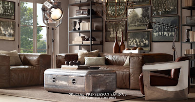
I was just flipping through Architectural Digest (thanks again to my Mother in Law, my magazine habit enabler), when I saw these images from the Spring 2011 collection.
Um. An airplane desk? Steel patchwork shelves? A huge silver orb on the floor?
Classic furniture bred with robots? Corroded school lockers? Scandinavian-style pendants rolling around on the floor? (I do think it's interesting that they are including large-screen TVs in their shoots, like a nod to real life. But weird, when everything else about the shoot is pure fantasy.)
Restoration has been kind of interesting to follow. Remember in the beginning when it was kind of like Pottery Barn, only they had all those fun vintage gifts at Christmas? Lacking identity. A couple of years ago when they went Belgian with all the linen and pretty bleached out wood, they seemed to get a little personality, and I started poring over the catalog like I do with other stores: even though it wasn't my thing, I could appreciate what they were doing, and even sort of imagine an alternate reality where I would want half the catalog. Those pretty linen-covered Louis chairs! Put TWELVE of them at the most giant trestle table you've ever seen! Yes, please.
But this? I think they've taken a turn for the crazy. Who is going to put this stuff in their home?
Now, I know some if it is just the over-the-top styling, and some of these pieces would work when re-mixed with other stuff. But put together? It just feels silly to me. Am I alone in this?
Let's play high school debate team. Anyone wanna take the "pro" argument? Even better, anyone want to design a room they would actually live in, based around one of these pieces? Hmmm. Now I kind of want to take my own challenge...


Ack! It's official - the "steampunk" bandwagon has jumped the shark.
ReplyDeleteIt's hideous. All of it. I almost need tetanus shots just looking at it.
Could this be why the Grand Ave store just closed?!
ReplyDeleteI couldn't agree more. As of late, I've been bemoaning the crazy airplane furniture. Just strange. However, I will say that I currently have two friends lusting after that last sofa. It's kind of sexy on it's own. As long as it's not surrounded by other similar chairs or the outcasts from a plane graveyard. Great post! Thanks for visiting my blog!
ReplyDeleteSorry, I meant "its own" not "it's own." I hate grammatical errors.
ReplyDeletemichael kors outlet
ReplyDeleteminnesota vikings
nike running shoes
the north face outlet
babyliss flat iron
woolrich outlet store
uggs outlet
chanel handbags outlet
adidas wings shoes
nobis jacket
timberland shoes
chanel outlet
michael kors outlet
ray ban,rayban,occhiali ray ban,ray-ban,ray ban occhiali,ray ban sunglasses
canada goose jackets
ugg outlet
calvin klein outlet
snow boots
pandora outlet
christian louboutin outlet
mm1111