Thursday, June 25, 2015

I love a pretty bed

If you follow me on instagram, you have seen lots of beds in my feed lately.  There's really not much I love more than putting together a good bedding mix!

Two different looks for a new client: same elements, but one is pretty soft and the other crisp.

She has a cherry sleigh bed and matching nightstands, light carpet, and tall ceilings.  We chose a grey-green for the walls.

Look 1: soft

Here the soft palette comes from that awesome suzani long lumbar pillow.  I love green and purple together (was my favorite wardrobe combo in 6th grade), and these very soft greyed out colors are lovely and unexpected.  The raised medallion pattern on the euro shams and duvet add interest while keeping it neutral.

Look 2: crisp


Of course, your wall color does not need to reappear anywhere else.  Here we let it be the backdrop for a white, coral, and blue scheme with a pretty, fresh floral on the drapes and some lighter wood mixed in.

It's making me want to redo my bedroom...again!

Monday, June 22, 2015

Dining room designs

Happy Monday!

My kids started camp today, so we are getting back to some kind of structure around here.  The last two weeks felt like two months (in a good way!)

Back to work, back to blogging.

I recently got to see an old client again to get started on the dining room!  (We did her bedroom, living room, and spruced her kitchen all about 2 years ago).  Back then, I was calling her style "Bohemian," but as I look back on it that's not quite right.  There's something a little bit elegant French farmhouse with a contemporary spin to the look.  We talked about a farmhouse table, a mix of upholstered chairs, a chandelier with glass to echo the kitchen pendants, and incoporating the existing painting and sideboard, which bring a strong red to the palette.


What would you choose?

Friday, June 19, 2015

Art and pillows to liven up a family room

Hi there!

I have been home with my girls this week (mostly) and we have been having a delightful time.  I thought I would sneak in a post before we head in to the weekend.

I have been working with a client on various projects, in some spaces from scratch, and in some spots they just needed that finishing layer.

They have a gorgeous family room, mostly in grey and white but with a few pops of orange.  They wanted art for above the couch.  Here are some options they did NOT choose:


Love all the peaceful horizontal lines inspired by the photographs horizon line.


a modern take on preserved butterflies.


We've seen a lot of blurred and hazy photography lately, but rather than the more typical beach scenes, these are decidedly city.


A bright and cheerful abstract paired with bold geometric pillows.

That finishing layer is one of my favorite parts of this job.

Happy weekend!

Thursday, June 11, 2015

Sneak peek: some (impatient) before and afters

When rooms unfold slowly, I have this bad habit of sharing before and afters before we're really done (or photographed properly).  A habit I am about to indulge.

These are some pretty ghastly before shots:


Both rooms has 80s wallpaper along with bad mauve carpeting and golden oak trim.  The trim we left alone for now (trim is such a huge project because it is everywhere!), and while the carpet will be replaced eventually, we did tear down the wallpaper, stat.

These kids are currently two and four, so the beds are on the floor.

In Lael's room, we painted the walls a pale mint green and brought in happy prints and patterns that aren't too princessy sweet.  (This was the original inspiration.  Turned out the inspiration headboard didn't come in a Queen, so we rethought, here.  That's pretty much exactly what we ended up with!)


Love the watercolors by Lael (top) and her brother (bottom).

In Oliver's room, we lightened up with a blue-grey paint and offset the wood pieces with navy, green, and a car-themed art wall.


The abstract paintings are by Oliver, too.

Oli's room is pretty much complete, but Lael's still needs book shelves, a chair, and possibly a dresser makeover.  We're getting there.

It will be fun to share a full reveal (you know, including the other sides of these rooms), sometime this summer.

For now, hope you like the transformation!


Wednesday, June 10, 2015

Art you can afford: vintage (foreign) postcards

I'm always on the look out for interesting art that speaks to me, and I love having an art-filled home.  I have realized that while most people want art on their walls, many people don't have strong feelings about what it should be--they just want it to look good and not break the bank.  While there are now MANY wonderful sites for prints and limited editions, I always love using originals when I can--whether they are works by artists or interesting ephemera.

I was poking around etsy yesterday for a series of 6 small images I could use in a grid of frames in a dining room, when it occurred to me that postcards would be the right side for the mat openings in the frames I want to use.  Usually, I won't use ephemera from a place or an event if it is not personal (i.e. no concert posters if I wasn't there, no matter how awesome the graphic design).  But the postcards I found do not speak to a specific place.

Sometimes everything starts to look the same to me.  These cards are from Russia and Eastern Europe, and I love that they have a different graphic design style than what I see everywhere.


Wouldn't these look amazing framed and hung in a grid?  

We'll see what my client thinks about the ones I found for her!

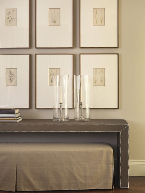
And just for inspiration, here are a couple of rooms that use a series of items hung in a grid.


Tuesday, June 2, 2015

Where do you put the accent color?

I recently got to go see this client to take on the dining room and to fluff up the office as a guest room.  It was a simple order: keep the black and ivory diamond rug and tan walls, bring in a neutral upholstered bed, crisp hotel bedding, and a pop of red -- the outgoing sofa was in a ruby hue and my client liked the effect.

So, where do you put the red?

On curvy lamps (to mimic the shape of the headboard)?

On side tables for a bigger punch?

Or keep it to the pillows--easiest should you change your mind and want to go for green on a whim.

LinkWithin

Related Posts Plugin for WordPress, Blogger...