Showing posts with label chandelier. Show all posts

Thursday, December 5, 2013

It's Baa-aack

My all time favorite chandelier, that is.


Various retailers have gotten in on the reproduction-crystal-ship-chandelier bandwagon from time to time (I almost bought a cheap one from PBTeen for my girls' bathroom before they disappeared.)  Well, I was delighted to discover that Z Gallerie has them back again, though sad that my plans have gone in another direction and this puppy--even if I could afford it--no longer fits in.

Do you have long term wish-list  items that you stalk?

The holidays are coming.....


Friday, January 27, 2012

If money was no object: Chandelier

I like budgets.

(Okay, I don't necessarily like following them.)

In project management, I like that budgets tell the complete story of what you are planning to do.  I like that they require choices.  In decorating, I often feel that because a limitless budget means limitless choices, it would be impossible to start anywhere.  My own home, which I love, is the product of the ingenuity that comes from the more limited choices of smaller budgets.

But my blog friend Elizabeth recently posted about the pieces she would choose if budget was no object, and it has stuck in my head.  Without being limited by dollars, going totally on what I love, what would I choose?

And so, a new series.

I'm starting with the one definitive thing that popped into my head:  The crystal ship chandelier.

First spotted in Muriel Brandolini's living room, and blogged here.


It may also be familiar from this post, "if I could steal someone's living room."


And look, here are more.

Elle Decor


Yup, no question about it.  If money was no object, I would have a crystal ship in my dining room.
Do you have a favorite chandelier?  Remember, money is no object!

Wednesday, December 14, 2011

Two Ways: Lantern chandeliers

Sometimes when the inspiration is flagging, it's fun to play around and experiment with a space that may or may not exist.  This "two ways" series is such a fun way to push myself in new directions, and this one is no exception.

Typically, we think of lanterns as a fairly traditional element.  Check out the roundup, here.  But a little bit of tradition can ground a modern, bohemian space.  And the new lanterns coming out these days are so architectural, they're suited to a modern, sculptural interior.  Check it out.

Neutral and Sculptural

Lantern - Modern Sculptural

Colorful and Bohemian

Lanterns - Colorful Bohemian

(Note: There would be 6 dining chairs in each room--it just looks crowded when you do that in a design board.)

I have to say, I would move right in to that second room.  But working with clients with an aesthetic more modern than mine is giving me added appreciation of form and texture (as opposed to color and pattern.)

What do you think?

Or do you prefer your lanterns a bit more traditional?

Monday, May 2, 2011

Maskros Gone Gold

Lately I have been staring at the Ikea Maskros light fixture in my dining room and willing it to be something else.  Don't get me wrong: I love it.  It's just, everyone has it.  Which I don't always mind.  And which was to be expected--I mean, a giant statement fixture for just $89?  What's not to like.  Ally at From The Right Bank posted recently about her own dining room find and the general trepidation of buying something you think will wind up everywhere, and it got me thinking: DO I care?  WHY do I care?

Meanwhile, the thing is WHITE.  Which at first I loved.  And my girls say it looks like snow, a giant snowball.  But as things come together in the house, it feels a bit TOO white.


And I got to wondering if I could spray it gold.  Or even spray the outsides of the "flowers" gold and the backs black for a whole lot of depth.  Or just tip the edges of each flower, so it would be white flecked with gold.  Only problem:  while only $89, I know my husband would blow a gasket if I ruined a perfectly good chandelier and had to buy another one.  And he would not be wrong in these feelings.

But then someone else did it first.  I saw the photos. I got my answer: Yes!  Yes!  Yes!


Whose gorgeous house is this, you ask?  None other than textile designer Amy Butler.  Check out the full house tour on Apartment Therapy.  I have to say, while I think Butler is lovely, her style is a but sweet for me, so I was surprised to find the main living spaces in her house to be so appealing.  Edgier than I would have expected.  It doesn't hurt that it is a huge mid-century house on a hill with all kinds of original details--wait till you see the front door.

Now, I have no qualms about being a copier.  Especially in this case, since I thought it up before I saw it done (though I appreciate a pioneer showing the way).  But:  will THIS version be everywhere?

Maybe I should go back to that birdcage I was thinking of wiring.  Except.  Aren't you seeing birdcages all over the place?

Perhaps I should just stop looking at Shelter mags.  Then I could go back to thinking I was a genius, all full up of original ideas.  A genius, I tell you.


Monday, March 21, 2011

Inspiration: Set Design

One of the great things about having returned home to the family seat is that everyone is a season ticket holder to all the cultural attractions in town, and sometimes I get called on as a seat warmer if someone can't attend a show. Recently, I got to see The Winter's Tale at the renowned Guthrie theater with my Dad when my Mom was out of town. To be honest, neither of us loved the show--it's not my favorite Shakespeare, not even in my top ten, plus the adaptation set the action in the 1950s and 1970s, and I think if you want to modernize Shakespeare you have to ave a really sound reason. But something stayed with me.


[photos: T. Charles Erickson]

Alexander Dodge's set design was beautiful. Simple yet highly dramatic, versatile enough to capture the range of mood, from convivial to dark to silly to transcendent. There was a time when I dreamed of being a costume or set designer (or window designer at ABC carpet and home in New York), because I love a good dose of fantasy in my furniture; prefer it, in fact, to the reality of seating arrangements and kid-proof fabric. So I kind of hate to admit it, but I found myself preoccupied through much of the play with how to achieve the effect of those floors. Those over scale blue, black, and grey-washed parquet floors.


Wouldn't this be a gorgeous way to highlight the parquetry in an old home if the wood was not in great shape? I've seen similar washes of tone and color on wide plank floors, but love the grid effect from the parquet. I was also inspired by those huge center doors (top photo), which were silver leafed. You could see the outlines of the squares from the leaf application, and I loved the sense of the hand-made and, of course, the glamor of the reflective surface.

In the second act, the huge chandeliers are tied up in fabric to a quite glamorous effect--you can see them here, in the set designer's portfolio (Go to Theatre, Winter's Tale, images 9 and 10--sorry, its in flash and I've been unable to grab it or link directly to it). There are so many spray-painted thrift store chandeliers out there, I love the idea of instead swathing that has a good shape but a bad finish in tulle or something equally gossamer and ethereal and tying it up at the bottom. In the play, this signifies mourning. In real life, I don't know: depressing, or artful?

Sometimes I feel like everything in interior design starts to look the same, with so many designers looking to the same magazines and blogs and books for inspiration. While I feel slightly guilty for thinking DIY while watching Shakespeare, mostly I walked away thrilled to find inspiration in new places, and to take a cue from a different kind of artist.

I'm curious: what unusual sources have provided inspiration for your home?

Wednesday, February 16, 2011

Bird Cages

I love birdcages. Not for caging birds, but as beautiful objects, even architecture. I borrowed one from my grandparents to hold the cards at my wedding. I recently pulled this image out of Interior Design magazine--I love the effect of all those antique birdcages in a cluster in this San Francisco spa.

It also made me think of Han Fen's loft, which is altogether too minimalist for me, but lovely and serene, and I love the way the birdcage seems fanciful in an austere environment.


[From the book New York Living, by Lisa Lovatt Smith]

And then, wandering through the St Louis Park store the Mix in search of a chinoiserie console on a reader tip (and before my epiphany that the dining room needed art, not furniture), I spotted this.

Wouldn't it make an incredible chandelier? If I didn't already have a huge, dramatic fixture in my dining room, I would want to wire this baby. It's like three feet tall. Unlike the Ikea pendant we have, this bird cage wouldn't be showing up in every home and magazine, now would it?

In a way, it makes me think of my favorite chandelier of all time, this crystal boat in Murial Brandolini's living room. Z Gallerie used to offer a knockoff, but for the money I'd give the bircage a try first. (plus, I missed the boat on the knockoff--just went to their site and they no longer do the crystal boat thing.)


[New York Living]

Lovers of the Brandolini may notice that she has since redecorated, but i prefer the old space. Oh, okay, here's what it looks like now.


[Elle Decor]

The boat is one of the only things she kept!
How about you: have you remade objects into light fixtures, hanging, standing, or table? There are so many great ones out there....

Wednesday, October 20, 2010

What I Learned From Decorating a Rental

By the time we moved to Boulder, I had been a homeowner for 10 years, living for 5 years in each of two Brooklyn homes. I took decorating them very seriously (despite an utter lack of budget). When you're settling in to a place that you own, there's this idea that you need to get it just right because it is permanent. Of course, the upside is that you can do whatever you want without asking permission: Calypso Blue living room? Sure! (Did it in Park Slope when Dave moved in). Paint the vinyl tile in the kitchen? Of Course! (Did it when we moved out of Park Slope). But there is an inherent freedom in decorating a rental. It is temporary by definition. In Boulder, we knew we would be in that house for one, maybe two years before moving on from Colorado or settling down and buying a place there. While I knew that it didn't make sense to invest much in decorating a temporary place, I'm also not a person who can just live in an unfinished space, so I went to work making it feel like home using (mostly) things that I had.

And you know what? Just by easing up and playing it fast and loose (SO not my usual style), I learned some great lessons that I have brought into our new, "permanent" home. The main thing, of course, is to trust what you love and to try not to worry too much about what it is "supposed" to look like. Believe me, this was a HUGE lesson for old rule-follower me.

I started this post a month ago with so many "lessons," I got kinda overwhelmed. So lets consider this the first in a series. Who know is there will actually be a second.

Create Drama
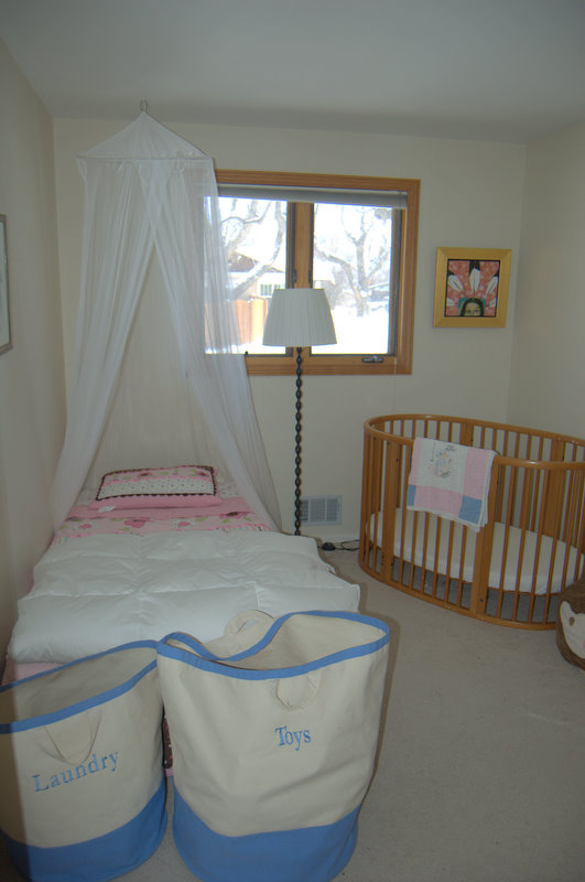
Most rentals don't have much in the way of dramatic architecture or fabulous features. Create them! In Boulder, the girls were sharing a pretty tiny room, and to create visual interest and give a bit more separation to their sleeping spaces, I hung a $19 mosquito net from Ikea over Clio's bed. Instant drama.


While our new house has loads of light and great space and good, simple choices in fixtures and is really nothing like a rental, it is something of a clean slate: white or gray walls, pale wood, no flourishes, doo-dads or whimsy. The dining room and kitchen are one big room in the middle of the house, with somewhat awkward lines. The room, where we spend an awful lot of time, needed drama. To anchor the space, I turned to Ikea again and hung this enormous chandelier.


It's not to everyone's taste, but it's hard to deny that it offers some drama (a real conversation-starter, too!) Now, I love coming in the front door and catching a glimpse of this around the corner of the stairwell.


I love sitting underneath it's largeness. I love that Eleri calls it "Big Ball" and that Clio says it looks like snowflakes (I think so too.)

And it didn't even take all that much to convince Dave!

LinkWithin

Related Posts Plugin for WordPress, Blogger...