Wednesday, October 20, 2010

What I Learned From Decorating a Rental

By the time we moved to Boulder, I had been a homeowner for 10 years, living for 5 years in each of two Brooklyn homes. I took decorating them very seriously (despite an utter lack of budget). When you're settling in to a place that you own, there's this idea that you need to get it just right because it is permanent. Of course, the upside is that you can do whatever you want without asking permission: Calypso Blue living room? Sure! (Did it in Park Slope when Dave moved in). Paint the vinyl tile in the kitchen? Of Course! (Did it when we moved out of Park Slope). But there is an inherent freedom in decorating a rental. It is temporary by definition. In Boulder, we knew we would be in that house for one, maybe two years before moving on from Colorado or settling down and buying a place there. While I knew that it didn't make sense to invest much in decorating a temporary place, I'm also not a person who can just live in an unfinished space, so I went to work making it feel like home using (mostly) things that I had.

And you know what? Just by easing up and playing it fast and loose (SO not my usual style), I learned some great lessons that I have brought into our new, "permanent" home. The main thing, of course, is to trust what you love and to try not to worry too much about what it is "supposed" to look like. Believe me, this was a HUGE lesson for old rule-follower me.

I started this post a month ago with so many "lessons," I got kinda overwhelmed. So lets consider this the first in a series. Who know is there will actually be a second.

Create Drama
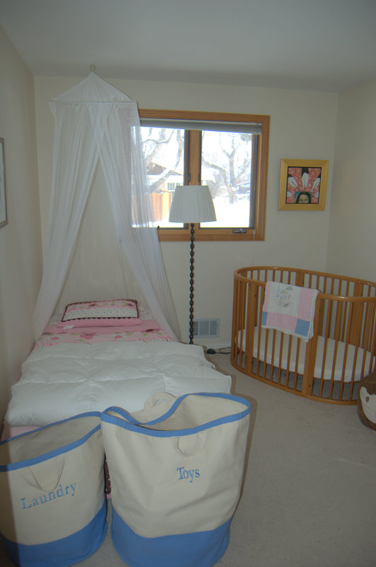
Most rentals don't have much in the way of dramatic architecture or fabulous features. Create them! In Boulder, the girls were sharing a pretty tiny room, and to create visual interest and give a bit more separation to their sleeping spaces, I hung a $19 mosquito net from Ikea over Clio's bed. Instant drama.


While our new house has loads of light and great space and good, simple choices in fixtures and is really nothing like a rental, it is something of a clean slate: white or gray walls, pale wood, no flourishes, doo-dads or whimsy. The dining room and kitchen are one big room in the middle of the house, with somewhat awkward lines. The room, where we spend an awful lot of time, needed drama. To anchor the space, I turned to Ikea again and hung this enormous chandelier.


It's not to everyone's taste, but it's hard to deny that it offers some drama (a real conversation-starter, too!) Now, I love coming in the front door and catching a glimpse of this around the corner of the stairwell.


I love sitting underneath it's largeness. I love that Eleri calls it "Big Ball" and that Clio says it looks like snowflakes (I think so too.)

And it didn't even take all that much to convince Dave!

Structural Improvements

Dave and I have never really been ones for making improvements to a house of any lasting nature. I think we think we're all DIY, yet the first house we chose to buy together had just been renovated and the next was brand spankin new. I'm hoping we're staying put for a while, and because we set aside a little budget to decorate, we decided to invest in some strategic upgrades. Like having an electrician work some magic in adding a chandelier in the middle of all the can lights in the dining room and tiling the backsplash in the kitchen.

I had never seriously investigated tile before, though I do know that the first time I went online to look around a bit, I chose a gorgeous limited-edition gold-leafed tile that retailed for about $200 PER SQUARE FOOT. In Boulder, our friends Amy and Justin did a gut renovation of their kitchen, and when deciding on tile they went for an option more in the $2/SF range, and Amy installed it herself. Our backsplash is 2 feet by 12 feet, and we settled on $5/SF for our budget. I found some tile outlets in Plymouth, MN, and away we went.

And get this: we came home with tile the very same day. You may or may not know Dave and I well enough to know that this is nothing short of a miracle. With no advanced research, we went into the field, visited three stores, and MADE A PURCHASE. Truly amazing.

Here's the thing, though. There are about 3 options for tile in the $5/SF range if you do not want white subway tile. (We are certainly fans of white subway tile, it's just that we needed a little more life back there.) We found these pretty glass tiles in the perfect shade of green, but I was almost positive that I did not want squares.


When we came across a glazed ceramic hex tile for $5.20/sf, it was only a matter of deciding between the smaller and larger sizes and the "moss" or the "milk." I found a birch cabinet in the store, plunked our countertop sample down, and proceeded to stand about 10 feet back while Dave switched samples back and forth. (Sometimes I do this thing where I turn around or go around the corner so I can "walk into the room" and let the material take me by surprise. I swear, it works.) Here's the penny tile from the same line.

(I will also point out that Home Depot had similar penny tiles for twice as much money. Home Depot! And they did not have the fabulous hex.)

And here's Dave with the small moss hex tile.


I loved the moss color, but ultimately felt the larger tiles were better and they didn't come in the greenish tone. Ultimately, viewed from a distance of 15 feet, we realized that the small tile would just read as a wash of color, whereas the larger tile would read as a white wall with a delicately drawn honeycomb pattern, and the answer was clear.

Install is tomorrow.

Related to this. We had been discussing some under-light cabinets, and realized we would have to put them in before the tile, so we scrambled and headed out to an electric wonderland where we picked up some stainless steel 40" xenon lights from counter attack. (get it? clever, no?) THEY went in this morning, and now I can actually see the dishes I am washing!


I never think of these practical things. I'm all: wallpaper! upholstery! let's make headboards! And Dave's all: wouldn't it be nice if these things functioned? Or, it's broke, let's fix.

We make a good team.

Now, if we did it ourselves, that would really be something. But that's the other thing about a nice, brand new house: it makes you nervous to go messing around.

Wednesday, September 29, 2010

Sometimes You've Gotta Just Snap it Up!

I've been decorating.

You would know more about this if I could finish my decorating posts and get 'em posted already, but hey, if I had enough brain space to post about decorating, that might mean that the decorating frenzy had died down, and then where would I be?

There's this thing that happens when I move into a new space, particularly a bigger space, where I want so desperately to be in and settled that I spend every waking minute online or at furniture and antique stores until my head spins around and Dave wonders what happened to his wife. Okay, I made that part up: Dave knows perfectly well that this is his wife, he just wishes the head-spinning would stop. At the same time, I love the process and know that the best rooms sit for a while, grow over time, and reveal themselves slowly. So it goes: get 'er done fast, let it grow slow. Oh, the tension.

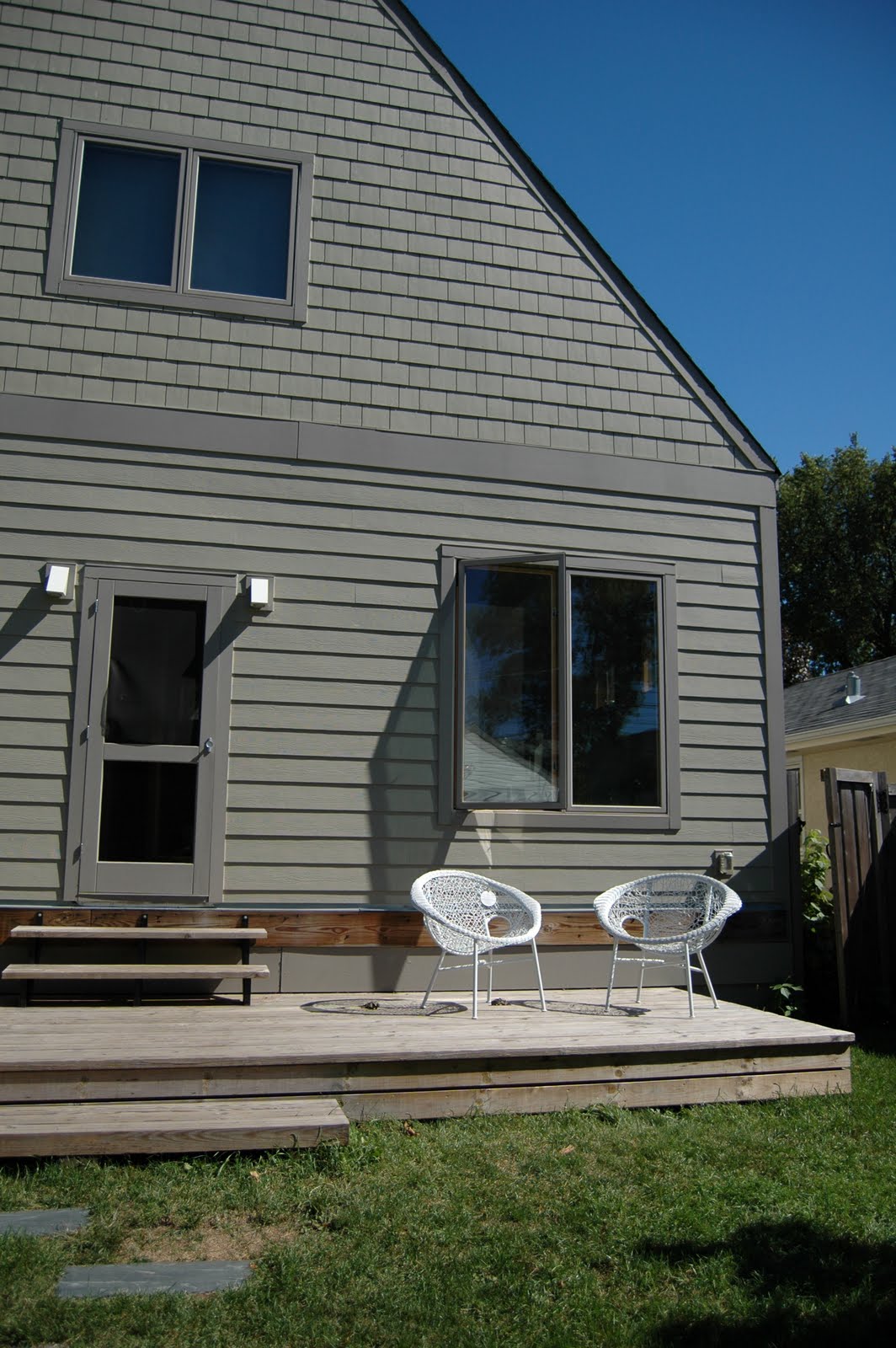
But sometimes these things magically come together. Take our deck. (I know: the deck? I'm decorating the deck? don't I have bigger fish to fry? Well, sure thing, but I want to be outside before the tundra descends, and while I'm out there I'd like some place to sit.) Years ago, I stumbled upon some African Hoop Chairs in the kids department of ABC Home, and i fell in love. I was smitten. I can't remember now if this was before I had kids, or if I simply couldn't afford them at $150 a chair, but no matter.


Aren't they the cutest?

I saw them show up later in the kids' room in the Domino spread of Mark Ruffalo's Hollywood home, which I would totally show you here if I had a scanner and if I knew whether or not it was legal to do so (I'm a rule-follower, what can I say?) Well all of a sudden, these things have had a little resurgence. At the Denver Biennial art exhibition this summer, I saw these awesome specimens in the outdoor lounge, and remembered that love at first sight.


After much ado, I found them for sale in every imaginable color, on a website that now eludes me, at the unaffordable price of $500 a pop. Then, what joy! there they were on page 22 of the June/July issue of Lonny, hailing from CB2 for a mere $150 each! Okay, still too much money, but no matter: when I followed the link, the item was sold out or discontinued. Probably both. My search went on, turning up similar rubber ones (at stores in LA that don't ship)


and cool metal versions online, like this one, but still out of the price range.


Well, lo and behold. Late one night I ran off to Pier 1 in search of a Chinese-red console table for the dining room and stumbled upon two "crazy chairs," as the name might indicate, not so sophisticated as the ones I had been lusting after but fun nonetheless, and on clearance for $39 each. Now, some might think that is STILL a hefty price for a chair that will sit outside your house, but at less than 1/10th the price of the ones I really wanted, and barely twice the price of those plastic adirondack chairs from Home Depot, I say, sold.


Wednesday, September 15, 2010

Buying Vintage

When we moved in to this house, I had visions for most of the rooms, and had a mental list of where we would need to invest in some new pieces and where we could use what we had.

I was wrong about almost all of it.

Take the dining room. Our dining room contains some of my absolute favorite pieces: a beautiful Chinese armoire, handed down from my parents, a beautiful solid cherry wood farm table, made by hand by my father-in-law, and a set of four Phillipe Starck Ghost Chairs, the only big furniture purchase Dave and I made together in the Brooklyn 30th street house, a splurge we saved for for a long time. Plus we had a decent neutral rug and plenty of art and accessories to choose from. I thought we were set. But I got it all in and realized something: the scale was all wrong. The table was too small. The rug was way too small. And now that we live where we know a lot more people, the number of chairs was too, too small.

Tackling the seating problem, I just couldn't make the room add up. I considered an upholstered banquette, a pair of wing chairs to anchor the table, a pair of upholstered chairs AND a long lacquered bench. But most of those scenarios still yielded 6-8 seats, and some STILL required the purchase of an additional Ghost Chair (or two). Did I mention the price has gone up on those things TWICE since we bought them?

Then, trolling craiglist for a dresser for the guest room, opportunity knocked. Someone in Wisconsin was selling a set of 8 original Herman Miller fiberglass shell chairs. They were teal. I got excited, then forgot about them. I really wanted to incorporate my Ghost chairs into the scheme, right? Later that night, looking for something online, I noticed the tab still open, and showed it to Dave.

"Okay, don't tell me I'm crazy, but what do you think about these?" I asked. "For the dining room."

"Hm. I like them," He said. (You have no idea: normally I research for days, sit him down and show him a bunch of tabs, and he rejects everything.)

The next day we drove to Stillwater and just over the bridge to Wisconsin where we met Ron, a 3-decades employee of 3M who bought a palette of these chairs when the company was selling them off. They've been in the garage for years, but now he's selling his mother's house. So.

Normally, I think it's great to see a thing in your house before you have to commit to it. Color can be deceiving, and scale, especially if you're looking at a piece of furniture in a vast warehouse or flea market or a small dark garage where your point of reference is way off from your reality at home. Generally, with vintage, you have to decide on the spot.

We bought the chairs, but on our way home with the first half of them in the car, Dave wondered aloud: "Did we just repeat the yellow chairs?" The yellow chairs being a set of four mid-century leather and chrome chairs that we bought when we first moved in together. Dave was obsessed with them, I was fine with them, they were all piled onto a table in a cramped antique shop on Atlantic Avenue and after we bought them we discovered that the legs were a bit warped, the seats a bit scratched, and Dave was pissed off every time he sat in one of them. We had them just under a year and then sold them at a loss when we moved to the house on 30th street.

As it is turning out, I'm loving the Eames chairs in the dining room, and any fears that we overpaid are quelled by a quick search of ebay, where the chairs start high and then skyrocket, and where sets of 8 are exceedingly rare. There are some scratches that we'll have to learn not to see, and we'll spend a little money replacing some of the feet, but I think we still got a good deal, and the seller got a fair price. This is one of the goals in buying vintage.

It could have worked out differently, though. The teal could have been hideous in context, the feet exorbitantly expensive, the scale all wrong for the room, etc. Then we would have had an expensive mistake on our hands, and we would have been on ebay trying to sell them off again. So I thought I would share some tips on buying vintage. Consider these the Lessons I Refuse to Learn.

1. Do your research. While it can feel like there is the pressure of losing out on a purchase if you wait, you usually have time to do a little research. In our case, before heading out to see the chairs we should have checked out the going rate on ebay (although I had a sense of it from looking for one of these chairs in Boulder), as well as looked into the price of replacement parts so I would know what I was dealing with. If we had know that replacement feet cost $25/set of 4, we could have negotiated a better price on the chairs. The more you know, the more you will feel confident in your offer, and the less regrets you'll have later, whether you ultimately get the piece or not.

2. With small items (small price tag and physically small), buy what you love. You'll find a place for it.

3. Take a picture. This serves two purposes: it allows you to see the piece from a different perspective, and it allows you to sit on it and "bring it home" if you can't physically bring it home.

4. Ask to take it home. You likely can't do this with anything particularly large, but it's worth asking. I recently brought home two 1960s painted portraits on 24-hour approval. It took the pressure off the purchase and allowed me to decide if I really loved them or if I just felt I had to because now they were mine. (I kept them)

5. Even in an antique store, ask if the price is firm. There's often room to negotiate, but be reasonable. You want everyone to walk away happy.

6. Don't carry a lot of cash. If you love a piece, you can ask the seller to hold it while you get money. This cuts down on impulse purchases and allows you to walk away and consider.

7. Inspect the piece carefully before handing over the money. I've made this mistake more than once, either because I didn't want to hurt the seller's feelings or because I got nervous in the negotiation or because the piece was against a wall/on a table/in the dark. Take your time!

- Check the BACKS of things (I once bought a dresser that turned out to be water stained on the back)
- Check the legs, which can be chipped or broken (I recently bought a small side table that turned out to have a chunk of wood missing on one leg)
- Check the UNDERSIDES for rust or water damage (okay, this one has never happened to me, but it sure could)
- Sit in chairs, and put them on the flattest surface you can find to make sure they are level (a la the yellow chairs)

If a dealer isn't willing to let you pull out, sit in, or turn upside down a piece of furniture, walk away.

7. Make an offer, then don't nickel and dime. Once, in a Paris flea market, I forgot the conversion rate (approximately five francs to one dollar at the time), haggled mercilessly, then walked away. In retrospect, it turned out I was fighting over a dollar. This is a waste of everyone's time and energy.

8. Stick to your guns. If you have a bottom dollar, hold steady. The seller may be willing to meet you, or you may walk away, but you'll know you did the right thing.

You can see the new chairs in the background of this photo (with the added bonus of adorable Eleri). They made me reconsider certain things about the room, in a good way. I'm working on curtains and wallpaper and the chandelier, and will post the big reveal when it's all done.


Monday, August 23, 2010

How to Hang an Art Wall

My first job out of college, I worked for a downtown boutique advertising agency, assisting, and then becoming, the Art Buyer, the person who works with the creative teams and finds the right photographer or illustrator to realize their vision for a print campaign. Photographers like to work editorial assignments for the artistic freedom and the recognition, but they like to do commercial shoots for the big budgets and better fees, so Art Buyers tend to become friends with photo agents and known to agencies. This is all a lot of background to say that when I was about 23, I got a call from Magnum, an elite agency representing the world's best photo journalists, asking to meet with me about hanging a show of Burt Glinn's work at the ad agency. The agent and the photographer came in with a collection of prints from his work in Cuba in the 1960s, and as we worked out a plan to arrange the work, I began to see clearly how a wall of art prints could tell a story, and the way the narrative changed as we created different juxtapositions.

On the day they came to install, I learned a thing or two about the practical aspects of hanging a group of works, the actual nails and measuring, and I have now put the tips into practice in three houses and several arrangements, like this one in the dining room in Boulder.


When we moved into our new house, I had an immediate vision for a wall of art in the office, a more private room tucked away at the back of the house, where there was one large, blank wall. Because the scale of the wall was much larger than the ones I had worked with before, I knew it would take some careful planning. Now, there are entire books on the subject of hanging art displays, but I believe it is largely instinctive, a matter of personal preference in terms of both the aesthetics and, more importantly, what story you want to tell. Apart from feeling it out, there are a few steps that work for me. (You can do this in just a couple of hours, and it's really fun).

1. Choose your work

Most people don't have endless works of art to choose from. When making a grouping, you may just want to use everything you have--you chose each of the pieces, you can probably make them work together. If you do have more to choose from, look for commonalities that tie a group together, whether a color scheme or a subject theme. If there's no theme within the works, you probably want to limit yourself to one medium, say photographs, oil paintings, or works on paper. If all your pieces relate to the ocean (to choose a subject at random), you can much more easily mix a watercolor and a photograph. Keep in mind that the frames are a visual element, too. Some people will suggest framing everything uniformly, but I say, not necessary. You can use uniform frames as a way to make a statement- I once saw a long hallway filled with black and white photographs all framed in red, which packed a totally chic punch- but the general rule of thumb is to choose a frame that is right for the piece, not for a grouping or your room.

2. Plan your composition

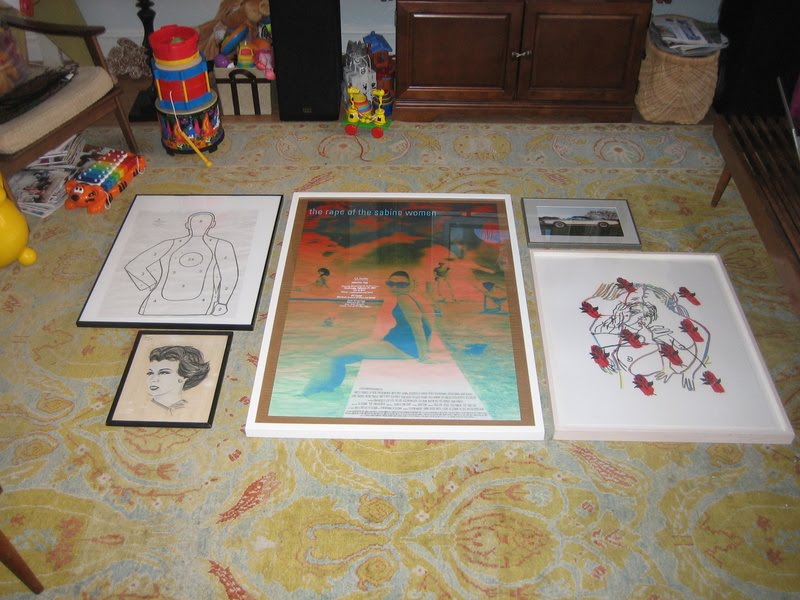
This is the fun part. Take all the pieces your thinking of using, and lay them out on the floor. Move them around until it feels like they fit. I usually start with the largest piece, which I like to put somewhere near the middle for weight, and then let the smaller pieces radiate out from there.


I also think about balance in terms of light and dark, both in the piece and in the frame material, and the density of the image versus the amount of negative space. With a very large wall or a lot of pieces, it's also a good idea to think about creating pockets of order within the larger composition- incorporating pairs or using symmetry in placement, as I ultimately did here in the office.


With fewer pieces, you can create a sense of energy by playing against symmetry. Our final grouping in our Brooklyn dining room had three pieces hung "too high"- not everyone's cup of tea, but in the end I found it more interesting than if it was completely balanced. (And, i will admit, a happy accident-I used existing nails from a previous grouping for one or tow of the pieces on the right, and then just went with it.)


3. Mock it up

Once you have your arrangement set, take a picture: you'll need it for reference later. (It's also helpful to do this while planning your composition- you see things in the photograph that you may not see looking directly at the arrangement.) Now trace each piece on butcher paper, cut them out, and label them. With smaller walls I have generally skipped this step, though the results vary. In our Boulder dining room, one half of the arrangement ended up all scrunched up while the other half had more breathing room between pieces. Oops! I had to swap in a bigger piece on the left to make it feel more balanced.


When you have all your paper cut, refer to your photo and begin adhering the paper to the wall, using some of that sticky tack that won't leave a mark on the wall. It's a good idea to measure the overall dimensions of the arrangement in order to place the first piece on the wall, but eyeballing it should get you pretty close, too (I'm definitely an eyeballer). This is also a good chance to make any adjustments based on what you see in your photos from the floor layout. In our office, I realized that the little square piece at the top of the grouping was too disconnected from the piece around it when centered; I moved it off center towards the other square piece, and I like the energy this ended up giving things.


4. Hang it!

Take a picture of the mock up, too, and use it to finalize things. Without the distraction of the color in the artwork, you might see some wonky things in the layout. In our office, I didn't end up liking the single piece way on the right,kind of hanging out alone, and simply nixed it from the scheme. Make any final adjustments to the mock up, and get ready to hang. Measure the distance from the wire on the back of each piece to the top of the frame, then measure down from the top of the butcher paper to mark the spot for the nail or picture hook. Measure across the paper, too, to find the center. You can pound the nail in and then remove the paper, but if you want to save the paper for another use (fingerpainting!), I recommend hammering the nail in just enough to make a mark, then removing the paper and finishing up with the nail. Repeat. And repeat, repeat, repeat!

Here's the finished product in our office:


It is, by far, my favorite to date. I love the scale and the overall statement, the fact that I was able to collect all of our poster and text-based work into one place, and the accidental color story. But most of all, I like that every single piece here is significant to at least one of us, and most are significant to both of us. The Doug Aitken poster and the small flower drawing beneath it are from Creative time events; Sur Les Paves La Ferme is from the WORKac project at PS1, where Dave worked on the project and I edited the book; the target is from a day Dave spent at a shooting range for a bachelor party and the Fred Tomaselli newspaper print was a wedding present to both of us; the watercolor on the far left was made for Dave by the little boy he was an au pair for in Denmark, and there are three pieces by Clio incorporated, too. (Don't be afraid to mix amateur work in with the "real" art). It was a lot of work to hang this particular wall, especially since I actually did it right for once, but I have to say, I love the result, and the story that it tells about our lives together.

I say, go for it in your own house, and if you do, send me pictures to post!

Sunday, August 22, 2010

Top 10 benefits to living in a new-construction house

When Dave and I were looking at homes in the Twin Cities, we were pretty open to different styles, eras, and parts of town. We made nearly 50 showings over the course of two weekends, and our list included a geodesic dome, a townhouse in a converted mansion, a modern pre-fab, and a 50s rambler that remained untouched since it appeared in Better Homes and Gardens magazine in 1955. We were looking for character, and I held the general belief that character comes with age. So imagine my surprise when we ended up with a house that was built in 2007, and nary a Spanish tile in sight. In fact, in a way what I love about this house is that is is a blank slate, a clean starting point. It has 10-foot ceilings and was designed to maximize light. It has wide-plank, light-wood floors, white and grey walls, and grey and white marble tiles in the bathrooms. I am a self-described maximalist, yet i have purchased a home with no flourishes. The kitchen cabinets do not even have hardware, and the backsplash is simply paint- that's like a dress without ruffles and an ensemble with no jewelry. Over the years, I have come to appreciate good bones, and the freedom of adding the flourishes with fabric and furnishings (and having the ability to change them without a contractor.) When we finally walked into the house after driving cross-country to the closing, I thought about the times that I have been displeased upon similar encounters: the tears shed over the tininess of my first new York apartment (a 300-sf one-bedroom walkup to be shared with a roommate); the sinking stomach upon entering the little brick rowhouse bought--at a price far too high--in the frenzy of the 2004 real estate market.

But this was more like entering my beautiful pre-war park slope co-op, or even our rental house in Boulder: it may not have been certainty at first sight, but it sure was love at second.

Another thing about me: I generally do things the "old" way, or go for form over function. While I'm not exactly a luddite, it drives Dave crazy--CRAZY--that I don't use quick keys to cut and paste. I suppose I am a creature of habit, and see nothing wrong with doing it the old way. So imagine my surprise as we get settled in and I find that the little short cuts and luxuries of modern convenience are a wonderful thing, to be embraced. Keep in mind that Dave and I lived without a dishwasher for 5 years, and when our dinner plates didn't fit in the dishwasher in the Boulder rental, we bought rimless salad plates to stand in. That I watched a TV through static for several years in Park Slope because the look of antennas just drove me to distraction.

So for the past few weeks, I've been mentally debating which shiny new "luxury" features are my favorites. There must be at least ten, which will fit into an inverted list and make a nice little outdated reference (does anyone still watch Letterman?) in keeping with the spirit of being set in my ways.

10. Automated ice-maker

Just in time for Eleri's favorite new declaration: "Cold water please! Ice. In it."

9. Central Air

Okay, we were lucky enough to have this is Brooklyn, but it was retrofitted to an old house, and the cold air came in surges so loud, watching TV involved a major volume control roller coaster. Here? Whisper soft. (This same level of quiet is less of a perk on the dishwasher, which I keep opening mid-cycle because I CAN NOT HEAR IT.)

8. Dedicated laundry room

Not the basement hallway, not a corner of the kitchen (using the dryer as a surface for both folding clothes AND cooling cookies (etc.) = unsavory), no: it's very own room. With cabinets big enough to store all the linens and towels, PLUS drawers and a utility sink.

7. Kitchen Island

The size of Malta. Is that an Island? That's what just popped into my head.

6. A walk in pantry

That you can walk into

5. Walk in Master Closet

Did I mention? You can walk in. To the closet.

4. In-floor heat in the bathroom tile

Okay, I admit, now I'm just showing off. But this is Minnesota, and I'm sure this feature will jump to number one on the list come, oh, February.

3. Basement Playground

Oh yes, it's true, there's a slide, monkey bars, climbing rope, and hanging swing chair built in to the basement. But shhhhh, don't tell the girls. We're saving it for a rainy day. Or, really, for the gym mats to arrive and save us all from the concrete floors.

2. Outlets

There are so many in each room, it's almost confusing to decide which to use for what. (Not always great with options over here.) In Brooklyn, our bedroom has ONE outlet, directly across from where the bed so obviously belonged. We had extension cords just ringing the molding along the floor (and cable wires ringing the crown molding.) Which leads me to the number one most awesome thing about buying a new-construction house:

1. Whole-house wiring

I have been known to nix entire stereo and media components because i didn't like how they looked. Imagine my delight to discover the house wired for a wall TV that was wired for a cable box or DVD player HIDDEN IN A CABINET. Do you know what this means? NO WIRES. We have forsaken our year of living TV free for a 50-inch on the wall, with no visible wires. That's like a his 'n' hers icing on this amazing cake.

Having just written all of that out, I feel like the luckiest girl alive where real estate is concerned. I also feel compelled to say that we got a GREAT deal on this house because it was built in the market surge but sold after the crash, and that we could only afford it because our fortunes went in the other direction with New York real estate. I imagine we'll only have the opportunity of going downmarket once in our lives, and I feel we did well in cashing in the chips.

if you can stand it, there may be a deluge of photos and decorating posts to come.

Tuesday, May 25, 2010

Resin Planter

This weekend I made a side trip to Home Depot when I was at Staples having copies made of our organization's strategic plan. Clio had picked out a potted flower at the grocery store the week before, and it was sitting on the dining room table, slowly shriveling in its plastic, temporary home. We had a pot from the aloe that drove with us all the way to Boulder from New York, only to be left on the deck all winter in some kind of sick botanical experiment about succulents and the high desert climes. (The climes won.) But we did not have dirt. We also do not have fresh herbs, something we had become very used to in Brooklyn, where we had a little container garden outside our kitchen door, and rosemary and sage plants that had survived many a New York winter (take that, aloe.) So I picked up dirt and threw in Rosemary, Sage, and Thyme (just short Parley for a trip to Scarborough Fair), and realized I would need a pot for this bounty.

Enter these resin pots in the most amazing hues: marigold, teal, raspberry, some of my favorites. It was hard to choose between the larger, ridged tubs (very modern!) and the softer-edged bowls. In the end, I went for scale and got the slightly smaller bowl, in this fabulous yellow.


Clio and Eleri helped repot the flowers and the herbs, though Eleri, surprisingly, was a little squeamish about the dirt (that and the wind, of which we have had plenty this past week). Now they love to water this tiny little "garden," and I love to look at the combination of color and textures (yellow resin! turquoise terra cotta! purple petals!) in this corner of the deck.

Plus: bonus! The ever photo-shy Clio thought it was just dandy to pose (and demonstrate her dance moves) with the new pots.


LinkWithin

Related Posts Plugin for WordPress, Blogger...