Showing posts with label bathrooms. Show all posts

Friday, September 9, 2016

Teeny tiny bathroom


I wish I could call this a "before and after," but I forgot to snap photos of the before!
This is a shame, because while the "After" is pretty cute, the real transformation is in how much bigger this small space feels.

This is what I would call a bathroom "refresh."  We didn't move any mechanicals, and we kept the original tub.  But everything else is new--tile, lights, medicine cabinet, toilet, and most importantly, vanity.  The old one was huge and blocky and cut off the space.  The new one is slim and sleek but still provides storage.

I may have shared the design boards before, but here we go again (if I don't remember, you sure won't!),  I gave them 3 options:

Option 1: Classic/ Vintage
(I should mention that we were deciding between flanking sconces with the original wiring versus moving to one overhead sconce, so both options are in these boards--it was to be one or the other, NOT both.  We were also debating re-using their shower curtain versus a new one.)


Option 2: Coastal


Option 3: Rustic

After a little revision, we landed on this:

Before, the bathroom was painted a very bright green, with some real acidity to it.  We wanted to to keep the space bright but also calm it down.  White paint made sense for brightness, but it may have felt a bit unfinished.  The grey "wainscot" feel fresh and modern and finished without getting too dark or heavy.


One of the ways we saved was not moving any mechanicals.  The sconces are placed a bit wider than we might have chosen if we were working from scratch, but aligning the towel ring and towel bars with the light's centerline makes it all feel pretty deliberate.  I think it's important to know when you really have to spend the money and when it makes more sense to make it work.


 We did corner shelves instead of a tiled cubby in the shower--we wanted to keep the lines of the tile as simple as possible.  You can also see next to the window we added a porcelain robe hook for easy access to a towel while showering.


In a small space, little details make a big difference.  I love the porcelain cross handles with the hot and cold labels.


But my real favorite is the blue-green-grey matte penny tile.  It looks hand made and is so fun and pretty!


We didn't want to spend a ton in this bathroom.  We got a totally cute, totally functional space on a tight budget!


Monday, April 4, 2016

Before and After: Contemporary in Jersey City

Well hello there!

What a busy month it has been.  Last week was my girls' Spring Break, and we headed to our old home, New York City.  The impetus for the trip was photographing a project I finished a while back in Jersey City, but then we almost didn't shoot it!  I'm so glad we made the time in the end, even if it was a very quick venture and I didn't do as much styling or get as many details as I usually would.

Ready for the tour?

The space is a tall and narrow brownstone which got a modern update but kept many original details intact.  My clients planned the major architectural changes on their own and brought me in to help decorate the entry, living/dining room, powder bath, master and guest bedrooms.

I shared some of the design boards and floor plans along the way:

Guest Room
Living room/ Dining Room
Master bedroom

Now for the before and after!
(A major caveat: these clients have great taste.  They had JUST moved in so everything is VERY unfinished in the before photos.  Lucky for me--the "Afters" look that much better!)

Living space before:


From the front entry, you looked at this stairway; the door to the left looked into the living room.  That whole wall got opened up.)


And after:
(We flip flopped the layout--living room went to the front windows and dining room in the middle, next to the kitchen.)


(I can't believe I didn't take my coat off the hooks in the front hall for the photo!  And missed an angle that shows the chartreuse wall color in there.)


Before again, looking towards the front of the house:


And after:


 Living room before:
(you can see the fireplace at the left edge of the photo for reference.)


Now the dining room:


This is such a good example of choosing carefully in a space with few pieces--the special items like this leather-front sideboard and the fabulous chandelier can really shine.

GUEST ROOM

This is the first space we tackled, on the top floor of the house.  We used the existing bed but put it on the window wall.  I had them take the accent wall color on to all the walls.  From there it was all about textiles and texture!

Before:


After:


MASTER BEDROOM

This one was the most challenging.  Obviously these clients love color, but they wanted a calm, soothing retreat for the bedroom.  The trick?  It couldn't be boring.  So we chose pale neutrals and brought in interest through the details--wallpaper that makes a quiet statement, studded lacquered bedside tables, a fabulous mirror, etc!  


After:


Before:


After:


Let's see a close up of that fireplace:


Before:

After:


I also love that wool geometric runner that runs up both flights of steps.  Great pattern, but subtle, as it is tone on tone.

POWDER ROOM

There's no before, as this space is brand new-- carved out under the stairs.  It's teeny tiny and SO cute!


We used the same cement tile here as in the entry.  We should probably look at that again, no?


One funny thing about this project--though complete for a while now, this is the first time I saw it with all the changes and selections we made!

I love all my projects, and have enjoyed sharing some more traditional spaces lately.  But this one is closer to my own style, making it that much more exciting.  Sometimes I do this weird thing where I think about which magazine a space would best fit it, if it were to be in a magazine.

I think this one is SO domino.  Don't you agree?


Tuesday, July 7, 2015

Traditional Bath: before and after

A while ago, I wrote about a bathroom where I needed to create a "design language" that blended the previous design choices in the client's kitchen and bath.  That full post is here.  The bathroom is just about done and looking great!

Here's the before:


And the after:


The biggest problem in this tiny bath was the overscale, dated vanity that took up most of the room.


This little guy solved that problem and made the room feel much bigger!


Having a smaller pivot mirror separate from the vanity unit also helps.

This room is 5x7 and nearly impossible to photograph (and of course, my phone camera is not the best), but I think the results are charming.

I should also say that I wouldn't often do grasscloth in a bathroom, but this one is very infrequently used, and the texture makes a hug difference in the feeling of the space.

Cute, right?


Wednesday, March 25, 2015

A bathroom (making sense of previous choices)

I generally work with clients who want to make improvements, but most aren't starting from scratch.  This means that the most challenging part of my job is often creating a design language where none exists.  I'm working with a lovely client right now who has redone her kitchen and master bath, and we are doing her other bathroom, among other things. Here's the before:


Her kitchen is fairly traditional, with cherry shaker cabinets, granite counters, and a travertine backsplash accented with blue corners.  The hardware is nickel, and contemporary in shape.


Her master bath has contemporary tile (large format rectangles in the shower with a glass-mixed border), cherry cabinetry, and more traditional oil rubbed bronze hardware.


My goal in designing the new bath is to have it feel as though these spaces were all renovated at the same time, not three separate renovations.  Palette is one way to do it, but we knew we wanted light and bright colors in the guest bath. So here's the plan:


- a cherry cabinet with shaker styling connect to both rooms (and the recessed cabinet and small scale sink solves the largest space problem in this tiny room!)
- we repeated the same oil rubbed bronze fixtures from the other bathroom, and I will recommend swithcing the kitchen hardware to ORB as well.
- I took the idea of the kitchen backsplash--beige travertine squares with a corner detail--and put a version of it on the floor
- The tub surround gets clean white subway tile, but a border connects to the upstairs bath.  The border combines travertine and glass.

The client loves texture, and we all know how much I love a good grasscloth, so we used that for a finishing touch.

Can't wait to see the transformation!
 

Thursday, September 11, 2014

Another Decision

Thanks for your input over on Facebook yesterday on how to lend polish to the Happy Hallway.  Colorful frames were definitely a hit, and ultimately I think I am going to go for grasscloth AND frames, possibly in a standard ikea color (bright red or high gloss gray) to save myself a huge DIY headache.  We'll see how it looks when the grasscloth arrives.  (I have to say, I have forever and ever wanted grasscloth and have never used it in my own home, so this is a double treat.)

Moving on!

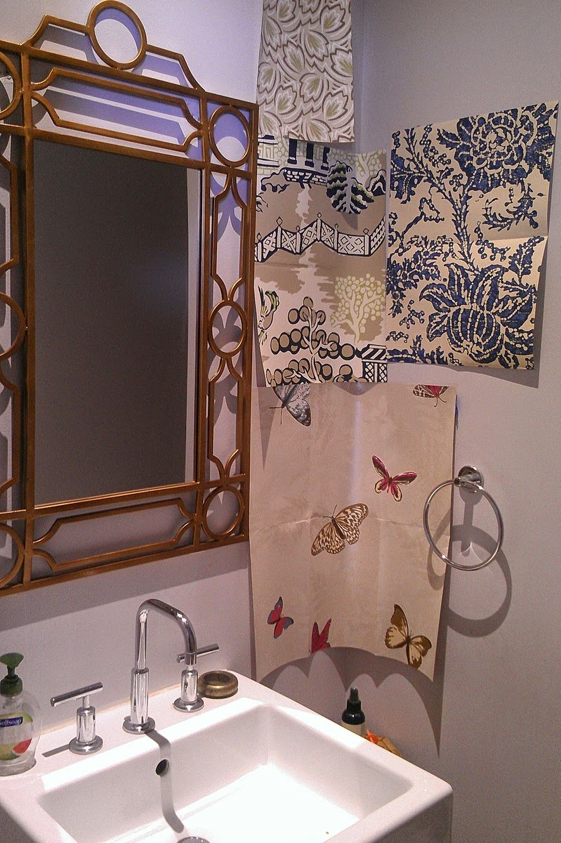
I asked for input on the powder room wallpaper a while back, and many of you liked our favorite: Raphael from Sanderson.


I went ahead and put in the order, only to discover, to my dismay, that the use of a liner is recommended with this paper, which significantly increases the labor cost.

I hemmed and hawed and pulled additional possibilities.


Surprisingly, my husband liked the butterflies (Nina Campbell's Farfalle), and my girls liked the leafy print up top (also a Nina Campbell pick.)


But we put the tree sample back in, and it sort of felt like no comparison.  The trees are magical.

I have written before about how I would rather "get a great deal" than "pay for the perfect thing."  I have said before that it is the lesson I refuse to learn.  Hanging wallpaper is pretty much never cheap, and my husband suggested that if we were going to spend the money to do it, why not spend a little more to get something we really loved?

No decision made, but I am leaning back towards those trees.

What about you: do you splurge on things that are "just right?"  Or are you more one to "make do?"  I think we need a balance of the two, and you know what?

I got a great deal on the grasscloth.


LinkWithin

Related Posts Plugin for WordPress, Blogger...