Wednesday, February 3, 2016

Before and After: Clinton Avenue Sunroom

We're getting the hang of these shoot days around here!
Yesterday we photographed the home with the surprise bedroom makeover and the tween girl's bedroom, both of which you have seen here (but the photos were terrible!  Maybe I'll share the new ones, if that isn't too boring.)  We recently completed the sunroom/ home office, so these photos are brand new.  (though again instagram followers got some sneak peeks.)

Here's the before:

Basically a long narrow room with GORGEOUS windows and not much else happening!


And after:


We divided the room into two areas by floating the desk in the middle, behind a loveseat.  The loveseat faces a chair, which we kept in the corner (but created a better proportion--taller and narrower.)

Before:


After:


We also closed up the door on the middle of the windowless wall--it went to the master bedroom but wasn't needed.


After:


That's about where the door used to be.  More space for the fresh wallpaper!  I think adding the trellis paper and removing the window sheers so the mullions are visible were the major transformative elements in here.

Behind the desk we did a console and a pair of lamps, and brought in a prettier chair at the desk.


The pair of poufs tucks under this console when they aren't needed at the coffee table for games.


The best thing about this room?  Apart from closing up the wall and papering, we totally did it on a budget.  EVERYTHING is big box/retail and affordable, but honestly, I don't think you would ever guess!

Monday, February 1, 2016

Before and After: Queen Avenue South

I've been shooting some of last year's projects for my portfolio and a website update, and I'm excited to share these projects here!  If you follow me on instagram (you should!  @hpetersondesign), you have seen peeks of this project, both when it was installed and last week during the shoot.  But I think the full reveal before and after is pretty fun!

This is just the nicest family.  They moved from a small apartment in a bigger city to a much larger tudor home here in Minneapolis.  As is so often the case when we upsize, their home was full of hand me downs and small scale furniture.  Nothing was their taste and nothing really worked.

They wanted a moody palette and masculine vibe, with some hits of color to bring a cheerful edge.

The dining room.  Before:


And after:


before:


And after:


The client picked this deep blue with a touch of green and gray, and I love the impact.  The room is on the dark side, and going dark on the walls kept a cool, moody vibe.

 Before:


And after:


We also played with scale a lot, and I love the contrast of the tall head chairs with the small side chairs.  The oversize gold drum shade makes it work.

A detail:


Living room before:


And after:


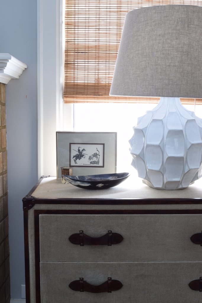
We kept the basic layout of the couch facing the lovely fireplace, but we really hit on the symmetry with a pair of chests flanking it, topped with overscale ceramic lamps.  We also did a pair of chairs, and added function by floating a desk behind the couch.

So much of the interest in this project came from texture, like the reclaimed wood and iron coffee table and the mix of linen and leather on the chests.


Before:


After:


Silk curtains in a grey similar to the walls adds softness without contrast and highlights the beautiful window.

Before:


Before:


After:


The sunroom before:


The sunroom was probably the most neglected, with an ikea couch and a small media stand.  The single shutters on each window also chopped up the space, and because they had a tall stack, they blocked the light.

Sunroom, after:


Now, the roller shades are a much simpler treatment on the windows (and they do retract completely).  A slim sectional and pair of leather poufs are great for TV watching.  I'm a huge fan of the patchwork hemp kilim rug--custom made for us in Turkey.

This is one of my favorite projects.  (My only regret is that we did not have the dining room radiators painted the wall color--but that could always happen at a later date, if desired.)  These rooms look very different than if it was my own house, but I love every piece and I am totally thrilled with the transformation!  I suppose that's how it should be with a good design collaboration with a client.


Tuesday, January 19, 2016

Eleri's room process and mistakes

Yesterday I shared the before and after in the guest room-turned 7 year old's room.  I also mentioned that this room continued to feel unresolved to me.  Why?  Well, I rushed.  I didn't stick to a master plan.  And then I made incremental changes to over-correct, and that kept making things worse instead of better.

Here's some of the phases and what we can all learn from them!

1.  The day of the surprise.


We decided to surprise the girls with makeovers when they spent a week with their grandparents.  I had this plan for Eleri's room, inspired by the pastel suzani euro shams, found on sale at Pottery Barn.


Some of the furniture plans changed, and the linen scheme felt a bit grown up--I would have been happy with it in my own room!  Also the sheepskin-over-the jute rug didn't work as both pieces are old and it just looked dirty. The result on the day of the surprise was okay, just a bit unfinished. 

Then, my bedding gave out and I decided to put the hotel bedding in my room and get new bedding in here.  I found this reversible duvet from the Shabby Chic line at Target and loved the floral--Eleri draws flowers all the time.  Flowers are her favorite.


Right about then, we had the conversation about layers.  This is also the child who has always wanted "bed curtains."  I remembered some block printed curtains I picked up to use as a shower curtain in their bathroom.  Here's another problem, though: the blue in the new bedding and curtains is very different than the wall color.  More porcelein blue versus slightly aqua.  And whoever says all blues go together has not been in this room!  I would sit in here at night reading Harry Potter, just cursing the wall color.  This is 100% my fault: Eleri chose something lighter and wispier, "like the sky," but going from Navy I was afraid to go SO light.  She was right, I was wrong!


You can also see here how I started swinging to the Loud!  Bright!  Crazy!  end of the spectrum.  I can tell you that the effortless bohemian layered mix of patterns things is not an easy look to pull off.


Whoa.  WAY too many dominant colors going on here.  (Also a lesson in experimenting when the children aren't home.  As soon as I brought that pouf up from the basement, Eleri did not want it to leave!)

Then I added the butterflies.  The swing chair had to go where it is in order to screw into a ceiling joist.  The placement is awkward and the wall needed to be filled with art--but I wanted her to be able to USE the chair, so I couldn't hang anything that was going to get knocked and broken.  At the same time, I really wanted to cover the blue wall color, which, as mentioned, I hate.  

The butterflies were going to fill that corner with the chair, only, but either I mis-ordered or the vendor sent me extra.  I had HUNDREDS of butterflies, folks.


And it was just WAY too much with the bedding and the rug.

Finally, I just had to walk away for a while.  I knew there were too many tensions at work:

- Dirty colors and fresh/clean colors
- strong color AND strong pattern
- too many 2-tone elements

And that ultimately I kept switching gears between soft and dreamy and bright and cheerful.  I had to make some decisions.

So I stole the rug from Clio's room, which has both clean and dirty colors and a beautiful dose of texture, returned to the hotel bedding, and reduced the amount of color and pattern over all.  I swapped the bright pouf for a soft one and the painted green desk chair for the clean white Ghost chair.


I also kept most of the pattern to a simple palette: the butterflies, dresser, headboard, and reversible quilt (totally stolen from a room I designed at my parents house while they are out of town!) are all two shades of purple.  There is still plenty going on here, but it is much calmer now overall, with more concentrated areas of bright and fun.


Of course, I still want to repaint the walls.....


Monday, January 18, 2016

One Room Challenge Reveal: Part 2!

Happy New Year!

It seems I was extra light on the blogging last fall, not to mention the non-existent effort to put in appearances over the holidays.

The One Room Challenge kept me sharing in October and November, but I never did reveal my second daughter's bedroom. (The first reveal was here.)


Why?

Well, the space was a bit unresolved.  (I've been watching a lot of Project Runway, and this is a big critique that Nina Garcia uses.)

Truthfully, the space STILL is a bit unresolved, but I've spent too much money on this budget makeover, and I just need to live with it.  I'll tell you more about that tomorrow, after the photo reveal.

As a reminder, the before was pretty darn good if I do say so myself.  I love that the after is SUCH a different mood, even though the furniture mostly stayed put.  If you want a reminder, this post is where I went through the planning, this post is all about the palette and textile selections, this post was about the furniture DIYs, this one is about the rugs, and THIS one is all about putting on the brakes in Eleri's room and re-evaluating.

But now it's (sort of done)!

Before:


After:


Before:


After:


Before:


After:


Before:


After:


So, it's pretty cute and she loves it.

I'll fill you in on the process and the problems tomorrow!


LinkWithin

Related Posts Plugin for WordPress, Blogger...