Thursday, March 8, 2012

Too much DIY?

A while back, Elle Decor asked a number of designers what trends they thought were on their way out.  Two of the designers referred to DIY projects and painted furniture--the bread and butter of many blogs.  Perhaps it is not surprising that bloggers threw up their hands at these predictions.

I have to say, though: I get it.

While I am all for a good DIY, and feel incredibly inspired by all the creativity that bloggers share with the world, I also believe that doing it yourself should add to the look and feel of your home.  One thing I have noticed is the number of projects that look okay in a styled photograph, but that I absolutely can't imagine living with in my home.

When I opened the most recent Midwest home magazine, I saw an article that really hit this home for me.


This room is darling: the fresh palette, furniture with fun lines, natural rug, and fun fabrics.

In my opinion, the DIY is bringing it way down.  Pine shims as a valance?  Rolls of twine on the wall?  PVC pipe planters?  A washtub filled with birch logs as a coffee table?  I suppose you could say these are clever ideas, and the twine looks kind of fun in the photo, but would you actually want to sit and look at it in your house?  (This was always the big problem with Trading Spaces, too.  Straw on the walls might be fun for the camera, but what a nightmare for homeowners.  I'm talking to you, Hildy.)

The one project that is working for me here is the lamp.  This is a great example of what the most creative bloggers bring to the party: a common item (fence post tops) reimagined into a piece that looks great on its own, like something you might actually covet if you saw it on the shelf in a store. 

If we had more of that, and less of the "random objects tacked to the wall", DIY wouldn't get such a bad rap, and it might just be here to stay. 

What do you think?

Wednesday, March 7, 2012

How to balance really low dining chairs

I love the look of sleek, low-back dining room chairs.  You know, the ones that barely kiss the table top.  Without any height around the table, though, a room needs some balance.  I love the way these spaces fill the void with overscale light fixtures and/or big, big art.


A more traditional take, with wood captains chairs and an overscale lantern:


If you can't go for a large-scale pendant, curtains can help, or flowers, too. It's all about the volume of space and filling the void from table top to ceiling.


What do you think: would you go low?

Tuesday, March 6, 2012

DIY wallpaper

Sometimes I need to let things percolate for a long time.  Especially in my own house: I am here all the time, and sometimes one needs to step away for perspective.

Just this morning, I was sitting in my girls' room singing wake up songs and looking absent mindedly into their bathroom, and my mind wandered to the stripes I have been planning to paint in there, and for the first time maybe ever, I thought to myself, Stripes?  Stripes?  I don't know.

(As an aside, we went to a dinner Friday night with three families.  Out of the 6 grown ups and 6 children, only 3 people were NOT wearing stripes.  My family of four had at least 5 striped items--my 3 year old likes to layer stripe on stripe.)

I would like pattern in there.  I can't afford wallpaper.  I already used the block-printing on a different project in their room.  Trolling my own pinterest pages, I was reminded of this.


Isn't that rose wall just the cutest thing?  From a designsponge sneak peek.  These guys took a cell phone picture of a rose covered wallpaper at a Kate Spade store, printed it out a bunch of times, used a plain old glue stick to put them on the walls in a random pattern, and basically decoupaged over it with a diluted glue solution.

People are geniuses, I tell you.  Geniuses.

(Don't hold your breath that I'm doing this any time soon.  I'm just feeling inspired in the moment!)

Happy Tuesday.

Monday, March 5, 2012

Before and After!

Let's start the week off right.

On Friday, I went for a follow up visit with a client to hang a family gallery wall and basically zhush the place up (though as it turned out, my client had everything looking fab when I arrived.)

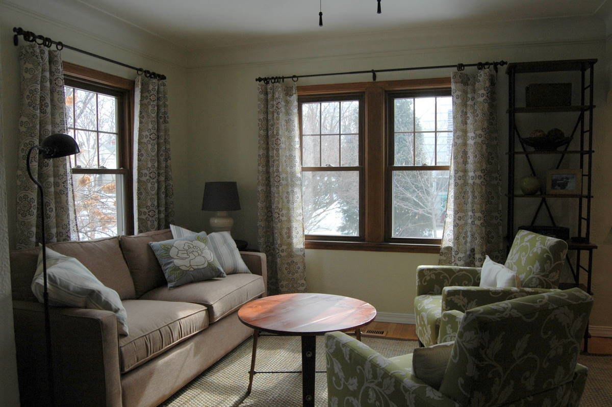
This was a family home for years, but with the grown children out of the house, the parents were ready for "real" furniture and a place that felt all theirs.  The space we started with was dark, the furniture bulky.


Our goal?  To lighten everything up, create distinct areas, and maximize the square footage.


I think we succeeded!

1. Lighten everything up.
The biggest change here was to go from three wall colors in earthy tones to a single hue that is much breezier.  One color is unifying, key in a small space, and a light creamy green is very fresh and soothing.
The furnishings and textiles are also lighter, with a neutral base that allows the greens and blues to come forward.


2. Create distinct areas.
Before, the sectional wrapped the room, and the area rug was oriented in the  middle of the space, making the entry, living, and dining areas all function as one.  It may seem counter-intuitive, but in a small space designating areas can make everything feel bigger.  Here, we used a bigger area rug to define the living area, leaving the entry and dining areas out.  Next, we used a pair of armchairs to break up the space and emphasize the line between living and dining, and added a tall narrow bookcase to further define the living room's edge.

Before:


 After:


3.  Maximize square footage.
Again, this may be counter-intuitive, but sometimes putting the biggest pieces possible into a space can make a room feel bigger.  The upholstered pieces here are as big as the room can take, but streamlined.  A three-cushion couch, for example, would have felt fussier.  We also chose smart storage, like the tall narrow shelf unit, nesting side tables, and a garden stool that can function as a table or an extra seat.


Other tricks and tips.

-- To unify the small space, we repeated the same wood tone throughout, and brought the oil rubbed bronze finish to the curtain rods, coffee and side tables, standing lamp, and etagere.

-- To make the windows feel bigger, we removed the individual faux-wood blinds and replaced them with breezy curtains, hung wide.

-- To keep things from feeling too stiff, we used several shades of blue and green, and pulled both the grey and the brow neutrals from the drapery fabric.

Let's have one last look, shall we?

Before:


After:


This project was a very fun collaboration with my client.  I showed you the design board process here.  (If you take a look back, you might wonder what happened to the sconces.  They were meant to be incorporated into the gallery wall, but when we opened them up, they were missing parts, called for bulbs neither of us had ever seen, and one of the shades was stained.  As it turned out, there were plenty of photos to create a gallery wall without sconces, so we simply nixed them.  Sometimes you have to make these decisions on the fly.)

Once we settled on a final scheme, my client then went ahead and ordered everything, put furniture together as needed, painted, hung the curtains, and then had me back for final details.  This is a great and economical way to get a designer room for less!

Saturday, March 3, 2012

Small Measures: Graduated doors


So much more fun than a solid, especially against this light and airy backdrop.

Friday, March 2, 2012

Christian LaCroix


here

Loving this wallpaper from Christian LaCroiz for Designer's Guild.  Reminds me a bit of this paper


via Living Etc.

But a little more haphazard, like a super chic pinboard gone trompe l'oeuil.

Ooh, and while we're on the subject, loving this one, too.  Not for me, but loving nonetheless.


here

It could be a fun DIY to "wallpaper" a small space by decoupaging your own ephemera, and add a clear polycoat over the top.  Add it to the list of things I would do in a crumbling old house, if that's where I lived.

Thursday, March 1, 2012

Anthropologie rug: the look for less

I have always loved the Anthro "festival" rug.


But I don't love the price tag. At $998 for an 8x10, it certainly isn't crazy, but when you are doing a whole house (or even a whole room), the price tags add up.

Check out a similar rug from NuLoom.


You can find it right now at rugstudiousa where a 7'6" x 9'6" is only $425.60 (sale price).

Noe, I do believe that you get what you pay for, and the big difference here (besides the slightly murkier color palette from nuloom) is the way the rug is made.  The anthro rug is a quite detailed crewelwork construction, while the nuLoom appears to be machine tufted.

Either way, though, you get that bohemian look at a good price.

LinkWithin

Related Posts Plugin for WordPress, Blogger...