Wednesday, October 31, 2012

Art to Benefit Sandy Relief

I love this movement of art for disaster relief--I feel like many artists are such humanitarians, it makes sense to me that art could contribute both directly and indirectly to the mitigation of troubled times. I always sort of wish I had one of the Milton Glaser I Heart NY More than Ever prints as a reminder/remembrance of 9/11. In this era of instant news and quick forgetting, there is something appealing to me about an artwork that reminds us of tragedy--both to keep us focused on gratefulness but also to keep us mindful or the sometimes surprising upside of difficult events: a sense of community, connectedness, or faith.

 After the Earthquake in Japan, there was this.

Already, there are two editions out with sales benefiting the relief effort.


Blue Marble, 20x200, buy here


Purchase here (NJ print also available)

Art to support the losses of the storm are especially poignant, considering this.
Somehow, I think it is the most unexpected, unpredictable losses that hit the hardest.

Aftermath

Have you been seeing photos of the aftermath of Sandy?  With many friends and family on the East coast, they are all over my Facebook feed, and many are heartbreaking.  All the photos of large, displaced items (boats, shipping containers, a shark!) get me the most: they demonstrate the power of the water, the randomness of the event.  I keep thinking of the movie Ponyo.  Isn't it funny how our brains work?

I've been thinking about disbelief.  Like when the tornado came to Minneapolis and I did not heed the sirens.  People who got stuck because they would not go.  And I have been thinking about loss, how we may be surprised by what we mourn afterwards.  Not too long ago, I stumbled upon this list from a woman who lost everything in a house fire.  What she most misses.  (Hint: it has nothing to do with money, everything to do with soul.)  When I think about what I would take, that old tale of the first things you would grab in a fire or flood, I'm sure they would not be the most meaningful.  They would just be the closest at hand.  What do I think I would want?  Is that even a useful exercise?

We forget, too, that after a natural disaster, there is work to be done.  We hear the phrase "The hard work of rebuilding," but if we are not rebuilding ourselves, personally, we forget.

Today, from the lucky comfort of my home office, planning for trick or treating, playing with fabrics for a client in New Jersey who has no power (but is otherwise okay), I will be thinking of  all the people trying to get the boats back in the water.


Tuesday, October 30, 2012

Sandy


I spent all day yesterday listening to storm coverage as if I still lived in NYC.  I couldn't help thinking that our old house in Brooklyn was in the flood plain--we were so close to the water that most insurers wouldn't take us on.  Hoping that all my former neighbors and all my friends and family who are currently in the storm's path are safe and sound.


Monday, October 29, 2012

Fuschia, grey, yellow + aqua?

Whew.

At the end of last week, I found myself picking new paint colors for a client I've been working with in bits and pieces over the past year.

I've been thinking our palette will look a bit like this:


Love the happy vintagey quality of the fuschia and mustard/ochre, tempered by the grey and white or cream. But it is a bit strong for a whole space, yes?  And they want light and bright.

A deep or bright pink always makes me want blue.  (Remember this?)  And to keep things fresh, I love the addition of aqua, with just enough green in the yellows to keep the palette from dipping into rainbow sherbert territory.

Source: bhg.com via Heather on Pinterest


Why thank you, Better Homes and Gardens, that's just what I had in mind.

We could put the yellow on the walls


Source: flickr.com via Heather on Pinterest

Or  the aqua


Of course, none of these have the total palette, but it can be helpful, when you're stuck, to visualize a wall color this way.

While searching for inspiration, I revisited some Domino magazines, including a piece about designer Barrie Benson's own home.  She originally painted it all white, before realizing it was too stark and cold, and she came back in with a palette of pale blues and greens.

Design is a process, sometimes easier than others.

Wednesday, October 24, 2012

Large Scale botanical on a budget

SIBBARED Picture IKEA

I popped in to Ikea yesterday to take a look at their curtain rack systems for a project, and happened to notice this large-scale botanical poster for $19.99.

Vintage versions have been making appearances (I blogged about them here), and really nice reproductions can be had from here, but if you want the look just for now, this is a great way to go.

I have to say, I kind of like that this poster LOOKS like a vintage knock-off.  Something about the way the images are styled, it almost ends up a little bit cheeky.  Know what I mean?

Tuesday, October 23, 2012

If you like this designer headboard, try that retail one

All of a sudden, there are a number of great headboard shapes out there that can be customized with a selection of fabrics (or, in some cases, the fabric of your choice.)  While these tend not to be cheap, they do offer you a wide range of options without hiring a designer to give you access to a tried and true workroom and trade-only fabric lines.  It offers you the option of a designer-look custom bed without much hassle.

It has been fun to try to replicate some designer looks through retail.

So, if you like this, try that:


Top row: if you like this fabulous San Francisco apartment bedroom, originally published in Domino, try that velvet upholstered headboard from Urban Outfitters. (and some knock-off Clarence House flowering quince fabric to go with it.)

Middle: if you like this fun and fabulous Annie Selke bedroom, try that fantastical bed from John Robshaw.

Bottom: If you like this updated-traditional blue fabric on a curvy shape, try this block-printed number from Serena and Lily.

Round Two!


Top tow: if you like this floral number in Lonny editor Michelle Adam's apartment, try the loose floral on a custom bed from Bassett.

Middle: if you like this vintage french look, spotted on Amber Interiors, try this inset-stripe Louis style bed from Ballard design.

Bottom: And if you like this over the top floral, spotted on Little Green Notebook, try a similar fabric on a straight-lined bed, also from Bassett.

That should get you started.  Try out the customization tools at these retailers, and let me know what you come up with!

And come on back tomorrow.  I'll try for a "best of the rest" round up of retail beds in great shapes, even if they come in a more boring array of fabrics.


Monday, October 22, 2012

Curvy Headboards

Have you noticed this major trend towards major headboards?

Planning a round up of the retail options, I started pinning examples in finished rooms, and quickly amassed two dozen pins.  Veranda did an entire slideshow here.

With more and more elaborate headboards showing up on the market, I've been thinking about the time cycle from magazine to retail, and it seems that a ton of these sinuous, curvy headboards showed up on the scene in magazines in early 2010.

These are all from Lonny, June/July 2010:


And Lonny seems to be on a trajectory of featuring headboards that are more and more dramatic.

September 2011


March/April 2012


House Beautiful is in on the action, too.  Some favorites:


Of course, the Do it yourselfers get in on the action early.

Grace of Designsponge made her otomi version as early as 2009 (inspired by one she saw in the now-defunct Cookie magazine).


And the DIYs seem to be getting more and more elaborate, too, like this recent reader design on Little Green Notebook.


Isn't it fun?  You can read more about it here.

Need even more inspiration? Check out my pin board here.

If you are planning to make your own, there are a bunch of great tutorials out there, including Grace's how-to video, here.  (I also talk about strategies for challenging curves, here.)  If you have some bucks and prefer the retail method, come on back tomorrow and I'll show you the best options to be had.

Happy Monday!

Saturday, October 20, 2012

Small Measures


Have pretty pots, but lack storage? Do as Julia did: hang them up. The arrangement here, via Apartment Therapy, is more aesthetic, less utilitarian, but there's something to be said for Child's method, too: hang a pegboard, arrange your pans, and outline them in marker, chalk or paint. You'll always know what goes where.

I'm having a dinner party tonight. I suppose cooking is on my mind!

p.s. Note that mint ceiling, and the sink pipes painted to match the wall.  This is super fun color blocking!

Thursday, October 18, 2012

Custom pelmets and bumper

Thanks so much for your lovely comments about the boy's room I revealed yesterday.  I can't wait to see it in person!

His sister's room is still a work in progress--it is also tiny and, I imagine, difficult to photograph.  But today I can show you the statement pelmets we had made, and the cutest crib bumper ever!


Here's a detail of the pelmet shape and fabric.  And the cute mobile we found on etsy.  Love that this baby can grow with this room.

And the bumper.

How amazing is this fabric?  Little tufted velvety sots on linen.

Eventually, the changing table will be replaced by the perfect, narrow tallboy, and moving the glider out could make room for a more kid-sized chair.

Pelmets are a great way to make a statement in a small room, especially when there is just no room for curtain panels.

What do you think of this progress?


Wednesday, October 17, 2012

Boys room REVEAL!

Yesterday I told you I would have something useful someday soon.
And then I got photos from afar, revealing how this:

Photo

Became this!


And this, too!


We still need to hang art, tweak details, etc, and I can't wait to go out there next month to finish up.  But it is already such a big change, and so danged cute, I just had to share.


That little orange table and chairs is in the space, too, in a little nook I didn't show you yet--cause it's not finished.

I was just about to wish you a happy weekend.  Then I realized that only in Minnesota are all the children home from school for the next two days.


Tuesday, October 16, 2012

The dominoes keep tumbling (occupational hazard # 231)

I will share something useful with you some day soon.  Promise.

But for now, let's continue on my recent journey to rearrange my living room, shall we?

So, I painted the fireplace wall.  Then I inherited this beautiful behemoth.  Next I started to consider a natural, more neutral rug. and just this weekend I upholstered a top for the bench by the fireplace.

Well, the other day I was helping this friend (and client) sourcing accent tables and ottomans for her living room and family room.  We were liking the Target knock off of a Panton table (that Erin write about here), but couldn't find details (like measurements) online.

Then I remembered:  not only did I have one of the tables in my trunk (for this client), but my friend and I havebasically the same couch--this one, in different colors and lengths.

So like any good friend/ crazy designer, I brought the table in to see if it would work with the couch.  The verdict: no go to use two as a coffee table (too tall), but they sure are fabulous as side tables!  When I was at Target this weekend I bought a second one (on clearance already!?!) and have been testing them out.


With a rug swatch, naturally.

It's a pretty big shift from the solid tables I'm so used to (remember?).  So we'll see.

It's funny how making one change in a nearly-finished room can lead to reconsidering everything.  Has this ever happened to you?

P.S.  Hi all you new followers, thanks so much for being here!!  Am I scaring you with this nonsense of late? I hope you'll stick around....

Monday, October 15, 2012

Adding to the fireplace vignette

When I revealed the black-painted fireplace wall, I mentioned that I was planning to add an upholstered top to the mid-century bench.  The wall needed a textile for softness, the new coffee table meant I needed a little extra height for the bench, and the wood-slat, though I love it, was reading a little too casual for where the design of this room is going.

Using a leftover piece of glazed linen (it was welting for client pillows), a piece of plywood I already had, and leftover foam from a headboard project, the only expense to this project was a couple of dollars in batting.


I also went looking for baskets to use under the bench a couple of weeks ago, and came up short.  Friday, however, I hit Consignment Central and found this pair.  They were exactly what I was looking for.


Because they were $12 each--pricey for consignment--I almost didn't buy them.  Then I remembered that most of the baskets I had looked at (at Michael's, World Market, Target, Home Goods) were more expensive and less perfect!  I'm thinking of giving them a dipped effect with either gold or silver rub n buff or spraypaint.

Kind of like these two combined:


both photos, Martha Stewart

This way my husband and I will have his-and-hers magazine bins, eliminating the conflict of who/when/how magazines get sorted and recycled.

Isn't it funny how we almost walk away from what we want because we are expecting a "better deal"?  I also almost bought just one of the baskets, but the truth is, you should never split up a good pair!

Friday, October 12, 2012

Playing around with a jute rug

I love the layered look.  Love it.  Escpecially in a house like ours, which has simple, clean lines and little patina.  Sometimes the problem with layers is that it means A LOT of individual items that may not be strictly "necessary", and that can add up to the big bucks.

In the small guest room, where I have a beloved turkish rug in the small area of free space at the foot of the bed, I have long thought that a natural woven rug underneath would add texture, depth, and a soft place to step in and out of the bed.  But the room didn't "need" it, so I wasn't going to buy it.

And then.

Then I found a rug that I FORGOT THAT IT HAD.

Is that weird?  (I know there are all you hoarders out there who are shaking your head: no, not weird at all.  In fact, I just found a dining room set in my storage locker.)  But for the rest of you, I know.  But it can happen.


The rug is a 6x9 jute rug from World Market that we bought in Boulder for our dining room (above).  When we first got here, I put it in the dining room, too, but that room is big.  (BIG: It now has a 9x12 rug).  Apparently, when that didn't work, we put it in the loft above our garage, a dark scary place that I never ever venture, until the other day when I thought maybe my husband's bike was stolen and went up there, hoping against hope that he had just stashed it for the winter.  (He hadn't.  Stolen.)  Silver lining?  Jute rug.

First, i used it to test out whether I REALLY want a natural rug in the living room what with the arrival of the new coffee table.


The verdict?  Probably, yes.  (But what do you think?)

Then, I realized that because it is the wrong size for anywhere in this house, and because I own it already, I can layer it up.


What do you think?

P.S.  sometimes the posts I think are quick posts end up being the longest ever.  My brain just makes these circuitous connections and I want to tell you the WHOLE STORY.  My husband is trying to cure me of this but so far, no dice.

Thursday, October 11, 2012

Hand block-printed shades

If you follow me on Facebook, then you know I was featured with six other bloggers (including my blog friends Kathy at My Interior Life and Autumn at Design Dump) in a round up of budget decorating DIYs on the Style at Home website.  My project is an oldie that I hinted at but never shared.


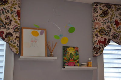
In fact, this project started as a cautionary tale.  When we moved in, this house did not have window coverings in the bedrooms, and since I had no design plan and had not even begun to think about budget, I simply ran to Home Depot and had some white vinyl shades cut to size.  This was basically the cheapest option with good light control.  Fast forward a year or so and you encounter the problem: because we already had window shades, we did not want to buy new window shades.  (The lesson: don't buy "temporary" unless you are okay with it being basically permanent!)

So I needed a fix.  I ordered a carved block used in block printing off of etsy, read tutorials on painting vinyl shades, and got down to business.  Before starting in on the shade, I tested some patterns and colors on large paper.  I quickly realized that a light color would work better than a dark one, like the navy wall paint from the guest room, which showed too many of the irregularities in this process.


So I settled on the wall color from the girls room.  And rather than the climbing vine motif above, I settled on a simple grid pattern.

I taped a tape measure across the bottom of the shade, used a roller to layer paint on the block, and printed every five inches.  (Look closely to see the paint!!)


When it was time to do the next row, I used a ruler to make sure the spacing was even in both directions.


I printed a straight square grid first, then added one stamp in the middle of each square.  I just eyeballed that.

To finish it off, I used a krylon matte sealer and let it cure for a couple of hours before hanging it back up.


These shades have gone up and down at least once daily for about 9 months, and they are still looking good!

Of course, I would still love custom matchstick blinds in there, but for now these are pretty cute, but darn hard to photograph.  In fact, this may be why I never did share the project--that pale pink is sure hard to see, and when you have to shut out the natural light in a room (but don't have professional lighting equipment at your disposal, well, it doesn't look like much.

But tell me: would you ever hand-block print anything?  It actually took way less than an hour once I made decisions about pattern and color and got on with it already!

Wednesday, October 10, 2012

Mismatched drapery hardware

I had this great idea for a follow-up post to Monday's resource for custom-look drapery hardware: mixing, not matching, your drapery rod and rings. I recently saw the most gorgeous space with black curtain rod and shiny gold rings, finials, and tiebacks. So custom, such a great detail. The problem? Can't find the picture ANYWHERE. I have combed through my pinterest pages, my loose file of recent tearsheets, everywhere I could think to look.

It would have been much easier to just scrap the idea and post something else, but somehow once I had invested all that time in finding the image, I kind of dug in and wasted MORE time looking for replacement images. I found these, which are GREAT, but not quite as heart-stopping as the black and gold combo.


Via A storied Style

If you love the idea of the lucite and metallic, but don't have a million bucks, check out this DIY tutorial to get the look for less.

Aren't you glad it took me two days to come up with this?


Monday, October 8, 2012

Drapery Rods and Hardware: new custom-look options

One of those "it's all in the details" areas I often skimp on is curtain rods and hardware.  It doesn't shame me to admit this.  Often, if you hang your curtains high, the rod is not particularly visible anyway, and the truth is, the cost gap between a rod from target and a custom rod is vast.  Since I work with many clients who want to stretch their dollars, I have certainly advocated for cheap rods to allow a little splurge elsewhere (or to make sure we can do everything in the room within budget.)  None of my own curtain rods are custom.

All of that said, I know that many rooms call for more substantial hardware.  This client's 12-foot drapes would have eaten a smaller rod alive, and this bedroom's large furniture required balance.  Additionally, if you are opening and closing your drapes constantly, telescoping rods (the ones that can extend because they are made in two or three pieces) can catch your drapery rings or panel headers, making it a big pain in the butt to utilize their function.

Okay.  Guess what?  A compromise has arrived.  Lowes and Bed Bath and Beyond are both offering limited collections of wood rods that can be cut to length on site.

Lowes Allen+Roth brand:


Bed Bath and Beyond's Cambria Collection:


Excuse the cell phone pics.  I took them to show a client, but it turns out the websites for these stores are not particularly useful where these products are concerned.

With both collections, the rods come in three lengths, 4, 6, and 8 ft, and can be cut to measure.  (Not by the store: by you.)  Rods also come in two widths, which we will call thinner and fatter, and there is some variation of smooth, fluted, and twisted. They come in black, white, and two tones of wood, and each collection does have several finial options and tie backs.

While they are more expensive than Target rods, they are still cheaper than telescoping rods from pricier big box stores like Restoration Hardware, and you get that custom look.

I am testing some from Lowes in a project and will let you know how it goes.

I'm excited!

LinkWithin

Related Posts Plugin for WordPress, Blogger...